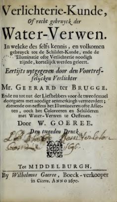
GOEREE, Willem, Verlichterie-kunde, of recht gebruyck der Water-Verwen: in welcke des selfs kennis, en volkomen gebruyck tot de Schilder-Kunde, ende de Illuminatie ofte Verlichterie noodigh zijnde, kortelijck werden geleert : Eertijts uytgegeven dor den voortreffelijcken verlichter Mr. Geerard ter Brugge. Ende nu tot nut der Liefhebbers voor de tweedemael doorgaens met noodige aenmerckingh vermeerdert; dienende om neffens het Illumineeren ofte Afsetten, oock het Coloreeren en Schilderen met Water-Verwen te Oeffenen, Den tweeden Druck, Middelburg, Wilhelmus Goeree, 1670.
As an author, Goeree published on art and (the history of) religion. In 1668, he published Verlichterie-kunde of recht gebruyck der water-verwen. The book was bounded in the same volume as the Inleydinge tot de Al-ghemeene Teycken-Konst, also written by Goeree. In 1670, the Inleydingh tot de practijck der al-gemeene Schilder-Konst followed. Willem Goeree had the intention to write a six-volume magnum opus on the Art of Painting. In the preface to the reader in the Inleydingh tot de practijck der al-gemeene Schilder-konst of 1670, he writes that, apart from the volumes on Drawing and Painting, this book – which he calls “onse geheele Schilderkonst” – would consist of books on Perspective, Anatomy, Architecture, Composition and Invention (“Ordineeringh and Inventeeringh”) and Light and Colour (“…de kracht en Eygenschap der schaduwen, dagen, reflexien en houdinge en wat verder in ‘t coloreeren waer te nemen state, door Wiskundige figueren te betoogen”) and was intended to assist and improve artistic instruction. The Verlichterie-kunde was not part of this series. Only two of the envisioned other volumes were published: one on Architecture (d’Algemeene Bouwkunde volgens d’Antyke en Hedendaagse Manier, 1681) and the other on Anatomy (Natuurlyk en Schilderkonstig Ontwerp der Menschkunde, 1682). Goeree stated in the latter that he had written the volume on composition, but it was never published.
The Verlichterie-kunde of recht gebruyck der water-verwen (1668) is a considerably enlarged edition of Gerard Ter Brugghen’s Verlichtery kunst-boeck in de welcke de rechte fondamenten, ende het volcoomen ghebruyck der illuminatie met alle hare eyghenschappen klaerlijcken werden voor oogen ghestelt, which had first been published in 1616 with subsequent editions in 1634 (Leiden: Jacob Roels) and 1667 (Amsterdam: Willem Gort). Goeree restructured the book, rewrote the text in a more appropriate contemporary Dutch and added information throughout. The reference to Ter Brugghen’s text is included on the title pages of all editions of Goeree’s book, both in Dutch and in German and English translations, suggesting the importance and notoriety of Ter Brugghen’s book. Goeree’s book appears to have enjoyed a similar popularity, as it was republished three times (1670, 1697 and 1705).[2]
For the first edition of 1668, the treatise was bound together in one volume with the Teycken-konst. This example is followed in the English translation (1674), which was based on this first edition. Subsequent editions appeared in separate volumes. However, the German edition of 1678 (which was used for the analysis in the database) bound together the Verlichterie-kunde, Teycken-konst and Schilder-konst.
Goeree divided his Verlichterie-kunde in two parts. In the first, he discusses the tools and the different colours, followed by technical advice. In the second part, he elaborates on the use of colours to depict particular subjects, going into great detail. The book includes a page on which the owner could add samples of all the colours that are discussed in the text.
Although the detailed description of how to paint different subjects may be of great interest to the reader, the variety of art terms that are used in this part is limited, therefore, we have often chosen to only select chapter or paragraph titles. The database user is encouraged to open the pdf pages and consult the rest of the text. Moreover, for the first occurrence of a particular colour, we have added an index of subsequent occurrences of this colour in the text.
A suggested translation of the selected citations is added for the convenience of the database user who might not be familiar with the Dutch language. Please note that this should by no means serve as a definite translation, it is a work in progress.
The analysis is based on the second Dutch edition of 1670, instead of the first edition of 1668. The reason for this decision is both scientific (Goeree revised the first edition) and practical (the availability of a digitized version). For the analysis of the translations, we have worked with the only English translation (1674), which was likely based on the first Dutch edition (1668) and bound together with a translation of Goeree’s Teycken-konst. For the German, the analysis is based on the second edition of 1677 and not the first of 1669. The edition of 1677 was based on the second Dutch edition and was bound together with the translation of the Teycken-konst and Schilder-konst.
Marije Osnabrugge
[1] For more information on Goeree’s life and work as a publisher, see: KWAKKELSTEIN, 1998.
[2] For more information about the German translations of the text, see: OSNABRUGGE, forthcoming 2018.
Dedication
Aenden Leser
Avis au lecteur at
GOEREE, Willem, Verlichtery-konst, In de welcke den rechten grondt, ende volkomen gebruyck der Water-Verwen, tot de Schilder-Konst, ende de Illuminatie ofte Verlichtery noodigh zijnde, met alle hare Eygenschappen klaerlijck werden geleert. Eertijds uyt-ghegeven door den voortreffelijcken Verlichter Mr. Geerard ter Brugge, Ende nu tot nut der Lief-hebbers, doorgaens vermeerdert en verbetert, met eenighe aen-merckingen rakende neffens de Illuminatie, het Colloreeren en Schilderen met Waterverwen. Door W.G. Tot Middelburgh, Middelburg, Wilhelmus Goeree, 1668.
GOEREE, Willem, Verligterie-kunde, of regt gebruik der Water-Verwen: in welke Desselfs Kennis, en Gebruik tot de Schilderkunde, en de Illuminatie of Verligterie noodig zijnde, kortelijk geleerd word. Eertijds uytgegeven door den Voortreflijken Verligter Mr. Geerard ter Brugge. Ende nu tot nut der Liefhebbers, doorgaans met noodige aanmerkingen vermeerder; om neffens het Illumineeren of Afzetten, insonderheid het Schilderen met Water-Verwen te Oeffenen. Door W. Goeree. Den Derden Druk, Amsterdam, Daniel van Dalen, 1697.
GOEREE, Willem, Verligterie-kunde, Of regt Gebruyk der Water-Verwen. In welke Desselfs Kennis, en Gebruik tot de Schilder-kunde, en de Illuminatie of Verligterie noodig zijnde, kortelijk geleerd word. Eertijds uytgegeven door den Voortreffelijken Verligter Mr. Geerard ter Brugge. Ende Nu tot nut der Liefhebbers, doorgaans met noodige aanmerkingen vermeerderd; om neffens het Illumineeren of Afzetten, insonderheid the schilderen met Water-Verwen te Oeffenen. Door W. Goeree. Den Vierden Druk, Amsterdam, Andries van Damme, 1705.
GOEREE, Willem, Verligterie-kunde, of regt Gebruik der water-verwen: in welke deszelfs kennis, en gebruik tot de schilderkunde, en de illuminatie of verligterie noodig zijnde, kortelijk geleerd word / eertijds uytgeg. door ... Geerard ter Brugge ; ende nu tot nut der liefhebbers, ... met noodige aanmerkingen vermeerderd ...Amsterdam, Van Dalen, 1697 (derde druk), Doornspijk, Davaco, 1974.
GOEREE, Willem, Verlichtery-konst, In de welcke den rechten grondt, ende volkomen gebruyck der Water-Verwen, tot de Schilder-Konst, ende de Illuminatie ofte Verlichtery noodigh zijnde, met alle hare Eygenschappen klaerlijck werden geleert. Eertijds uyt-ghegeven door den voortreffelijcken Verlichter Mr. Geerard ter Brugge, Ende nu tot nut der Lief-hebbers, doorgaens vermeerdert en verbetert, met eenighe aen-merckingen rakende neffens de Illuminatie, het Colloreeren en Schilderen met Waterverwen. Door W.G. Tot Middelburgh, Middelburg, Wilhelmus Goeree, 1668.
GOEREE, Willem, Kurtzer Begrif der Erleuchterei- und Anfarbe-Kunst: darinnen der rechte grund, und volkommene gebrauch der so wohl zur Mahl- als Erleuchterei nöhtigen Wasserfarben, mit allen ihren eigenschaften erklahret wird. ehrmahls durch den fürtreflichen Erleuchter Gerharden zur Brügge herausgegeben, und nach der Zeit durch den Kunsterfarnen Wilhelm Goeree mit etlichen zum Anlegen und Mahlen mit Wasserfarben so wohl als zum Erleuchtern dienlichen Anmerkungen vermehret und verbessert; nun mehr aber aus den Niederdeutschen verhochdeutschet durch F. von Zesen, trad. par VON ZESEN, Philipp, Hamburg, Johann Naumann und Georg Wolffen, 1669.
GOEREE, Willem, Illuminir- oder Erleuchterey-Kunst, Oder der Rechte Gebrauch der Wasserfarben: Darinnen Derselbigen rechter Grund und vollkom[m]ener Gebrauch so wohl zu der Mahlerey als Illuminirung und Erleuchterey kürtzlich gezeiget wird,Ghemahls durch den fürtrefflichen Illuminirer Gerhard zur Brügge / Und nun den Liebhabern zu Nussen zum andernmahl durchaus mit nöthigen, und nebenst dem Illuminiren auch zu den Anlegen und Mahlen mit Wasserfarben, dienlichen Anmerckungen vermehret und verbessert. Durch Wilhelm Goeree. Und aus dem Nieder- ins hochteutsche übersesset Von Johann Langen, trad. par LANGE, Johann, Hamburg, Samuel Heyl, 1723.
GOEREE, Willem, Anweisung zu der Mahler-Kunst, worinnen nebst derselben Fürtreflichkeit und Nutzen gezeiget wird, was einer zum gründlichen Verstand der Mahler-Kunst wissen, und wie er sich durch Ubung darinnen perfectioniren soll, nebst einem gründlichen Unterricht von der Reiss- und Zeichen- wie auch Illuminir-Kunst, oder dem rechten Gebrauch der Wasser-Farben, Leipzig, Friedrich Lanckischens Erben, 1744.
GOEREE, Willem, Anweisung zu der Mahler-Kunst, worinnen nebst derselben Fürtreflichkeit und Nutzen gezeiget wird, was einer zum gründlichen Verstand der Mahler-Kunst wissen, und wie er sich durch Ubung darinnen perfectioniren soll, nebst einem gründlichen Unterricht von der Reiss- und Zeichen- wie auch Illuminir-Kunst, oder dem rechten Gebrauch der Wasser-Farben, Neue und verbesserte Auflage, Leipzig, Friedrich Lanckischens Erben, 1750.
GOEREE, Willem, Anweisung zu der Mahler-Kunst, worinnen nebst derselben Fürtreflichkeit und Nutzen gezeiget wird, was einer zum gründlichen Verstand der Mahler-Kunst wissen, und wie er sich durch Ubung darinnen perfectioniren soll, nebst einem gründlichen Unterricht von der Reiss- und Zeichen- wie auch Illuminir-Kunst, oder dem rechten Gebrauch der Wasser-Farben, Neue und verbesserte Auflage, Leipzig, landischen Handlung, 1756.
OSNABRUGGE, Marije, « German Translations of Dutch Art Literature: Goeree, Beurs and De Lairesse », dans VAN LEEUWEN, Rieke (éd.), La Haye, RKD, forthcoming 2018 [En ligne : http://www.rkdmonographs.nl/ consulté le 31/12/2017].
KWAKKELSTEIN, Michael W., Willem Goeree: inleydinge tot de al-ghemeene teycken-konst: een kritische geannoteerde editie, Leiden, Primavera press, 1998.
VAN DE LINDT, Adriana, « Willem Goeree (1635-1711) : un amateur entre art et Lumières radicales », dans HECK, Michèle-Caroline (éd.), L’histoire de l’histoire de l’art septentrional au XVIIe siècle, Actes des journées d’études de Lille et Bruxelles, Turnhout, Brepols, 2009, p. 155-186.
FILTERS
QUOTATIONS
Quotation
Aengesien dat den Liefhebber in ’t vervolgh van dese Verlichterie-Kunde, dickwils van het aenleggen, schaduwen, diepen en hoogen sal gewaeght vinden, als zijnde de voornaemste doeningen in ’t oeffenen der Water-Verwen; soo sal het noodigh zijn, kortelijk van elcks yets tot grondighe verstaningh daer van aen te mercken, wantmen sonder grondige kennis daer van te hebben, tot de volkomene oeffeninghe deser Konste niet en kan komen.
Wy beginnen dan eerstelijck het aenleggen te verklaren, zijnde het begin van alle wercken diemen in dese Konst wil aenvangen. Aenleggen dan is, soo wanneermen eenigh dingh, met eenerhande Coleur van Verwe diemen daer toe verkiest, na sijn believen vlack en eenparigh aenleyt en simpel overdeckt, sonder eenighe schaduwe of dagh waer te nemen. Aengeleyt zijnde, soo volght wanneer dat Coleur droogh is, datmen het uytschaduwe en verdiepe, ghelijckwe dat doorgaens in ’t vervolgh soo sullen noemen; en geschiet op die gront, welcke te vooren aengeleyt is; sulcks geschiet altijt door een Verwe welcke veel vetter, stercker ofte bruynder is, als die daer sy mede beleyt is: waer door dan de Parthyen van doncker en licht onderscheyden en afgepaelt werden; alsoo datmen de schaduwen, en de vlackheydt der dingen kan beseffen, en siet uytheffen, daer sy te vooren plat schenen; (…)
Nu de derde waernemingh die is verhoogen, welcke op de lichte plaets van alle dingen, als daer den dagh sonder eenige schaduwe het sterckst opvalt, moet geschieden; en komt dese verhoogingh meest te geschieden op hooge en uytsteeckende parthyen, gelijck aen de Menschen op de Kaecken, boven op de Neus, op het Voor-hooft, Kinne, Schouderen, Borst, Billen, Elleboogh, Knyen, &c. Van gelijcken in Kleedinghen op de ployen, en vlacke deelen der Ledematen die door deselve werden uyt-gedruckt; en voorts alles wat sich boven de vlackte verheft; dit doetmen met een lichter Verwe en blyer Coleur, als daer ’t mede aengheleyt is: en verhooght het alsoo als het na sijn Trap min of meer, na het sterckste licht aerdende, verlicht is, om dat te doen ronden en voorkomen, &c. (…)
de schaduwen nu diemen op het Gront-Papier doet, komen oock over een met de schaduwen diemen in ’t Schilderen met een stercker Verwe over ’t aengeleyde heen leght; de hooghsels komen van gelijcke over een; de diepsels accordeeren met de toetsen, diemen hier en daer inde Teyckeningh inset; invoegen geen onderscheyt tussen het Teyckenen en Verlichterie-Schilderen en is, als de handelingh vande Pinceel, en datmen sich telckens inbeelt dat yeder aangeleyt Coleur daermen op Schilderen moet, een soort van Gront-papier is daermen op Teyckent, en datmen voor die tijt de handelingh van Teyckenen oeffent, diemen wassen noemt. Staet oock noch aen te mercken, datmen de schaduwen, diepsels en hooghsels alle tijt moet schicken, na dat het Coleur vande gront-vlackte is, op welckmen die komt te leggen: want die niet evenredigh zijnde, soo sullense of te hart, indiense te sterck zijn, ofte flets en Kernemelkachtigh by aldiense niet behoorlijck krachtigh en zijn.
[suggested translation, Marije Osnabrugge:] As the Amateur will often find the building up , shadowing, deepening and heightening discussed in the continuation of this Verlichterie-Kunde, as they are the principal actions in the practice of Watercolouring; as such it is necessary, to briefly mention something for the profound understanding of them, because one cannot acquire a perfect practice of this Art, without profound knowledge of it. We start first by explaining the building up, being the start of all that one wants to do in this Art. Building up is, when one builds up a thing, with any Colour of Paint that one choses for it, flat and uniformly as is desired and simply covers, without paying attention to any shadow or light. Built up, once the paint is dry, one continues by shadowing and deepening, as we will call it from now on; and it is done on the ground, which was build up beforehand; it is always done by means of a colour that is greasier, stronger or darker than the one with which it was build up: because of which the Parts of dark and light are discerned and framed; that is, that one can recognize the shadows and flatness of things, and see them rise, while they appeared to be flat before; [...] The third observation now is heightening, which should happen at the light spot of all things, where the light falls strongest without any shadow; and this heightening mostly occurs on high and protruding parts, such as on Humans on the Jaws, on top of the Nose, on the Forehead, Chin, Shoulders, Breast, Buttocks, Elbow, Knees, etc. . Similarly in Clothing on the folds, and flat parts of Limbs that are expressed by it; and furthermore everything that raises itself above the surface; this is done with a lighter Paint and happier Colour, as the one with which it is build up: and heighten it in a way as it is lit up more or less according to its level, towards the strongest light, to round it and make come forward, etc. [...] now the shadows that are made on the grounded Paper, also coincide with the shadows that, in Painting, one places over the first layer with a stronger Paint; the highlights also coincide; the depths accord with the touches, that are placed here and there in the Drawing; and there is no difference between Drawing and Illumination-painting, as the handling of the Brush, and that one often imagines that every applied Colour on which one has to Paint, is a kind of grounded paper on which one Draws, and that one practices the manner of Drawing beforehand, which is called washing. It may also be remarked, that one should always place the shadows, depths, highlights, after the Colour of the ground-surface, on which it is placed: because if these are not corresponding , they will be too hard – if they are too strong – or too weak and Buttermilk-like – if they are not sufficiently strong.
Conceptual field(s)
Quotation
Dan een verstandigh Oeffenaer moet de natuer der Teycken en Schilder-Konst volgen. Maer inde verlichterie, diemen doet omtrent Printen of Gedruckte Kunst, daer moetmen letten hoedanigh den Meester en Plaet-Snyer de trecken, hier hart, daer flaeuw en sacht gemackt heeft, en soo oock aengaende de schaduwen door de Artseeringen aengewesen, op datmen daer de sterckheydt van Coleuren bequaemelijck na schicken magh, en al isset datmen in desen de Artseeringhen sachtelijck door de Verwen siet speelen, ’t salder niet en slimmer om moghen gheacht wesen.
term translations[suggested translation, Marije Osnabrugge:] A sensible Practitioner should follow the nature of the Art of Drawing and Painting. But in the Illumination that is done regarding Prints or Printed Art, one should pay attention how the Master and Engraver has made the lines, here hard, there weak and soft, and similarly regarding the shadows that are marked by hatchings, to make the force of the Colours according to it, and although it might be that one softly sees the Hatchings through the Paints, it will not be thought of any less.
Conceptual field(s)
Quotation
Wit. {1. Loot-wit. 2. Schelp-wit. 3. Schelp-silver.}
Blaeuw. {4. Indigo. 5. Blauw Lack. 6. Blaeuw As. 7. Smalt. 8. Oltermarijn. 9. Lackmoes.}
Geel. {10. Ligte Schijtgeel. 11. Bruyne schijt Geel van verscheyde soorten. 12. Masticot. 13. Geel Oprement. 14. Saffraen. 15. Geel-Besien. 16. Geel Oocker. 17. Guttegom. 18. Rustgeel. 19. Schulp Gout.}
Groen. {20. Spaens groen. 21. Sap groen. 22. Bergh groen. 23. Groene Aerd of Terreverde.}
Root. {24. Fermilioen. 25. Meny. 26. Root Krijt. 27. Roon Oocker of Bruyn root. 28. Lack. 29. Brezilje verf.}
Bruyn. {30. Bruyn Oocker. 31. Bitter, of Root uyt de Schoorsteen. 32. Keulse aerde.}
Swart. {33. Lamp-swart. 34. Been-swart. 35. Wijngaert-swart. 36. Smee-Kool-swart. 37. Oostindische Inct.}
De andere Coleuren nu die in de Verlichterie souden mogen dienen, konnen alle uyt dese boven-genoemde Verwen, door vermengingh getempert en gevonden werden;
[suggested translation, Marije Osnabrugge:] White. {1. Lead White. 2. Flake white. 3. Shell-silver.} Blue. {4. Indigo. 5. Blue Laquer. 6. Blue bice. 7. Smalt. 8. Ultramarine. 9. Litmus.} Yellow. {10. Light Pinck. 11. Brown Pinck. 12. Masticot. 13. Yellow orpiment. 14. Saffron. 15. French berries. 16. Yellow Ocher. 17. Gum bugee. 18. Spruce Oker. 19. Shell-Gold.} Green. {20. Verdigris. 21. Sap Green. 22. Bergh Green. 23. Terraverde.} Red. {24. Vermilion. 25. Red lead. 26. Red Chalk. 27. Red Ocher. Spanish brown. 28. Lake. 29. Brasil.} Brown {30. Brown Ocher. 31. Soot. 32. Collins Earth.} Black {33. Lamp black. 34. Ivory Black. 35. Vine black. 36. Smal-coal black. 37. East India ink.} The other Colours that may be of use in the Illumination, can all be mixed and found from the aforementioned Colours through mixing;
Blauwe As is the same as Ascus. This colour is also cited on pages: part I: 2, 9, 11, 50; part II: 4, 5, 6, 18, 19, 21, 32, 41, 46, 47, 54, 57. In between pages 2 and 3, Goeree inserted a sample sheet, on which the owner of the book could paint the different colours mentioned in the book. [MO]
Conceptual field(s)
Quotation
Blaeuwen Ascus
term translations[suggested translation, Marije Osnabrugge:] Blue ascus
Conceptual field(s)
Quotation
En of schoon datter veel aen vast is, datmen de Teycken-Konst diende te verstaen, en deswegen veel Arbeydts en Hooft-breeckingh van nooden is, om de Verlichterie-Kunde te Leeren; soo moetmen hier op weten, dat alhoewel dese Konst sulcks al vereyst, ghelijckse dat oock doet; datter evenwel veel fraye dingen inde selve konnen ghemaeckt werden, sonder heel geleert inde Teycken-Kunde te wesen: gelijck als daer dan zijn de Freuytagien, Bancketten, Vogelkens, en alderhande Looven en Bloemen welcke insonderheyt playsant voor d’Ooge zijn, en stoffe genoegh geeft van veranderlijckheyt, oock om sijnen goeden Geest en Kennis diemen besit, daer in bekent te stellen, en een roemruchtigen naem van hem te laten uytgaen. De swaere dingen, als daer zijn Beelden, Ordinantien, Beesten, Lantschappen en diergelijcke mogen Jonge Borsten, ofte die na meerder Geleertheydt staen, of alreede hebben, aenvanghen, na dat yeder tot dese andere tot andere dingen van sijn ingenium geleyt wort; oock kan het ligt gebeuren dat sommige Geestige Ionckvrouwen door ’t Oeffenen vande gheringhste Werckstucken, inde Konst, door het wel gelucken van haren Arbeyt, lust souden krijghen om verder tot de algemeenheydt deser Konst in te booren, en alsoo uytnemende te werden.
term translations[suggested translation, Marije Osnabrugge:] And although much depends on being able to understand the Art of Drawing, for which much Work and pondering is necessary, to learn the Art of Illumination; yet one should know that although this Art needs all this that she does; that still many beautiful things can be made in this art, without being very learned in the Art of Drawing: such as the Fruit pieces, Banquets, Birds, and all sorts of Foliage and Flowers which are especially pleasant to the Eye and offer enough material of changeability, also to make one’s good Mind and Knowledge – which one has – familiar with it and radiate an illustrious name. The difficult things, such as Figures, Compositions, Animals and Landscapes and the like, may be began by Young Men who either lean towards more Knowledge, or have it already, after everyone is led towards these other [ndr: things] by other elements of his ingenuity; it can moreover easily happen that some Spirited Young Ladies by practicing the small tasks of the Art, would get the desire – because of the success of their labour – to penetrate further into the general parts of this Art and thus become excellent.
The introduction to the English translation does not follow the text of the original. [MO]
Conceptual field(s)
Quotation
Wit. {1. Loot-wit. 2. Schelp-wit. 3. Schelp-silver.}
Blaeuw. {4. Indigo. 5. Blauw Lack. 6. Blaeuw As. 7. Smalt. 8. Oltermarijn. 9. Lackmoes.}
Geel. {10. Ligte Schijtgeel. 11. Bruyne schijt Geel van verscheyde soorten. 12. Masticot. 13. Geel Oprement. 14. Saffraen. 15. Geel-Besien. 16. Geel Oocker. 17. Guttegom. 18. Rustgeel. 19. Schulp Gout.}
Groen. {20. Spaens groen. 21. Sap groen. 22. Bergh groen. 23. Groene Aerd of Terreverde.}
Root. {24. Fermilioen. 25. Meny. 26. Root Krijt. 27. Roon Oocker of Bruyn root. 28. Lack. 29. Brezilje verf.}
Bruyn. {30. Bruyn Oocker. 31. Bitter, of Root uyt de Schoorsteen. 32. Keulse aerde.}
Swart. {33. Lamp-swart. 34. Been-swart. 35. Wijngaert-swart. 36. Smee-Kool-swart. 37. Oostindische Inct.}
De andere Coleuren nu die in de Verlichterie souden mogen dienen, konnen alle uyt dese boven-genoemde Verwen, door vermengingh getempert en gevonden werden;
[suggested translation, Marije Osnabrugge:] White. {1. Lead White. 2. Flake white. 3. Shell-silver.} Blue. {4. Indigo. 5. Blue Laquer. 6. Blue bice. 7. Smalt. 8. Ultramarine. 9. Litmus.} Yellow. {10. Light Pinck. 11. Brown Pinck. 12. Masticot. 13. Yellow orpiment. 14. Saffron. 15. French berries. 16. Yellow Ocher. 17. Gum bugee. 18. Spruce Oker. 19. Shell-Gold.} Green. {20. Verdigris. 21. Sap Green. 22. Bergh Green. 23. Terraverde.} Red. {24. Vermilion. 25. Red lead. 26. Red Chalk. 27. Red Ocher. Spanish brown. 28. Lake. 29. Brasil.} Brown {30. Brown Ocher. 31. Soot. 32. Collins Earth.} Black {33. Lamp black. 34. Ivory Black. 35. Vine black. 36. Smal-coal black. 37. East India ink.} The other Colours that may be of use in the Illumination, can all be mixed and found from the aforementioned Colours through mixing;
This colour is also cited on pages: part I: 3, 28. In between pages 2 and 3, Goeree inserted a sample sheet, on which the owner of the book could paint the different colours mentioned in the book. [MO]
Conceptual field(s)
Quotation
Been-Swart
term translations[suggested translation, Marije Osnabrugge:] Ivory black.
Conceptual field(s)
Quotation
En of schoon datter veel aen vast is, datmen de Teycken-Konst diende te verstaen, en deswegen veel Arbeydts en Hooft-breeckingh van nooden is, om de Verlichterie-Kunde te Leeren; soo moetmen hier op weten, dat alhoewel dese Konst sulcks al vereyst, ghelijckse dat oock doet; datter evenwel veel fraye dingen inde selve konnen ghemaeckt werden, sonder heel geleert inde Teycken-Kunde te wesen: gelijck als daer dan zijn de Freuytagien, Bancketten, Vogelkens, en alderhande Looven en Bloemen welcke insonderheyt playsant voor d’Ooge zijn, en stoffe genoegh geeft van veranderlijckheyt, oock om sijnen goeden Geest en Kennis diemen besit, daer in bekent te stellen, en een roemruchtigen naem van hem te laten uytgaen. De swaere dingen, als daer zijn Beelden, Ordinantien, Beesten, Lantschappen en diergelijcke mogen Jonge Borsten, ofte die na meerder Geleertheydt staen, of alreede hebben, aenvanghen, na dat yeder tot dese andere tot andere dingen van sijn ingenium geleyt wort; oock kan het ligt gebeuren dat sommige Geestige Ionckvrouwen door ’t Oeffenen vande gheringhste Werckstucken, inde Konst, door het wel gelucken van haren Arbeyt, lust souden krijghen om verder tot de algemeenheydt deser Konst in te booren, en alsoo uytnemende te werden.
term translations[suggested translation, Marije Osnabrugge:] And although much depends on being able to understand the Art of Drawing, for which much Work and pondering is necessary, to learn the Art of Illumination; yet one should know that although this Art needs all this that she does; that still many beautiful things can be made in this art, without being very learned in the Art of Drawing: such as the Fruit pieces, Banquets, Birds, and all sorts of Foliage and Flowers which are especially pleasant to the Eye and offer enough material of changeability, also to make one’s good Mind and Knowledge – which one has – familiar with it and radiate an illustrious name. The difficult things, such as Figures, Compositions, Animals and Landscapes and the like, may be began by Young Men who either lean towards more Knowledge, or have it already, after everyone is led towards these other [ndr: things] by other elements of his ingenuity; it can moreover easily happen that some Spirited Young Ladies by practicing the small tasks of the Art, would get the desire – because of the success of their labour – to penetrate further into the general parts of this Art and thus become excellent.
The introduction to the English translation does not follow the text of the original. [MO]
Conceptual field(s)
Quotation
Wit. {1. Loot-wit. 2. Schelp-wit. 3. Schelp-silver.}
Blaeuw. {4. Indigo. 5. Blauw Lack. 6. Blaeuw As. 7. Smalt. 8. Oltermarijn. 9. Lackmoes.}
Geel. {10. Ligte Schijtgeel. 11. Bruyne schijt Geel van verscheyde soorten. 12. Masticot. 13. Geel Oprement. 14. Saffraen. 15. Geel-Besien. 16. Geel Oocker. 17. Guttegom. 18. Rustgeel. 19. Schulp Gout.}
Groen. {20. Spaens groen. 21. Sap groen. 22. Bergh groen. 23. Groene Aerd of Terreverde.}
Root. {24. Fermilioen. 25. Meny. 26. Root Krijt. 27. Roon Oocker of Bruyn root. 28. Lack. 29. Brezilje verf.}
Bruyn. {30. Bruyn Oocker. 31. Bitter, of Root uyt de Schoorsteen. 32. Keulse aerde.}
Swart. {33. Lamp-swart. 34. Been-swart. 35. Wijngaert-swart. 36. Smee-Kool-swart. 37. Oostindische Inct.}
De andere Coleuren nu die in de Verlichterie souden mogen dienen, konnen alle uyt dese boven-genoemde Verwen, door vermengingh getempert en gevonden werden;
[suggested translation, Marije Osnabrugge:] White. {1. Lead White. 2. Flake white. 3. Shell-silver.} Blue. {4. Indigo. 5. Blue Laquer. 6. Blue bice. 7. Smalt. 8. Ultramarine. 9. Litmus.} Yellow. {10. Light Pinck. 11. Brown Pinck. 12. Masticot. 13. Yellow orpiment. 14. Saffron. 15. French berries. 16. Yellow Ocher. 17. Gum bugee. 18. Spruce Oker. 19. Shell-Gold.} Green. {20. Verdigris. 21. Sap Green. 22. Bergh Green. 23. Terraverde.} Red. {24. Vermilion. 25. Red lead. 26. Red Chalk. 27. Red Ocher. Spanish brown. 28. Lake. 29. Brasil.} Brown {30. Brown Ocher. 31. Soot. 32. Collins Earth.} Black {33. Lamp black. 34. Ivory Black. 35. Vine black. 36. Smal-coal black. 37. East India ink.} The other Colours that may be of use in the Illumination, can all be mixed and found from the aforementioned Colours through mixing;
This colour is also cited on pages: part I: 2, 20; part II: 15, 16, 21, 55. In between pages 2 and 3, Goeree inserted a sample sheet, on which the owner of the book could paint the different colours mentioned in the book. [MO]
Conceptual field(s)
Quotation
Voor eerst is er dan het Bergh-Groen (…) Engels-Groen (…) Sever-Groen komt met desen in allen over een. De Groene Aerde ofte Terreverd, wort inde Verlichterie om sijn onplaysant Coleur niet gebruyckt, soo dat wy achten niet noodigh te zijn yets meer vande Groenen te seggen, ghemerckt die d’een uyt d’ander, daer-en-boven uyt Blaeuw en Geel te samen gemenght, in ontelbare verschillige Coleuren konnen getempert en door Wit, of Geel na begeeren ge-aert werden.
term translations[suggested translation, Marije Osnabrugge:] Of the green colours: their preparation, mixing and use, according to the different types. Different greens. Firstly there is bergh green […] verditor […] seder green is similar to these in all ways. Green Earth or Terraverde, is not used in the Illumination because of its unpleasant Colour, which is why we do not think it is necessary to say anything more about the Greens, seen that they are mixed the one from the other and moreover mixed together from Blue and Yellow in innumerable different Colours and adjusted with White or Yellow as desired.
For the translation of the names of the different types of green, I have used the translation from the English translation (1674). [MO]
Conceptual field(s)
Quotation
Wit. {1. Loot-wit. 2. Schelp-wit. 3. Schelp-silver.}
Blaeuw. {4. Indigo. 5. Blauw Lack. 6. Blaeuw As. 7. Smalt. 8. Oltermarijn. 9. Lackmoes.}
Geel. {10. Ligte Schijtgeel. 11. Bruyne schijt Geel van verscheyde soorten. 12. Masticot. 13. Geel Oprement. 14. Saffraen. 15. Geel-Besien. 16. Geel Oocker. 17. Guttegom. 18. Rustgeel. 19. Schulp Gout.}
Groen. {20. Spaens groen. 21. Sap groen. 22. Bergh groen. 23. Groene Aerd of Terreverde.}
Root. {24. Fermilioen. 25. Meny. 26. Root Krijt. 27. Roon Oocker of Bruyn root. 28. Lack. 29. Brezilje verf.}
Bruyn. {30. Bruyn Oocker. 31. Bitter, of Root uyt de Schoorsteen. 32. Keulse aerde.}
Swart. {33. Lamp-swart. 34. Been-swart. 35. Wijngaert-swart. 36. Smee-Kool-swart. 37. Oostindische Inct.}
De andere Coleuren nu die in de Verlichterie souden mogen dienen, konnen alle uyt dese boven-genoemde Verwen, door vermengingh getempert en gevonden werden;
[suggested translation, Marije Osnabrugge:] White. {1. Lead White. 2. Flake white. 3. Shell-silver.} Blue. {4. Indigo. 5. Blue Laquer. 6. Blue bice. 7. Smalt. 8. Ultramarine. 9. Litmus.} Yellow. {10. Light Pinck. 11. Brown Pinck. 12. Masticot. 13. Yellow orpiment. 14. Saffron. 15. French berries. 16. Yellow Ocher. 17. Gum bugee. 18. Spruce Oker. 19. Shell-Gold.} Green. {20. Verdigris. 21. Sap Green. 22. Bergh Green. 23. Terraverde.} Red. {24. Vermilion. 25. Red lead. 26. Red Chalk. 27. Red Ocher. Spanish brown. 28. Lake. 29. Brasil.} Brown {30. Brown Ocher. 31. Soot. 32. Collins Earth.} Black {33. Lamp black. 34. Ivory Black. 35. Vine black. 36. Smal-coal black. 37. East India ink.} The other Colours that may be of use in the Illumination, can all be mixed and found from the aforementioned Colours through mixing;
This colour is also cited on pages: part I: 3, 13, 14, 27; part II: 8, 9, 11, 12, 13, 14, 15, 16, 17, 22, 23, 24, 25, 26, 27, 28, 29, 30, 31, 34, 35, 36,37, 38, 39, 40, 42, 43, 44, 46, 48, 50, 51, 53, 56, 58. In between pages 2 and 3, Goeree inserted a sample sheet, on which the owner of the book could paint the different colours mentioned in the book. [MO]
Conceptual field(s)
Quotation
Wit. {1. Loot-wit. 2. Schelp-wit. 3. Schelp-silver.}
Blaeuw. {4. Indigo. 5. Blauw Lack. 6. Blaeuw As. 7. Smalt. 8. Oltermarijn. 9. Lackmoes.}
Geel. {10. Ligte Schijtgeel. 11. Bruyne schijt Geel van verscheyde soorten. 12. Masticot. 13. Geel Oprement. 14. Saffraen. 15. Geel-Besien. 16. Geel Oocker. 17. Guttegom. 18. Rustgeel. 19. Schulp Gout.}
Groen. {20. Spaens groen. 21. Sap groen. 22. Bergh groen. 23. Groene Aerd of Terreverde.}
Root. {24. Fermilioen. 25. Meny. 26. Root Krijt. 27. Roon Oocker of Bruyn root. 28. Lack. 29. Brezilje verf.}
Bruyn. {30. Bruyn Oocker. 31. Bitter, of Root uyt de Schoorsteen. 32. Keulse aerde.}
Swart. {33. Lamp-swart. 34. Been-swart. 35. Wijngaert-swart. 36. Smee-Kool-swart. 37. Oostindische Inct.}
De andere Coleuren nu die in de Verlichterie souden mogen dienen, konnen alle uyt dese boven-genoemde Verwen, door vermengingh getempert en gevonden werden;
[suggested translation, Marije Osnabrugge:] White. {1. Lead White. 2. Flake white. 3. Shell-silver.} Blue. {4. Indigo. 5. Blue Laquer. 6. Blue bice. 7. Smalt. 8. Ultramarine. 9. Litmus.} Yellow. {10. Light Pinck. 11. Brown Pinck. 12. Masticot. 13. Yellow orpiment. 14. Saffron. 15. French berries. 16. Yellow Ocher. 17. Gum bugee. 18. Spruce Oker. 19. Shell-Gold.} Green. {20. Verdigris. 21. Sap Green. 22. Bergh Green. 23. Terraverde.} Red. {24. Vermilion. 25. Red lead. 26. Red Chalk. 27. Red Ocher. Spanish brown. 28. Lake. 29. Brasil.} Brown {30. Brown Ocher. 31. Soot. 32. Collins Earth.} Black {33. Lamp black. 34. Ivory Black. 35. Vine black. 36. Smal-coal black. 37. East India ink.} The other Colours that may be of use in the Illumination, can all be mixed and found from the aforementioned Colours through mixing;
This colour is also cited on pages: part I: 2, 8. In between pages 2 and 3, Goeree inserted a sample sheet, on which the owner of the book could paint the different colours mentioned in the book. [MO]
Conceptual field(s)
Quotation
Blaeuwe Lack
term translations[suggested translation, Marije Osnabrugge:] Blue Lacquer
This paragraph is missing in the English translation. [MO]
Conceptual field(s)
Quotation
En of schoon datter veel aen vast is, datmen de Teycken-Konst diende te verstaen, en deswegen veel Arbeydts en Hooft-breeckingh van nooden is, om de Verlichterie-Kunde te Leeren; soo moetmen hier op weten, dat alhoewel dese Konst sulcks al vereyst, ghelijckse dat oock doet; datter evenwel veel fraye dingen inde selve konnen ghemaeckt werden, sonder heel geleert inde Teycken-Kunde te wesen: gelijck als daer dan zijn de Freuytagien, Bancketten, Vogelkens, en alderhande Looven en Bloemen welcke insonderheyt playsant voor d’Ooge zijn, en stoffe genoegh geeft van veranderlijckheyt, oock om sijnen goeden Geest en Kennis diemen besit, daer in bekent te stellen, en een roemruchtigen naem van hem te laten uytgaen. De swaere dingen, als daer zijn Beelden, Ordinantien, Beesten, Lantschappen en diergelijcke mogen Jonge Borsten, ofte die na meerder Geleertheydt staen, of alreede hebben, aenvanghen, na dat yeder tot dese andere tot andere dingen van sijn ingenium geleyt wort; oock kan het ligt gebeuren dat sommige Geestige Ionckvrouwen door ’t Oeffenen vande gheringhste Werckstucken, inde Konst, door het wel gelucken van haren Arbeyt, lust souden krijghen om verder tot de algemeenheydt deser Konst in te booren, en alsoo uytnemende te werden.
term translations[suggested translation, Marije Osnabrugge:] And although much depends on being able to understand the Art of Drawing, for which much Work and pondering is necessary, to learn the Art of Illumination; yet one should know that although this Art needs all this that she does; that still many beautiful things can be made in this art, without being very learned in the Art of Drawing: such as the Fruit pieces, Banquets, Birds, and all sorts of Foliage and Flowers which are especially pleasant to the Eye and offer enough material of changeability, also to make one’s good Mind and Knowledge – which one has – familiar with it and radiate an illustrious name. The difficult things, such as Figures, Compositions, Animals and Landscapes and the like, may be began by Young Men who either lean towards more Knowledge, or have it already, after everyone is led towards these other [ndr: things] by other elements of his ingenuity; it can moreover easily happen that some Spirited Young Ladies by practicing the small tasks of the Art, would get the desire – because of the success of their labour – to penetrate further into the general parts of this Art and thus become excellent.
The introduction to the English translation does not follow the text of the original. [MO]
Conceptual field(s)
Quotation
Wit. {1. Loot-wit. 2. Schelp-wit. 3. Schelp-silver.}
Blaeuw. {4. Indigo. 5. Blauw Lack. 6. Blaeuw As. 7. Smalt. 8. Oltermarijn. 9. Lackmoes.}
Geel. {10. Ligte Schijtgeel. 11. Bruyne schijt Geel van verscheyde soorten. 12. Masticot. 13. Geel Oprement. 14. Saffraen. 15. Geel-Besien. 16. Geel Oocker. 17. Guttegom. 18. Rustgeel. 19. Schulp Gout.}
Groen. {20. Spaens groen. 21. Sap groen. 22. Bergh groen. 23. Groene Aerd of Terreverde.}
Root. {24. Fermilioen. 25. Meny. 26. Root Krijt. 27. Roon Oocker of Bruyn root. 28. Lack. 29. Brezilje verf.}
Bruyn. {30. Bruyn Oocker. 31. Bitter, of Root uyt de Schoorsteen. 32. Keulse aerde.}
Swart. {33. Lamp-swart. 34. Been-swart. 35. Wijngaert-swart. 36. Smee-Kool-swart. 37. Oostindische Inct.}
De andere Coleuren nu die in de Verlichterie souden mogen dienen, konnen alle uyt dese boven-genoemde Verwen, door vermengingh getempert en gevonden werden;
[suggested translation, Marije Osnabrugge:] White. {1. Lead White. 2. Flake white. 3. Shell-silver.} Blue. {4. Indigo. 5. Blue Laquer. 6. Blue bice. 7. Smalt. 8. Ultramarine. 9. Litmus.} Yellow. {10. Light Pinck. 11. Brown Pinck. 12. Masticot. 13. Yellow orpiment. 14. Saffron. 15. French berries. 16. Yellow Ocher. 17. Gum bugee. 18. Spruce Oker. 19. Shell-Gold.} Green. {20. Verdigris. 21. Sap Green. 22. Bergh Green. 23. Terraverde.} Red. {24. Vermilion. 25. Red lead. 26. Red Chalk. 27. Red Ocher. Spanish brown. 28. Lake. 29. Brasil.} Brown {30. Brown Ocher. 31. Soot. 32. Collins Earth.} Black {33. Lamp black. 34. Ivory Black. 35. Vine black. 36. Smal-coal black. 37. East India ink.} The other Colours that may be of use in the Illumination, can all be mixed and found from the aforementioned Colours through mixing;
This colour is also cited on pages: part I: 3, 23, 24, 30; part II: 44, 45, 51. In between pages 2 and 3, Goeree inserted a sample sheet, on which the owner of the book could paint the different colours mentioned in the book. [MO]
Conceptual field(s)
Quotation
Wit. {1. Loot-wit. 2. Schelp-wit. 3. Schelp-silver.}
Blaeuw. {4. Indigo. 5. Blauw Lack. 6. Blaeuw As. 7. Smalt. 8. Oltermarijn. 9. Lackmoes.}
Geel. {10. Ligte Schijtgeel. 11. Bruyne schijt Geel van verscheyde soorten. 12. Masticot. 13. Geel Oprement. 14. Saffraen. 15. Geel-Besien. 16. Geel Oocker. 17. Guttegom. 18. Rustgeel. 19. Schulp Gout.}
Groen. {20. Spaens groen. 21. Sap groen. 22. Bergh groen. 23. Groene Aerd of Terreverde.}
Root. {24. Fermilioen. 25. Meny. 26. Root Krijt. 27. Roon Oocker of Bruyn root. 28. Lack. 29. Brezilje verf.}
Bruyn. {30. Bruyn Oocker. 31. Bitter, of Root uyt de Schoorsteen. 32. Keulse aerde.}
Swart. {33. Lamp-swart. 34. Been-swart. 35. Wijngaert-swart. 36. Smee-Kool-swart. 37. Oostindische Inct.}
De andere Coleuren nu die in de Verlichterie souden mogen dienen, konnen alle uyt dese boven-genoemde Verwen, door vermengingh getempert en gevonden werden;
[suggested translation, Marije Osnabrugge:] White. {1. Lead White. 2. Flake white. 3. Shell-silver.} Blue. {4. Indigo. 5. Blue Laquer. 6. Blue bice. 7. Smalt. 8. Ultramarine. 9. Litmus.} Yellow. {10. Light Pinck. 11. Brown Pinck. 12. Masticot. 13. Yellow orpiment. 14. Saffron. 15. French berries. 16. Yellow Ocher. 17. Gum bugee. 18. Spruce Oker. 19. Shell-Gold.} Green. {20. Verdigris. 21. Sap Green. 22. Bergh Green. 23. Terraverde.} Red. {24. Vermilion. 25. Red lead. 26. Red Chalk. 27. Red Ocher. Spanish brown. 28. Lake. 29. Brasil.} Brown {30. Brown Ocher. 31. Soot. 32. Collins Earth.} Black {33. Lamp black. 34. Ivory Black. 35. Vine black. 36. Smal-coal black. 37. East India ink.} The other Colours that may be of use in the Illumination, can all be mixed and found from the aforementioned Colours through mixing;
This colour is also cited on pages: part I: d, 13, 14, 16, 26, 27, ; part II: 9, 11, 12, 13, 14, 15, 16, 17, 19, 20, 23, 24, 26, 27, 28, 29, 30, 31, 34, 35, 36, 48, 50, 51. In between pages 2 and 3, Goeree inserted a sample sheet, on which the owner of the book could paint the different colours mentioned in the book. [MO]
Conceptual field(s)
Quotation
Bruyn Oocker
term translations[suggested translation, Marije Osnabrugge:] Brown Ochre.
Conceptual field(s)
Quotation
Wit. {1. Loot-wit. 2. Schelp-wit. 3. Schelp-silver.}
Blaeuw. {4. Indigo. 5. Blauw Lack. 6. Blaeuw As. 7. Smalt. 8. Oltermarijn. 9. Lackmoes.}
Geel. {10. Ligte Schijtgeel. 11. Bruyne schijt Geel van verscheyde soorten. 12. Masticot. 13. Geel Oprement. 14. Saffraen. 15. Geel-Besien. 16. Geel Oocker. 17. Guttegom. 18. Rustgeel. 19. Schulp Gout.}
Groen. {20. Spaens groen. 21. Sap groen. 22. Bergh groen. 23. Groene Aerd of Terreverde.}
Root. {24. Fermilioen. 25. Meny. 26. Root Krijt. 27. Roon Oocker of Bruyn root. 28. Lack. 29. Brezilje verf.}
Bruyn. {30. Bruyn Oocker. 31. Bitter, of Root uyt de Schoorsteen. 32. Keulse aerde.}
Swart. {33. Lamp-swart. 34. Been-swart. 35. Wijngaert-swart. 36. Smee-Kool-swart. 37. Oostindische Inct.}
De andere Coleuren nu die in de Verlichterie souden mogen dienen, konnen alle uyt dese boven-genoemde Verwen, door vermengingh getempert en gevonden werden;
[suggested translation, Marije Osnabrugge:] White. {1. Lead White. 2. Flake white. 3. Shell-silver.} Blue. {4. Indigo. 5. Blue Laquer. 6. Blue bice. 7. Smalt. 8. Ultramarine. 9. Litmus.} Yellow. {10. Light Pinck. 11. Brown Pinck. 12. Masticot. 13. Yellow orpiment. 14. Saffron. 15. French berries. 16. Yellow Ocher. 17. Gum bugee. 18. Spruce Oker. 19. Shell-Gold.} Green. {20. Verdigris. 21. Sap Green. 22. Bergh Green. 23. Terraverde.} Red. {24. Vermilion. 25. Red lead. 26. Red Chalk. 27. Red Ocher. Spanish brown. 28. Lake. 29. Brasil.} Brown {30. Brown Ocher. 31. Soot. 32. Collins Earth.} Black {33. Lamp black. 34. Ivory Black. 35. Vine black. 36. Smal-coal black. 37. East India ink.} The other Colours that may be of use in the Illumination, can all be mixed and found from the aforementioned Colours through mixing;
This colour is also cited on pages: part II: 3, 23, part II: 8, 10, 12, 17, 22, 24, 25, 29, 58. In between pages 2 and 3, Goeree inserted a sample sheet, on which the owner of the book could paint the different colours mentioned in the book. [MO]
Conceptual field(s)
Quotation
ONder de Roode Verwen en is gheen soo schoon dan den Cinober, ofte Fermilioen; het selve vintmen meest altijdt fijn gevreven en droogh. Men tempert het mede met Gom-water, en leyt daer mede allerhande Kleeden aen, doch niet te dick, want het is een stercke Verwe; (…) de Fermilioen wert oock in Lijf-Verwe of Cornatie tot de Naeckten, doch soberlijck ghebruyckt, alswe op sijn plaetse sullen leeren.
term translations[suggested translation, Marije Osnabrugge:] Of the red colours: their preparation, mixing and use. Vermilion. Amongst the Red Colours none is as beautiful as Cinnabar or Vermilion; one can always find it grinded finely and dry. It is tempered with Gum-Water, and all sorts of Clothing are build up with it, yet not too thickly, because it is a strong Colour; (…) Vermilion is also used in the Carnation of Nudes, yet used modestly, as we will learn later.
Conceptual field(s)
Quotation
Dewijle dat sommighe Verwen nootsaeckelijck vet moeten Gegomt wesen, en andere wederom mager, oock eenige sonder die; soo moetmen in ’t Natmaecken en temperen der selve, sorge dragen dat hier in de mate behouden worde, volghens dat de nature der Verwe lijden mach: gelijck daer dan is de Meny, de Masticot, Brezilje Verwe, Fermilioen, en oock den Ascus konnen wel stercke Gomme verdragen, maer alle de andere Verwen moghen wel met wat mager Gom-water ghetempert zijn. ’t Geen men tot Carnatie ofte Lijf-Verwe in de Naeckten wil ghebruycken, temperen sommige met Lijm-water; dan dese wil wel wat warm verbesicht werden.
term translations[suggested translation, Marije Osnabrugge:] While some Colours are necessarily gummed greasy, and others thinly, some without it; as such one should pay attention, in wetting and mixing, to maintain the level that is necessary for the nature of the Paint: as there are Minium, Massicot, Brasil, Vermilion and also Ascus that can take strong Gum, but all other Paints are better mixed with some thin Gum-Water. Which one wants to apply to the Carnation or Skin-colour in the Nudes, mixing some with Glue-Water; than this is used a bit warmed up.
Conceptual field(s)
Quotation
ONder de Roode Verwen en is gheen soo schoon dan den Cinober, ofte Fermilioen; het selve vintmen meest altijdt fijn gevreven en droogh. Men tempert het mede met Gom-water, en leyt daer mede allerhande Kleeden aen, doch niet te dick, want het is een stercke Verwe; (…) de Fermilioen wert oock in Lijf-Verwe of Cornatie tot de Naeckten, doch soberlijck ghebruyckt, alswe op sijn plaetse sullen leeren.
term translations[suggested translation, Marije Osnabrugge:] Of the red colours: their preparation, mixing and use. Vermilion. Amongst the Red Colours none is as beautiful as Cinnabar or Vermilion; one can always find it grinded finely and dry. It is tempered with Gum-Water, and all sorts of Clothing are build up with it, yet not too thickly, because it is a strong Colour; (…) Vermilion is also used in the Carnation of Nudes, yet used modestly, as we will learn later.
Conceptual field(s)
Quotation
Soo wert oock de Bruyne Schijt-geel, die mede schoone en slechte gevonden wort, weynigh inde Water-Verwen gebruyckt; maer inde Oly-verwen geeft de beste, een Gloeyent doorschijnigh Colorijt, na den Bruyn-geelen aerdende.
term translations[suggested translation, Marije Osnabrugge:] Of the yellow colours: their preparation, mixing and use. Brown Stil de grain yellow. Similarly the Brown Stil de grain yellow, which can be found in beautiful and bad [ndr: varieties], is rarely used in the Illumination; but the best type gives a Glowing transparent Colour, close to Brown-Yellow, in Oil paints.
This paragraph is missing in the English translation. [MO]
Conceptual field(s)
Quotation
Het Hair vande jonge Kinderen, salmen als der jonge Vrouwen en Maeghden aenleggen, doch daer altijt wel in acht nemen, de verschillige Colorijten die in deselve komen te vallen; als namentlijck dat d’een veel Geelder, Bruynder, Vaelder, Blonter, ofte Swarter en Graeuwer als d’ander is; ’t welckmen moet navolgen met de Temperantie der Verwen, om het leven best te treffen, ’t welck den Konst-Oeffenaer moet aenmercken, en in sijn doen gheduerigh overwegen, op dat hy niet en doe als den Onverstandigen Landtman die sijn ploeg altijt inde oude vore stelt;
term translations[suggested translation, Marije Osnabrugge:] The hair of young Children, should be build up as that of young Women and Maidens, yet one should always pay attention to the different Colorings that occur in it; namely that the one is much more Yellow, Brown, Pale, Blond, Black or Gray than the other; wich one should imitate with the Mixing of Colors, to best approach the life, which the Art-Practitioner should remark and consider continually, so that he does not act like the Unwise Farmer who always puts his plow in the old furrow;
The chapter on hair (chapter five in the Dutch edition of 1670 and chapter four in the English translation) is much more succinct in the English translation. The section selected here is missing. [MO]
Conceptual field(s)
Quotation
Aengesien dat den Liefhebber in ’t vervolgh van dese Verlichterie-Kunde, dickwils van het aenleggen, schaduwen, diepen en hoogen sal gewaeght vinden, als zijnde de voornaemste doeningen in ’t oeffenen der Water-Verwen; soo sal het noodigh zijn, kortelijk van elcks yets tot grondighe verstaningh daer van aen te mercken, wantmen sonder grondige kennis daer van te hebben, tot de volkomene oeffeninghe deser Konste niet en kan komen.
Wy beginnen dan eerstelijck het aenleggen te verklaren, zijnde het begin van alle wercken diemen in dese Konst wil aenvangen. Aenleggen dan is, soo wanneermen eenigh dingh, met eenerhande Coleur van Verwe diemen daer toe verkiest, na sijn believen vlack en eenparigh aenleyt en simpel overdeckt, sonder eenighe schaduwe of dagh waer te nemen. Aengeleyt zijnde, soo volght wanneer dat Coleur droogh is, datmen het uytschaduwe en verdiepe, ghelijckwe dat doorgaens in ’t vervolgh soo sullen noemen; en geschiet op die gront, welcke te vooren aengeleyt is; sulcks geschiet altijt door een Verwe welcke veel vetter, stercker ofte bruynder is, als die daer sy mede beleyt is: waer door dan de Parthyen van doncker en licht onderscheyden en afgepaelt werden; alsoo datmen de schaduwen, en de vlackheydt der dingen kan beseffen, en siet uytheffen, daer sy te vooren plat schenen; (…)
Nu de derde waernemingh die is verhoogen, welcke op de lichte plaets van alle dingen, als daer den dagh sonder eenige schaduwe het sterckst opvalt, moet geschieden; en komt dese verhoogingh meest te geschieden op hooge en uytsteeckende parthyen, gelijck aen de Menschen op de Kaecken, boven op de Neus, op het Voor-hooft, Kinne, Schouderen, Borst, Billen, Elleboogh, Knyen, &c. Van gelijcken in Kleedinghen op de ployen, en vlacke deelen der Ledematen die door deselve werden uyt-gedruckt; en voorts alles wat sich boven de vlackte verheft; dit doetmen met een lichter Verwe en blyer Coleur, als daer ’t mede aengheleyt is: en verhooght het alsoo als het na sijn Trap min of meer, na het sterckste licht aerdende, verlicht is, om dat te doen ronden en voorkomen, &c. (…)
de schaduwen nu diemen op het Gront-Papier doet, komen oock over een met de schaduwen diemen in ’t Schilderen met een stercker Verwe over ’t aengeleyde heen leght; de hooghsels komen van gelijcke over een; de diepsels accordeeren met de toetsen, diemen hier en daer inde Teyckeningh inset; invoegen geen onderscheyt tussen het Teyckenen en Verlichterie-Schilderen en is, als de handelingh vande Pinceel, en datmen sich telckens inbeelt dat yeder aangeleyt Coleur daermen op Schilderen moet, een soort van Gront-papier is daermen op Teyckent, en datmen voor die tijt de handelingh van Teyckenen oeffent, diemen wassen noemt. Staet oock noch aen te mercken, datmen de schaduwen, diepsels en hooghsels alle tijt moet schicken, na dat het Coleur vande gront-vlackte is, op welckmen die komt te leggen: want die niet evenredigh zijnde, soo sullense of te hart, indiense te sterck zijn, ofte flets en Kernemelkachtigh by aldiense niet behoorlijck krachtigh en zijn.
[suggested translation, Marije Osnabrugge:] As the Amateur will often find the building up , shadowing, deepening and heightening discussed in the continuation of this Verlichterie-Kunde, as they are the principal actions in the practice of Watercolouring; as such it is necessary, to briefly mention something for the profound understanding of them, because one cannot acquire a perfect practice of this Art, without profound knowledge of it. We start first by explaining the building up, being the start of all that one wants to do in this Art. Building up is, when one builds up a thing, with any Colour of Paint that one choses for it, flat and uniformly as is desired and simply covers, without paying attention to any shadow or light. Built up, once the paint is dry, one continues by shadowing and deepening, as we will call it from now on; and it is done on the ground, which was build up beforehand; it is always done by means of a colour that is greasier, stronger or darker than the one with which it was build up: because of which the Parts of dark and light are discerned and framed; that is, that one can recognize the shadows and flatness of things, and see them rise, while they appeared to be flat before; [...] The third observation now is heightening, which should happen at the light spot of all things, where the light falls strongest without any shadow; and this heightening mostly occurs on high and protruding parts, such as on Humans on the Jaws, on top of the Nose, on the Forehead, Chin, Shoulders, Breast, Buttocks, Elbow, Knees, etc. . Similarly in Clothing on the folds, and flat parts of Limbs that are expressed by it; and furthermore everything that raises itself above the surface; this is done with a lighter Paint and happier Colour, as the one with which it is build up: and heighten it in a way as it is lit up more or less according to its level, towards the strongest light, to round it and make come forward, etc. [...] now the shadows that are made on the grounded Paper, also coincide with the shadows that, in Painting, one places over the first layer with a stronger Paint; the highlights also coincide; the depths accord with the touches, that are placed here and there in the Drawing; and there is no difference between Drawing and Illumination-painting, as the handling of the Brush, and that one often imagines that every applied Colour on which one has to Paint, is a kind of grounded paper on which one Draws, and that one practices the manner of Drawing beforehand, which is called washing. It may also be remarked, that one should always place the shadows, depths, highlights, after the Colour of the ground-surface, on which it is placed: because if these are not corresponding , they will be too hard – if they are too strong – or too weak and Buttermilk-like – if they are not sufficiently strong.
Conceptual field(s)
Quotation
Om vande Viervoetige Dieren yeder in ’t bysonder te spreecken, soude een groot verhael van nooden zijn: dies wy alleen vande kennelijckste, ende voornaemste willen spreecken, ende voornaementlijck in acht nemen, die welcke meest in eenige Ordinantien te pas gebracht worden, en dickwils voorkomen.
term translations[suggested translation, Marije Osnabrugge:] To discuss each of the quadruped Animals separately, would need a long story: which is why we only want to speak of the most typical and principal ones, and pay most attention to those which are used most in some Compositions and appear regularly.
Conceptual field(s)
Quotation
(…) staet alleen vande Conijnen te Noteeren, datter meer verscheyden van coleuren gevonden worden, als vande Hasen; Namentlijck witte, swarte, vaele, rosse, doch meest graeuwe; ontrent welcke in ’t Coloreeren niet anders als het toepassen en verkiesen vande Verwen waer te nemen is, gelijck deselve in andere Dieren die alreede beschreven zijn, gevonden werden: want die dus verre zijn ghekomen, sullen de overighe na het leven en aenleydingh van hunnen Geest, weten na te volghen.
term translations[suggested translation, Marije Osnabrugge:] [...] about the Rabbits we only have to remark, that more different colours can be found, than with the Hares; Namely white, black, pale, reddish, yet most grayish; regarding which nothing else but applying and choosing the colours is to be observed for the Colouring, like it can be found in other Animals that have already been described: because those who have come this far, will be able to imitate the other [ndr: animals] after the life and the occasion of their Mind.
The phrasing is more succinct in the English translation. [MO]
Conceptual field(s)
Quotation
Soo wert oock de Bruyne Schijt-geel, die mede schoone en slechte gevonden wort, weynigh inde Water-Verwen gebruyckt; maer inde Oly-verwen geeft de beste, een Gloeyent doorschijnigh Colorijt, na den Bruyn-geelen aerdende.
term translations[suggested translation, Marije Osnabrugge:] Of the yellow colours: their preparation, mixing and use. Brown Stil de grain yellow. Similarly the Brown Stil de grain yellow, which can be found in beautiful and bad [ndr: varieties], is rarely used in the Illumination; but the best type gives a Glowing transparent Colour, close to Brown-Yellow, in Oil paints.
This paragraph is missing in the English translation. [MO]
Conceptual field(s)
Quotation
Het Bezie-Geel wert oock veel gebruyckt, en komt in Coleur den Saffraen seer na, […] Het en verdraeght om sijn doorschijnentheydt geen verhooghingh, ten sy met Schulp-Gout. […]
term translations[suggested translation, Marije Osnabrugge:] Of the yellow colours: their preparation, mixing and use. French berries. French berries is frequently used as well, and comes close to Saffron in colour, […] Because of its transparency it does not endure heightening, unless with shell gold. […]
Conceptual field(s)
Quotation
Wanneermen nu Verlichterie Schildert, die men selfs Inventeert en Teyckent, Copieert, ofte dat men eenige Print-Konst natuerlijck wil Coloreeren, soo salmen oock altijdt acht geven op de eenparigheydt en vlackigheydt, en oock bysonderlijck op de houdingh, of voor en achter uytwijcken, ’t welck hier door t’onderscheyt der stercke en flaeuwe Verwen moet voortgebracht werden, met die vlack en proportioneel verminderende aen te leggen, sonder dat die eenige hardigheyt of stijvigheyt veroorsaecken.
term translations[suggested translation, Marije Osnabrugge:] When one is Painting Illumination, that one Invents and Draws oneself, Copies or that one wants to colour some Art of Printing in a natural way, one should always pay attention to the evenness and flatness and also especially to the harmony, or moving back and forth, which should be caused by the difference between strong and weak Colours, by adding them flatly and proportionally diminishing, without them causing any hardness or stiffness.
In the English translation, this section is part of the Introduction to the second part of the book. The structure of this introduction is therefore different from the Dutch chapter (in the second edition of 1670, which we are treating here). Many of the terms are described in the English introduction, but no specific terms are used (for eenparigheid, vlakheid, houding). [MO]
Conceptual field(s)
Quotation
Voor eerst is er dan het Bergh-Groen (…) Engels-Groen (…) Sever-Groen komt met desen in allen over een. De Groene Aerde ofte Terreverd, wort inde Verlichterie om sijn onplaysant Coleur niet gebruyckt, soo dat wy achten niet noodigh te zijn yets meer vande Groenen te seggen, ghemerckt die d’een uyt d’ander, daer-en-boven uyt Blaeuw en Geel te samen gemenght, in ontelbare verschillige Coleuren konnen getempert en door Wit, of Geel na begeeren ge-aert werden.
term translations[suggested translation, Marije Osnabrugge:] Of the green colours: their preparation, mixing and use, according to the different types. Different greens. Firstly there is bergh green […] verditor […] seder green is similar to these in all ways. Green Earth or Terraverde, is not used in the Illumination because of its unpleasant Colour, which is why we do not think it is necessary to say anything more about the Greens, seen that they are mixed the one from the other and moreover mixed together from Blue and Yellow in innumerable different Colours and adjusted with White or Yellow as desired.
For the translation of the names of the different types of green, I have used the translation from the English translation (1674). [MO]
Conceptual field(s)
Quotation
Wanneermen nu Verlichterie Schildert, die men selfs Inventeert en Teyckent, Copieert, ofte dat men eenige Print-Konst natuerlijck wil Coloreeren, soo salmen oock altijdt acht geven op de eenparigheydt en vlackigheydt, en oock bysonderlijck op de houdingh, of voor en achter uytwijcken, ’t welck hier door t’onderscheyt der stercke en flaeuwe Verwen moet voortgebracht werden, met die vlack en proportioneel verminderende aen te leggen, sonder dat die eenige hardigheyt of stijvigheyt veroorsaecken.
term translations[suggested translation, Marije Osnabrugge:] When one is Painting Illumination, that one Invents and Draws oneself, Copies or that one wants to colour some Art of Printing in a natural way, one should always pay attention to the evenness and flatness and also especially to the harmony, or moving back and forth, which should be caused by the difference between strong and weak Colours, by adding them flatly and proportionally diminishing, without them causing any hardness or stiffness.
In the English translation, this section is part of the Introduction to the second part of the book. The structure of this introduction is therefore different from the Dutch chapter (in the second edition of 1670, which we are treating here). Many of the terms are described in the English introduction, but no specific terms are used (for eenparigheid, vlakheid, houding). [MO]
Conceptual field(s)
Quotation
En of schoon datter veel aen vast is, datmen de Teycken-Konst diende te verstaen, en deswegen veel Arbeydts en Hooft-breeckingh van nooden is, om de Verlichterie-Kunde te Leeren; soo moetmen hier op weten, dat alhoewel dese Konst sulcks al vereyst, ghelijckse dat oock doet; datter evenwel veel fraye dingen inde selve konnen ghemaeckt werden, sonder heel geleert inde Teycken-Kunde te wesen: gelijck als daer dan zijn de Freuytagien, Bancketten, Vogelkens, en alderhande Looven en Bloemen welcke insonderheyt playsant voor d’Ooge zijn, en stoffe genoegh geeft van veranderlijckheyt, oock om sijnen goeden Geest en Kennis diemen besit, daer in bekent te stellen, en een roemruchtigen naem van hem te laten uytgaen. De swaere dingen, als daer zijn Beelden, Ordinantien, Beesten, Lantschappen en diergelijcke mogen Jonge Borsten, ofte die na meerder Geleertheydt staen, of alreede hebben, aenvanghen, na dat yeder tot dese andere tot andere dingen van sijn ingenium geleyt wort; oock kan het ligt gebeuren dat sommige Geestige Ionckvrouwen door ’t Oeffenen vande gheringhste Werckstucken, inde Konst, door het wel gelucken van haren Arbeyt, lust souden krijghen om verder tot de algemeenheydt deser Konst in te booren, en alsoo uytnemende te werden.
term translations[suggested translation, Marije Osnabrugge:] And although much depends on being able to understand the Art of Drawing, for which much Work and pondering is necessary, to learn the Art of Illumination; yet one should know that although this Art needs all this that she does; that still many beautiful things can be made in this art, without being very learned in the Art of Drawing: such as the Fruit pieces, Banquets, Birds, and all sorts of Foliage and Flowers which are especially pleasant to the Eye and offer enough material of changeability, also to make one’s good Mind and Knowledge – which one has – familiar with it and radiate an illustrious name. The difficult things, such as Figures, Compositions, Animals and Landscapes and the like, may be began by Young Men who either lean towards more Knowledge, or have it already, after everyone is led towards these other [ndr: things] by other elements of his ingenuity; it can moreover easily happen that some Spirited Young Ladies by practicing the small tasks of the Art, would get the desire – because of the success of their labour – to penetrate further into the general parts of this Art and thus become excellent.
The introduction to the English translation does not follow the text of the original. [MO]
Conceptual field(s)
Quotation
Voorts de andere kleynen Aert-Vruchten moeten na het leven sien te doen, want den Liefhebbenden Konstenaer die hem hier in wil oeffenen, behoort altijt genegen te wesen om het leven doorgaens met aendacht te beschouwen, ten eynde als hy het leven moet missen, sich door sijn geoeffende inbeeldingh soude konnen behelpen, want alles te beschrijven is hier onmoghelijck.
Maer eer wy dit Capittel eyndighen, soo staet eens voor al noch aen te mercken, en in sonderheyt inde Vruchten, datmen deselve niet altijt van eenerley Colorijt en moet maecken, voornamentlijck daer een selfde dingh verscheydemael in een stuck wercks vertoont, gelijck als in Freuytagien, daer den eenen Appel, Peer, Abrikoos noch Pruym, niet juyst en is als den anderen, maer altijt verschillende, d’een geelder, groender, rooder, en soo voorts als d’ander, welck een playsantie in ’t aensien is, en ’t verstant des Constenaers te kennen geeft.
[suggested translation, Marije Osnabrugge:] Furthermore, the other small Fruit growing in the earth [ndr: beets, carrots etc.] should attempted to be done after the life, because the Loving Artist who wants to practice himself in this, should always be inclined to generally observe the life with attention, so that – if he has to do without the life – he could help himself by means of his trained imagination, because it is impossible to describe everything here. But before we end this Chapter, we should first remark, especially for the Fruits, that one should not make them always of one Colouring, especially when the same thing is depicted several times in one piece, like in Fruit pieces, in which an Apple, Pear, Apricot nor Prune is not the same as the others, but always different, one a bit more yellow, greener, redder, and so on, than the other, which is a pleasure to behold and shows the mind of the Artist.
This section is more succinct in the English translation and the selected terms are missing. [MO]
Conceptual field(s)
Quotation
Wit. {1. Loot-wit. 2. Schelp-wit. 3. Schelp-silver.}
Blaeuw. {4. Indigo. 5. Blauw Lack. 6. Blaeuw As. 7. Smalt. 8. Oltermarijn. 9. Lackmoes.}
Geel. {10. Ligte Schijtgeel. 11. Bruyne schijt Geel van verscheyde soorten. 12. Masticot. 13. Geel Oprement. 14. Saffraen. 15. Geel-Besien. 16. Geel Oocker. 17. Guttegom. 18. Rustgeel. 19. Schulp Gout.}
Groen. {20. Spaens groen. 21. Sap groen. 22. Bergh groen. 23. Groene Aerd of Terreverde.}
Root. {24. Fermilioen. 25. Meny. 26. Root Krijt. 27. Roon Oocker of Bruyn root. 28. Lack. 29. Brezilje verf.}
Bruyn. {30. Bruyn Oocker. 31. Bitter, of Root uyt de Schoorsteen. 32. Keulse aerde.}
Swart. {33. Lamp-swart. 34. Been-swart. 35. Wijngaert-swart. 36. Smee-Kool-swart. 37. Oostindische Inct.}
De andere Coleuren nu die in de Verlichterie souden mogen dienen, konnen alle uyt dese boven-genoemde Verwen, door vermengingh getempert en gevonden werden;
[suggested translation, Marije Osnabrugge:] White. {1. Lead White. 2. Flake white. 3. Shell-silver.} Blue. {4. Indigo. 5. Blue Laquer. 6. Blue bice. 7. Smalt. 8. Ultramarine. 9. Litmus.} Yellow. {10. Light Pinck. 11. Brown Pinck. 12. Masticot. 13. Yellow orpiment. 14. Saffron. 15. French berries. 16. Yellow Ocher. 17. Gum bugee. 18. Spruce Oker. 19. Shell-Gold.} Green. {20. Verdigris. 21. Sap Green. 22. Bergh Green. 23. Terraverde.} Red. {24. Vermilion. 25. Red lead. 26. Red Chalk. 27. Red Ocher. Spanish brown. 28. Lake. 29. Brasil.} Brown {30. Brown Ocher. 31. Soot. 32. Collins Earth.} Black {33. Lamp black. 34. Ivory Black. 35. Vine black. 36. Smal-coal black. 37. East India ink.} The other Colours that may be of use in the Illumination, can all be mixed and found from the aforementioned Colours through mixing;
This colour is also cited on pages: part I : 2, 13, 14, 41; part II : 7, 20, 21, 23, 33, 35, 43, 46, 47, 53, 55, 57. In between pages 2 and 3, Goeree inserted a sample sheet, on which the owner of the book could paint the different colours mentioned in the book. [MO]
Conceptual field(s)
Quotation
Het Bezie-Geel wert oock veel gebruyckt, en komt in Coleur den Saffraen seer na, […] Het en verdraeght om sijn doorschijnentheydt geen verhooghingh, ten sy met Schulp-Gout. […]
term translations[suggested translation, Marije Osnabrugge:] Of the yellow colours: their preparation, mixing and use. French berries. French berries is frequently used as well, and comes close to Saffron in colour, […] Because of its transparency it does not endure heightening, unless with shell gold. […]
Conceptual field(s)
Quotation
Den Geest besit hier de Vryheydt, soo wel als inde algemeene Schilder-Konst op Tafereelen, want daer in verkiest yeder Meester soodanighen Study als met sijne genegentheydt alderbest accordeert, ghemerckt het niet wel alle Universeele en in elck dingh, even groote Meesters konnen zijn.
term translations[suggested translation, Marije Osnabrugge:] The Mind has the Freedom here, like in the general Art of Painting on Panel, because every Master choses such a Study that coincides with his inclination, as it is not easy to all be Universal and be equally great Masters in all things.
The introduction to the English translation does not follow the text of the original. [MO]
Conceptual field(s)
Quotation
Van den Marber-steen kan seer weynigh geschreven worden, om dat dese meest uyt den Geest des Oeffenaers moet komen. Maer om er evenwel yets van te seggen, soo kanmen aenmercken, datmen na het aenleggen vanden grondt der Marmer-steen, hy sy dan Wit, Root of Swart, of anders van Coleur, eenige twijffelachtige en dommilige vlacken van Verwen, hier en daer moet aenschommelen
term translations[suggested translation, Marije Osnabrugge:] We can say very little about the Marble Stone, as it should mostly originate from the Mind of the Practitioner. But to nonetheless say something, one could remark, that for building up the ground of the Marble Stone, whether White, Red or Black or of another Colour, some vague and fuzzy fields of colour, should be scumbled here and there
I have chosen to translate the term ‘aanschommelen’ as scumble, because this is the translation that is used in the English translation (1738) of De Lairesse’s Groot Schilderboek. [MO]
Conceptual field(s)
Quotation
(…) staet alleen vande Conijnen te Noteeren, datter meer verscheyden van coleuren gevonden worden, als vande Hasen; Namentlijck witte, swarte, vaele, rosse, doch meest graeuwe; ontrent welcke in ’t Coloreeren niet anders als het toepassen en verkiesen vande Verwen waer te nemen is, gelijck deselve in andere Dieren die alreede beschreven zijn, gevonden werden: want die dus verre zijn ghekomen, sullen de overighe na het leven en aenleydingh van hunnen Geest, weten na te volghen.
term translations[suggested translation, Marije Osnabrugge:] [...] about the Rabbits we only have to remark, that more different colours can be found, than with the Hares; Namely white, black, pale, reddish, yet most grayish; regarding which nothing else but applying and choosing the colours is to be observed for the Colouring, like it can be found in other Animals that have already been described: because those who have come this far, will be able to imitate the other [ndr: animals] after the life and the occasion of their Mind.
The phrasing is more succinct in the English translation. [MO]
Conceptual field(s)
Quotation
En of schoon datter veel aen vast is, datmen de Teycken-Konst diende te verstaen, en deswegen veel Arbeydts en Hooft-breeckingh van nooden is, om de Verlichterie-Kunde te Leeren; soo moetmen hier op weten, dat alhoewel dese Konst sulcks al vereyst, ghelijckse dat oock doet; datter evenwel veel fraye dingen inde selve konnen ghemaeckt werden, sonder heel geleert inde Teycken-Kunde te wesen: gelijck als daer dan zijn de Freuytagien, Bancketten, Vogelkens, en alderhande Looven en Bloemen welcke insonderheyt playsant voor d’Ooge zijn, en stoffe genoegh geeft van veranderlijckheyt, oock om sijnen goeden Geest en Kennis diemen besit, daer in bekent te stellen, en een roemruchtigen naem van hem te laten uytgaen. De swaere dingen, als daer zijn Beelden, Ordinantien, Beesten, Lantschappen en diergelijcke mogen Jonge Borsten, ofte die na meerder Geleertheydt staen, of alreede hebben, aenvanghen, na dat yeder tot dese andere tot andere dingen van sijn ingenium geleyt wort; oock kan het ligt gebeuren dat sommige Geestige Ionckvrouwen door ’t Oeffenen vande gheringhste Werckstucken, inde Konst, door het wel gelucken van haren Arbeyt, lust souden krijghen om verder tot de algemeenheydt deser Konst in te booren, en alsoo uytnemende te werden.
term translations[suggested translation, Marije Osnabrugge:] And although much depends on being able to understand the Art of Drawing, for which much Work and pondering is necessary, to learn the Art of Illumination; yet one should know that although this Art needs all this that she does; that still many beautiful things can be made in this art, without being very learned in the Art of Drawing: such as the Fruit pieces, Banquets, Birds, and all sorts of Foliage and Flowers which are especially pleasant to the Eye and offer enough material of changeability, also to make one’s good Mind and Knowledge – which one has – familiar with it and radiate an illustrious name. The difficult things, such as Figures, Compositions, Animals and Landscapes and the like, may be began by Young Men who either lean towards more Knowledge, or have it already, after everyone is led towards these other [ndr: things] by other elements of his ingenuity; it can moreover easily happen that some Spirited Young Ladies by practicing the small tasks of the Art, would get the desire – because of the success of their labour – to penetrate further into the general parts of this Art and thus become excellent.
The introduction to the English translation does not follow the text of the original. [MO]
Conceptual field(s)
Quotation
Den Geest besit hier de Vryheydt, soo wel als inde algemeene Schilder-Konst op Tafereelen, want daer in verkiest yeder Meester soodanighen Study als met sijne genegentheydt alderbest accordeert, ghemerckt het niet wel alle Universeele en in elck dingh, even groote Meesters konnen zijn.
term translations[suggested translation, Marije Osnabrugge:] The Mind has the Freedom here, like in the general Art of Painting on Panel, because every Master choses such a Study that coincides with his inclination, as it is not easy to all be Universal and be equally great Masters in all things.
The introduction to the English translation does not follow the text of the original. [MO]
Conceptual field(s)
Quotation
Aldus verdreven wesende, salmen onder het uyterste van het Landtschap, boven ’t flaeuwste, ofte daer de Locht achter de Berghen, en beneden den Orizont of Zichteynder schijnt te gaen, een geheel dun Masticot strijcken, leggende alsoo een streeck langhs het voorschreven Landtschap, of Berghen, en drijven dan alsoo van onderwaerts, naer het Purperken toe, tot het daer in smelte en sich verliese: ’t Welck met een luchtige en veerdighe handt sonder daer in te knoeyen wil gedaen wesen, want anders wort het vuyl, en loopt somtijdts oock wel perijckel om door ’t Papier heen te arbeyden.
term translations[suggested translation, Marije Osnabrugge:] Once it is diminished like that, one should thinly apply Massicot, under the far end of the Landscape, above the weakest, or there where the Air appears to go behind the Mountains and beneath the Horizon, as such placing a line along the aforementioned Landscape, or Mountains, and blending it then from below, towards the Purple, until it melts in it and is lost: Which should be done with a loose and competent hand without messing with it, because otherwise it will become dirty, and sometimes also runs the risk to come through the Paper.
Conceptual field(s)
Quotation
Soo wert oock de Bruyne Schijt-geel, die mede schoone en slechte gevonden wort, weynigh inde Water-Verwen gebruyckt; maer inde Oly-verwen geeft de beste, een Gloeyent doorschijnigh Colorijt, na den Bruyn-geelen aerdende.
term translations[suggested translation, Marije Osnabrugge:] Of the yellow colours: their preparation, mixing and use. Brown Stil de grain yellow. Similarly the Brown Stil de grain yellow, which can be found in beautiful and bad [ndr: varieties], is rarely used in the Illumination; but the best type gives a Glowing transparent Colour, close to Brown-Yellow, in Oil paints.
This paragraph is missing in the English translation. [MO]
Conceptual field(s)
Quotation
[…] En gelijckwe hier van het Gout geseyt hebben, soo handelt men even met het Silver; invoegen de bereydingh en gebruyck, een en ’t selve is.
term translations[suggested translation, Marije Osnabrugge:] Of the yellow colours: their preparation, mixing and use. Gold Leaf. […] And as we have said here about the Gold, one treats Silver the same way; as the preparation and use is one and the same.
Conceptual field(s)
Quotation
Wit. {1. Loot-wit. 2. Schelp-wit. 3. Schelp-silver.}
Blaeuw. {4. Indigo. 5. Blauw Lack. 6. Blaeuw As. 7. Smalt. 8. Oltermarijn. 9. Lackmoes.}
Geel. {10. Ligte Schijtgeel. 11. Bruyne schijt Geel van verscheyde soorten. 12. Masticot. 13. Geel Oprement. 14. Saffraen. 15. Geel-Besien. 16. Geel Oocker. 17. Guttegom. 18. Rustgeel. 19. Schulp Gout.}
Groen. {20. Spaens groen. 21. Sap groen. 22. Bergh groen. 23. Groene Aerd of Terreverde.}
Root. {24. Fermilioen. 25. Meny. 26. Root Krijt. 27. Roon Oocker of Bruyn root. 28. Lack. 29. Brezilje verf.}
Bruyn. {30. Bruyn Oocker. 31. Bitter, of Root uyt de Schoorsteen. 32. Keulse aerde.}
Swart. {33. Lamp-swart. 34. Been-swart. 35. Wijngaert-swart. 36. Smee-Kool-swart. 37. Oostindische Inct.}
De andere Coleuren nu die in de Verlichterie souden mogen dienen, konnen alle uyt dese boven-genoemde Verwen, door vermengingh getempert en gevonden werden;
[suggested translation, Marije Osnabrugge:] White. {1. Lead White. 2. Flake white. 3. Shell-silver.} Blue. {4. Indigo. 5. Blue Laquer. 6. Blue bice. 7. Smalt. 8. Ultramarine. 9. Litmus.} Yellow. {10. Light Pinck. 11. Brown Pinck. 12. Masticot. 13. Yellow orpiment. 14. Saffron. 15. French berries. 16. Yellow Ocher. 17. Gum bugee. 18. Spruce Oker. 19. Shell-Gold.} Green. {20. Verdigris. 21. Sap Green. 22. Bergh Green. 23. Terraverde.} Red. {24. Vermilion. 25. Red lead. 26. Red Chalk. 27. Red Ocher. Spanish brown. 28. Lake. 29. Brasil.} Brown {30. Brown Ocher. 31. Soot. 32. Collins Earth.} Black {33. Lamp black. 34. Ivory Black. 35. Vine black. 36. Smal-coal black. 37. East India ink.} The other Colours that may be of use in the Illumination, can all be mixed and found from the aforementioned Colours through mixing;
This colour is also cited on pages: part I: 2, 21. In between pages 2 and 3, Goeree inserted a sample sheet, on which the owner of the book could paint the different colours mentioned in the book. [MO]
Conceptual field(s)
Quotation
Voor eerst is er dan het Bergh-Groen (…) Engels-Groen (…) Sever-Groen komt met desen in allen over een. De Groene Aerde ofte Terreverd, wort inde Verlichterie om sijn onplaysant Coleur niet gebruyckt, soo dat wy achten niet noodigh te zijn yets meer vande Groenen te seggen, ghemerckt die d’een uyt d’ander, daer-en-boven uyt Blaeuw en Geel te samen gemenght, in ontelbare verschillige Coleuren konnen getempert en door Wit, of Geel na begeeren ge-aert werden.
term translations[suggested translation, Marije Osnabrugge:] Of the green colours: their preparation, mixing and use, according to the different types. Different greens. Firstly there is bergh green […] verditor […] seder green is similar to these in all ways. Green Earth or Terraverde, is not used in the Illumination because of its unpleasant Colour, which is why we do not think it is necessary to say anything more about the Greens, seen that they are mixed the one from the other and moreover mixed together from Blue and Yellow in innumerable different Colours and adjusted with White or Yellow as desired.
For the translation of the names of the different types of green, I have used the translation from the English translation (1674). [MO]
Conceptual field(s)
Quotation
Want de Beelden moetmen of doncker tegen eenen lichten gront, of licht tegen eenen donckeren gront uytkomen; gemeenlijck sietmen dat de dingen, die van het gemeen dagh-licht beschenen werden, sodanigh verlicht zijn, dat de beschaduwde zijde van de Lichamen donckerder teghen haren grondt uytkomen, en de verlichte Party lichter dan den grondt vertoont; door welcke schickingh het natuerlijck leven sich altijdt reddet. Waer van wy de reden hier van souden konnen toonen, by aldien ’t niet te verr’ buyten ons voornemen gingh. ’t Gebeurt oock dat de Lichaemen geheel doncker tegen en lichten gront uytkomen, en wederom heel verlicht tegen eenen donckeren grondt, en dat nochtans soo sacht, datter geen grooter verschil tusschen de Coleuren gesien en wort, als tot de natuerlijcke houdingh, van Verw en distantie, van nooden is; waer op dat als een gewightigh deel der Schilder-Konst te letten staet. Wy meenen daer oock in ’t leste Boeck van onse Schilder-Konst, breeder betoogingen van te doen.
term translations[suggested translation, Marije Osnabrugge:] Because the Figures should either be placed dark against a light ground, or light against a dark ground: one commonly sees that the things, which are lit by a common daylight, are lightened in such a way, that the shadow side of the Bodies contrast more darkly against the ground, and the lightened part appears lighter than the ground; by which ordering the natural life always succeeds. Of which we could show the reason here, if it had not been too far removed from our intention. It also happens that the Bodies contrast completely dark against a light ground, as well as very lightened against a dark ground, and this so softly, that no great distinction is seen between the Colours, than is necessary for the natural harmony of Colour and Distance; wherefore it is to be observed as an important part of the Art of Painting. We intend to elaborate on it in the last Book of our Schilder-Konst.
Conceptual field(s)
Quotation
Wit. {1. Loot-wit. 2. Schelp-wit. 3. Schelp-silver.}
Blaeuw. {4. Indigo. 5. Blauw Lack. 6. Blaeuw As. 7. Smalt. 8. Oltermarijn. 9. Lackmoes.}
Geel. {10. Ligte Schijtgeel. 11. Bruyne schijt Geel van verscheyde soorten. 12. Masticot. 13. Geel Oprement. 14. Saffraen. 15. Geel-Besien. 16. Geel Oocker. 17. Guttegom. 18. Rustgeel. 19. Schulp Gout.}
Groen. {20. Spaens groen. 21. Sap groen. 22. Bergh groen. 23. Groene Aerd of Terreverde.}
Root. {24. Fermilioen. 25. Meny. 26. Root Krijt. 27. Roon Oocker of Bruyn root. 28. Lack. 29. Brezilje verf.}
Bruyn. {30. Bruyn Oocker. 31. Bitter, of Root uyt de Schoorsteen. 32. Keulse aerde.}
Swart. {33. Lamp-swart. 34. Been-swart. 35. Wijngaert-swart. 36. Smee-Kool-swart. 37. Oostindische Inct.}
De andere Coleuren nu die in de Verlichterie souden mogen dienen, konnen alle uyt dese boven-genoemde Verwen, door vermengingh getempert en gevonden werden;
[suggested translation, Marije Osnabrugge:] White. {1. Lead White. 2. Flake white. 3. Shell-silver.} Blue. {4. Indigo. 5. Blue Laquer. 6. Blue bice. 7. Smalt. 8. Ultramarine. 9. Litmus.} Yellow. {10. Light Pinck. 11. Brown Pinck. 12. Masticot. 13. Yellow orpiment. 14. Saffron. 15. French berries. 16. Yellow Ocher. 17. Gum bugee. 18. Spruce Oker. 19. Shell-Gold.} Green. {20. Verdigris. 21. Sap Green. 22. Bergh Green. 23. Terraverde.} Red. {24. Vermilion. 25. Red lead. 26. Red Chalk. 27. Red Ocher. Spanish brown. 28. Lake. 29. Brasil.} Brown {30. Brown Ocher. 31. Soot. 32. Collins Earth.} Black {33. Lamp black. 34. Ivory Black. 35. Vine black. 36. Smal-coal black. 37. East India ink.} The other Colours that may be of use in the Illumination, can all be mixed and found from the aforementioned Colours through mixing;
This colour is also cited on pages: part I: 2, 16. In between pages 2 and 3, Goeree inserted a sample sheet, on which the owner of the book could paint the different colours mentioned in the book. [MO]
Conceptual field(s)
Quotation
Aldus verdreven wesende, salmen onder het uyterste van het Landtschap, boven ’t flaeuwste, ofte daer de Locht achter de Berghen, en beneden den Orizont of Zichteynder schijnt te gaen, een geheel dun Masticot strijcken, leggende alsoo een streeck langhs het voorschreven Landtschap, of Berghen, en drijven dan alsoo van onderwaerts, naer het Purperken toe, tot het daer in smelte en sich verliese: ’t Welck met een luchtige en veerdighe handt sonder daer in te knoeyen wil gedaen wesen, want anders wort het vuyl, en loopt somtijdts oock wel perijckel om door ’t Papier heen te arbeyden.
term translations[suggested translation, Marije Osnabrugge:] Once it is diminished like that, one should thinly apply Massicot, under the far end of the Landscape, above the weakest, or there where the Air appears to go behind the Mountains and beneath the Horizon, as such placing a line along the aforementioned Landscape, or Mountains, and blending it then from below, towards the Purple, until it melts in it and is lost: Which should be done with a loose and competent hand without messing with it, because otherwise it will become dirty, and sometimes also runs the risk to come through the Paper.
Conceptual field(s)
Quotation
Aengesien dat den Liefhebber in ’t vervolgh van dese Verlichterie-Kunde, dickwils van het aenleggen, schaduwen, diepen en hoogen sal gewaeght vinden, als zijnde de voornaemste doeningen in ’t oeffenen der Water-Verwen; soo sal het noodigh zijn, kortelijk van elcks yets tot grondighe verstaningh daer van aen te mercken, wantmen sonder grondige kennis daer van te hebben, tot de volkomene oeffeninghe deser Konste niet en kan komen.
Wy beginnen dan eerstelijck het aenleggen te verklaren, zijnde het begin van alle wercken diemen in dese Konst wil aenvangen. Aenleggen dan is, soo wanneermen eenigh dingh, met eenerhande Coleur van Verwe diemen daer toe verkiest, na sijn believen vlack en eenparigh aenleyt en simpel overdeckt, sonder eenighe schaduwe of dagh waer te nemen. Aengeleyt zijnde, soo volght wanneer dat Coleur droogh is, datmen het uytschaduwe en verdiepe, ghelijckwe dat doorgaens in ’t vervolgh soo sullen noemen; en geschiet op die gront, welcke te vooren aengeleyt is; sulcks geschiet altijt door een Verwe welcke veel vetter, stercker ofte bruynder is, als die daer sy mede beleyt is: waer door dan de Parthyen van doncker en licht onderscheyden en afgepaelt werden; alsoo datmen de schaduwen, en de vlackheydt der dingen kan beseffen, en siet uytheffen, daer sy te vooren plat schenen; (…)
Nu de derde waernemingh die is verhoogen, welcke op de lichte plaets van alle dingen, als daer den dagh sonder eenige schaduwe het sterckst opvalt, moet geschieden; en komt dese verhoogingh meest te geschieden op hooge en uytsteeckende parthyen, gelijck aen de Menschen op de Kaecken, boven op de Neus, op het Voor-hooft, Kinne, Schouderen, Borst, Billen, Elleboogh, Knyen, &c. Van gelijcken in Kleedinghen op de ployen, en vlacke deelen der Ledematen die door deselve werden uyt-gedruckt; en voorts alles wat sich boven de vlackte verheft; dit doetmen met een lichter Verwe en blyer Coleur, als daer ’t mede aengheleyt is: en verhooght het alsoo als het na sijn Trap min of meer, na het sterckste licht aerdende, verlicht is, om dat te doen ronden en voorkomen, &c. (…)
de schaduwen nu diemen op het Gront-Papier doet, komen oock over een met de schaduwen diemen in ’t Schilderen met een stercker Verwe over ’t aengeleyde heen leght; de hooghsels komen van gelijcke over een; de diepsels accordeeren met de toetsen, diemen hier en daer inde Teyckeningh inset; invoegen geen onderscheyt tussen het Teyckenen en Verlichterie-Schilderen en is, als de handelingh vande Pinceel, en datmen sich telckens inbeelt dat yeder aangeleyt Coleur daermen op Schilderen moet, een soort van Gront-papier is daermen op Teyckent, en datmen voor die tijt de handelingh van Teyckenen oeffent, diemen wassen noemt. Staet oock noch aen te mercken, datmen de schaduwen, diepsels en hooghsels alle tijt moet schicken, na dat het Coleur vande gront-vlackte is, op welckmen die komt te leggen: want die niet evenredigh zijnde, soo sullense of te hart, indiense te sterck zijn, ofte flets en Kernemelkachtigh by aldiense niet behoorlijck krachtigh en zijn.
[suggested translation, Marije Osnabrugge:] As the Amateur will often find the building up , shadowing, deepening and heightening discussed in the continuation of this Verlichterie-Kunde, as they are the principal actions in the practice of Watercolouring; as such it is necessary, to briefly mention something for the profound understanding of them, because one cannot acquire a perfect practice of this Art, without profound knowledge of it. We start first by explaining the building up, being the start of all that one wants to do in this Art. Building up is, when one builds up a thing, with any Colour of Paint that one choses for it, flat and uniformly as is desired and simply covers, without paying attention to any shadow or light. Built up, once the paint is dry, one continues by shadowing and deepening, as we will call it from now on; and it is done on the ground, which was build up beforehand; it is always done by means of a colour that is greasier, stronger or darker than the one with which it was build up: because of which the Parts of dark and light are discerned and framed; that is, that one can recognize the shadows and flatness of things, and see them rise, while they appeared to be flat before; [...] The third observation now is heightening, which should happen at the light spot of all things, where the light falls strongest without any shadow; and this heightening mostly occurs on high and protruding parts, such as on Humans on the Jaws, on top of the Nose, on the Forehead, Chin, Shoulders, Breast, Buttocks, Elbow, Knees, etc. . Similarly in Clothing on the folds, and flat parts of Limbs that are expressed by it; and furthermore everything that raises itself above the surface; this is done with a lighter Paint and happier Colour, as the one with which it is build up: and heighten it in a way as it is lit up more or less according to its level, towards the strongest light, to round it and make come forward, etc. [...] now the shadows that are made on the grounded Paper, also coincide with the shadows that, in Painting, one places over the first layer with a stronger Paint; the highlights also coincide; the depths accord with the touches, that are placed here and there in the Drawing; and there is no difference between Drawing and Illumination-painting, as the handling of the Brush, and that one often imagines that every applied Colour on which one has to Paint, is a kind of grounded paper on which one Draws, and that one practices the manner of Drawing beforehand, which is called washing. It may also be remarked, that one should always place the shadows, depths, highlights, after the Colour of the ground-surface, on which it is placed: because if these are not corresponding , they will be too hard – if they are too strong – or too weak and Buttermilk-like – if they are not sufficiently strong.
Conceptual field(s)
Quotation
Soo mach oock dese Coloreeringh aen alle andere Dieren van gelijcke slagh toegepast worden; als daer sijn, Ossen, Koeyen, Stieren, Honden, &c. Want alle ’t gene een Coleur is, heeft eenerley handelingh.
term translations[suggested translation, Marije Osnabrugge:] As such this Colouring may be applied to all other Animals of similar types; such as, Oxes, Cows, Bulls, Dogs etc. . Because all that has the same Colour, has a similar handling.
Conceptual field(s)
Quotation
Wanneermen nu Verlichterie Schildert, die men selfs Inventeert en Teyckent, Copieert, ofte dat men eenige Print-Konst natuerlijck wil Coloreeren, soo salmen oock altijdt acht geven op de eenparigheydt en vlackigheydt, en oock bysonderlijck op de houdingh, of voor en achter uytwijcken, ’t welck hier door t’onderscheyt der stercke en flaeuwe Verwen moet voortgebracht werden, met die vlack en proportioneel verminderende aen te leggen, sonder dat die eenige hardigheyt of stijvigheyt veroorsaecken.
term translations[suggested translation, Marije Osnabrugge:] When one is Painting Illumination, that one Invents and Draws oneself, Copies or that one wants to colour some Art of Printing in a natural way, one should always pay attention to the evenness and flatness and also especially to the harmony, or moving back and forth, which should be caused by the difference between strong and weak Colours, by adding them flatly and proportionally diminishing, without them causing any hardness or stiffness.
In the English translation, this section is part of the Introduction to the second part of the book. The structure of this introduction is therefore different from the Dutch chapter (in the second edition of 1670, which we are treating here). Many of the terms are described in the English introduction, but no specific terms are used (for eenparigheid, vlakheid, houding). [MO]
Conceptual field(s)
Quotation
Dan staet aen te mercken datmen de dingen die verre in ’t verschiet komen, selden of weynigh hooght, invoegen dat het van veele alleen licht en schaduwe flaeuwelijck aengewesen, genoegh is;
term translations[suggested translation, Marije Osnabrugge:] It should then be remarked that the things that are far in the distance are seldom or sparingly heightened, and that in many case it is sufficient to faintly point out only light and shadow;
Conceptual field(s)
Quotation
Den Masticot is mede een seer goede Verwe, d’een soort hooger Geel, dan d’ander zijnde, wert meest onder de Groene Verwen getempert, want sy alleen wat schrael is: Sy wert evenwel gebruyckt om somtijts eenige Somerachtige helderheyt, in de verschieten der Lochten aen te leggen, datmen sachtjens tegen de blaeuwe Bergen aen drijven moet: Oock dientse tot Hooghsels van eenighe Boomen, Veldtstreecken van eenighe Verlichte Valeyen, of vlackheden op de Bergen ende diergelijcke, als dat in ’t aenleggen vande Landtschappen sal geseyt worden.
term translations[suggested translation, Marije Osnabrugge:] Of the yellow colours: their preparation, mixing and use. Massicot. Massicot is a very good Colour, some more Yellow than others, is mostly mixed with Green Colours, because by itself it is a bit pale: She is also used sometimes to give a Summery clarity to the perspective of the Sky, which one should softly place against the blue Mountains: It also serves for the Highlights of some Trees, the fields of sunlit Valleys, or plateaus in the Mountains and the like, as will be discussed with regard to the building up of landscapes.
Conceptual field(s)
Quotation
Aengesien dat den Liefhebber in ’t vervolgh van dese Verlichterie-Kunde, dickwils van het aenleggen, schaduwen, diepen en hoogen sal gewaeght vinden, als zijnde de voornaemste doeningen in ’t oeffenen der Water-Verwen; soo sal het noodigh zijn, kortelijk van elcks yets tot grondighe verstaningh daer van aen te mercken, wantmen sonder grondige kennis daer van te hebben, tot de volkomene oeffeninghe deser Konste niet en kan komen.
Wy beginnen dan eerstelijck het aenleggen te verklaren, zijnde het begin van alle wercken diemen in dese Konst wil aenvangen. Aenleggen dan is, soo wanneermen eenigh dingh, met eenerhande Coleur van Verwe diemen daer toe verkiest, na sijn believen vlack en eenparigh aenleyt en simpel overdeckt, sonder eenighe schaduwe of dagh waer te nemen. Aengeleyt zijnde, soo volght wanneer dat Coleur droogh is, datmen het uytschaduwe en verdiepe, ghelijckwe dat doorgaens in ’t vervolgh soo sullen noemen; en geschiet op die gront, welcke te vooren aengeleyt is; sulcks geschiet altijt door een Verwe welcke veel vetter, stercker ofte bruynder is, als die daer sy mede beleyt is: waer door dan de Parthyen van doncker en licht onderscheyden en afgepaelt werden; alsoo datmen de schaduwen, en de vlackheydt der dingen kan beseffen, en siet uytheffen, daer sy te vooren plat schenen; (…)
Nu de derde waernemingh die is verhoogen, welcke op de lichte plaets van alle dingen, als daer den dagh sonder eenige schaduwe het sterckst opvalt, moet geschieden; en komt dese verhoogingh meest te geschieden op hooge en uytsteeckende parthyen, gelijck aen de Menschen op de Kaecken, boven op de Neus, op het Voor-hooft, Kinne, Schouderen, Borst, Billen, Elleboogh, Knyen, &c. Van gelijcken in Kleedinghen op de ployen, en vlacke deelen der Ledematen die door deselve werden uyt-gedruckt; en voorts alles wat sich boven de vlackte verheft; dit doetmen met een lichter Verwe en blyer Coleur, als daer ’t mede aengheleyt is: en verhooght het alsoo als het na sijn Trap min of meer, na het sterckste licht aerdende, verlicht is, om dat te doen ronden en voorkomen, &c. (…)
de schaduwen nu diemen op het Gront-Papier doet, komen oock over een met de schaduwen diemen in ’t Schilderen met een stercker Verwe over ’t aengeleyde heen leght; de hooghsels komen van gelijcke over een; de diepsels accordeeren met de toetsen, diemen hier en daer inde Teyckeningh inset; invoegen geen onderscheyt tussen het Teyckenen en Verlichterie-Schilderen en is, als de handelingh vande Pinceel, en datmen sich telckens inbeelt dat yeder aangeleyt Coleur daermen op Schilderen moet, een soort van Gront-papier is daermen op Teyckent, en datmen voor die tijt de handelingh van Teyckenen oeffent, diemen wassen noemt. Staet oock noch aen te mercken, datmen de schaduwen, diepsels en hooghsels alle tijt moet schicken, na dat het Coleur vande gront-vlackte is, op welckmen die komt te leggen: want die niet evenredigh zijnde, soo sullense of te hart, indiense te sterck zijn, ofte flets en Kernemelkachtigh by aldiense niet behoorlijck krachtigh en zijn.
[suggested translation, Marije Osnabrugge:] As the Amateur will often find the building up , shadowing, deepening and heightening discussed in the continuation of this Verlichterie-Kunde, as they are the principal actions in the practice of Watercolouring; as such it is necessary, to briefly mention something for the profound understanding of them, because one cannot acquire a perfect practice of this Art, without profound knowledge of it. We start first by explaining the building up, being the start of all that one wants to do in this Art. Building up is, when one builds up a thing, with any Colour of Paint that one choses for it, flat and uniformly as is desired and simply covers, without paying attention to any shadow or light. Built up, once the paint is dry, one continues by shadowing and deepening, as we will call it from now on; and it is done on the ground, which was build up beforehand; it is always done by means of a colour that is greasier, stronger or darker than the one with which it was build up: because of which the Parts of dark and light are discerned and framed; that is, that one can recognize the shadows and flatness of things, and see them rise, while they appeared to be flat before; [...] The third observation now is heightening, which should happen at the light spot of all things, where the light falls strongest without any shadow; and this heightening mostly occurs on high and protruding parts, such as on Humans on the Jaws, on top of the Nose, on the Forehead, Chin, Shoulders, Breast, Buttocks, Elbow, Knees, etc. . Similarly in Clothing on the folds, and flat parts of Limbs that are expressed by it; and furthermore everything that raises itself above the surface; this is done with a lighter Paint and happier Colour, as the one with which it is build up: and heighten it in a way as it is lit up more or less according to its level, towards the strongest light, to round it and make come forward, etc. [...] now the shadows that are made on the grounded Paper, also coincide with the shadows that, in Painting, one places over the first layer with a stronger Paint; the highlights also coincide; the depths accord with the touches, that are placed here and there in the Drawing; and there is no difference between Drawing and Illumination-painting, as the handling of the Brush, and that one often imagines that every applied Colour on which one has to Paint, is a kind of grounded paper on which one Draws, and that one practices the manner of Drawing beforehand, which is called washing. It may also be remarked, that one should always place the shadows, depths, highlights, after the Colour of the ground-surface, on which it is placed: because if these are not corresponding , they will be too hard – if they are too strong – or too weak and Buttermilk-like – if they are not sufficiently strong.
Conceptual field(s)
Quotation
Aldus verdreven wesende, salmen onder het uyterste van het Landtschap, boven ’t flaeuwste, ofte daer de Locht achter de Berghen, en beneden den Orizont of Zichteynder schijnt te gaen, een geheel dun Masticot strijcken, leggende alsoo een streeck langhs het voorschreven Landtschap, of Berghen, en drijven dan alsoo van onderwaerts, naer het Purperken toe, tot het daer in smelte en sich verliese: ’t Welck met een luchtige en veerdighe handt sonder daer in te knoeyen wil gedaen wesen, want anders wort het vuyl, en loopt somtijdts oock wel perijckel om door ’t Papier heen te arbeyden.
term translations[suggested translation, Marije Osnabrugge:] Once it is diminished like that, one should thinly apply Massicot, under the far end of the Landscape, above the weakest, or there where the Air appears to go behind the Mountains and beneath the Horizon, as such placing a line along the aforementioned Landscape, or Mountains, and blending it then from below, towards the Purple, until it melts in it and is lost: Which should be done with a loose and competent hand without messing with it, because otherwise it will become dirty, and sometimes also runs the risk to come through the Paper.
Conceptual field(s)
Quotation
Ten Tweeden, een schoonen, suyv’ren, en gestreckten locht, die wat sommer en koelder van ghesteltheydt schijnt, sonder veel verscheydentheyt der Coleuren, moet aengeleyt worden met schoon Ascus, als boven geset is; en met dit selve Blaeuw dat met wat meer Wits getempert is, salmen onder het bovenste Blaeuw aenleggen, en soetjens van boven nederwaerts verdrijven, invoegen dat het altijdt een versoetend Blaeuw blijve, en op den Orizont het lichtste kome te wesen; dan salmen met den voorschreven Ascus hier en daer eenige veranderlijcke streecken, flaeuwelijck in ’t verschiet aenwijsen, altijt opmerckende datse wijckende blijven, en groote ruymte vertoonen.
term translations[suggested translation, Marije Osnabrugge:] Secondly, a clean, pure and quiet Air, which appears a bit more somber and cool of condition, without a lot of variety of Colours, should be build up with clean Ascus, as said above; and with the same Blue, mixed with some more White, one will build up underneath highest Blue, and gradually blend from high to low, and it always has to remain a sweetening blue, and be the lightest on the Horizon; then one should vaguely accentuate some variable touches in the distance with the aforementioned Ascus, always observing that they remain diminishing, and show great depth.
Conceptual field(s)
Quotation
Wanneermen nu Verlichterie Schildert, die men selfs Inventeert en Teyckent, Copieert, ofte dat men eenige Print-Konst natuerlijck wil Coloreeren, soo salmen oock altijdt acht geven op de eenparigheydt en vlackigheydt, en oock bysonderlijck op de houdingh, of voor en achter uytwijcken, ’t welck hier door t’onderscheyt der stercke en flaeuwe Verwen moet voortgebracht werden, met die vlack en proportioneel verminderende aen te leggen, sonder dat die eenige hardigheyt of stijvigheyt veroorsaecken.
term translations[suggested translation, Marije Osnabrugge:] When one is Painting Illumination, that one Invents and Draws oneself, Copies or that one wants to colour some Art of Printing in a natural way, one should always pay attention to the evenness and flatness and also especially to the harmony, or moving back and forth, which should be caused by the difference between strong and weak Colours, by adding them flatly and proportionally diminishing, without them causing any hardness or stiffness.
In the English translation, this section is part of the Introduction to the second part of the book. The structure of this introduction is therefore different from the Dutch chapter (in the second edition of 1670, which we are treating here). Many of the terms are described in the English introduction, but no specific terms are used (for eenparigheid, vlakheid, houding). [MO]
Conceptual field(s)
Quotation
Want de Beelden moetmen of doncker tegen eenen lichten gront, of licht tegen eenen donckeren gront uytkomen; gemeenlijck sietmen dat de dingen, die van het gemeen dagh-licht beschenen werden, sodanigh verlicht zijn, dat de beschaduwde zijde van de Lichamen donckerder teghen haren grondt uytkomen, en de verlichte Party lichter dan den grondt vertoont; door welcke schickingh het natuerlijck leven sich altijdt reddet. Waer van wy de reden hier van souden konnen toonen, by aldien ’t niet te verr’ buyten ons voornemen gingh. ’t Gebeurt oock dat de Lichaemen geheel doncker tegen en lichten gront uytkomen, en wederom heel verlicht tegen eenen donckeren grondt, en dat nochtans soo sacht, datter geen grooter verschil tusschen de Coleuren gesien en wort, als tot de natuerlijcke houdingh, van Verw en distantie, van nooden is; waer op dat als een gewightigh deel der Schilder-Konst te letten staet. Wy meenen daer oock in ’t leste Boeck van onse Schilder-Konst, breeder betoogingen van te doen.
term translations[suggested translation, Marije Osnabrugge:] Because the Figures should either be placed dark against a light ground, or light against a dark ground: one commonly sees that the things, which are lit by a common daylight, are lightened in such a way, that the shadow side of the Bodies contrast more darkly against the ground, and the lightened part appears lighter than the ground; by which ordering the natural life always succeeds. Of which we could show the reason here, if it had not been too far removed from our intention. It also happens that the Bodies contrast completely dark against a light ground, as well as very lightened against a dark ground, and this so softly, that no great distinction is seen between the Colours, than is necessary for the natural harmony of Colour and Distance; wherefore it is to be observed as an important part of the Art of Painting. We intend to elaborate on it in the last Book of our Schilder-Konst.
Conceptual field(s)
Quotation
Voorts de andere kleynen Aert-Vruchten moeten na het leven sien te doen, want den Liefhebbenden Konstenaer die hem hier in wil oeffenen, behoort altijt genegen te wesen om het leven doorgaens met aendacht te beschouwen, ten eynde als hy het leven moet missen, sich door sijn geoeffende inbeeldingh soude konnen behelpen, want alles te beschrijven is hier onmoghelijck.
Maer eer wy dit Capittel eyndighen, soo staet eens voor al noch aen te mercken, en in sonderheyt inde Vruchten, datmen deselve niet altijt van eenerley Colorijt en moet maecken, voornamentlijck daer een selfde dingh verscheydemael in een stuck wercks vertoont, gelijck als in Freuytagien, daer den eenen Appel, Peer, Abrikoos noch Pruym, niet juyst en is als den anderen, maer altijt verschillende, d’een geelder, groender, rooder, en soo voorts als d’ander, welck een playsantie in ’t aensien is, en ’t verstant des Constenaers te kennen geeft.
[suggested translation, Marije Osnabrugge:] Furthermore, the other small Fruit growing in the earth [ndr: beets, carrots etc.] should attempted to be done after the life, because the Loving Artist who wants to practice himself in this, should always be inclined to generally observe the life with attention, so that – if he has to do without the life – he could help himself by means of his trained imagination, because it is impossible to describe everything here. But before we end this Chapter, we should first remark, especially for the Fruits, that one should not make them always of one Colouring, especially when the same thing is depicted several times in one piece, like in Fruit pieces, in which an Apple, Pear, Apricot nor Prune is not the same as the others, but always different, one a bit more yellow, greener, redder, and so on, than the other, which is a pleasure to behold and shows the mind of the Artist.
This section is more succinct in the English translation and the selected terms are missing. [MO]
Conceptual field(s)
Quotation
Wit. {1. Loot-wit. 2. Schelp-wit. 3. Schelp-silver.}
Blaeuw. {4. Indigo. 5. Blauw Lack. 6. Blaeuw As. 7. Smalt. 8. Oltermarijn. 9. Lackmoes.}
Geel. {10. Ligte Schijtgeel. 11. Bruyne schijt Geel van verscheyde soorten. 12. Masticot. 13. Geel Oprement. 14. Saffraen. 15. Geel-Besien. 16. Geel Oocker. 17. Guttegom. 18. Rustgeel. 19. Schulp Gout.}
Groen. {20. Spaens groen. 21. Sap groen. 22. Bergh groen. 23. Groene Aerd of Terreverde.}
Root. {24. Fermilioen. 25. Meny. 26. Root Krijt. 27. Roon Oocker of Bruyn root. 28. Lack. 29. Brezilje verf.}
Bruyn. {30. Bruyn Oocker. 31. Bitter, of Root uyt de Schoorsteen. 32. Keulse aerde.}
Swart. {33. Lamp-swart. 34. Been-swart. 35. Wijngaert-swart. 36. Smee-Kool-swart. 37. Oostindische Inct.}
De andere Coleuren nu die in de Verlichterie souden mogen dienen, konnen alle uyt dese boven-genoemde Verwen, door vermengingh getempert en gevonden werden;
[suggested translation, Marije Osnabrugge:] White. {1. Lead White. 2. Flake white. 3. Shell-silver.} Blue. {4. Indigo. 5. Blue Laquer. 6. Blue bice. 7. Smalt. 8. Ultramarine. 9. Litmus.} Yellow. {10. Light Pinck. 11. Brown Pinck. 12. Masticot. 13. Yellow orpiment. 14. Saffron. 15. French berries. 16. Yellow Ocher. 17. Gum bugee. 18. Spruce Oker. 19. Shell-Gold.} Green. {20. Verdigris. 21. Sap Green. 22. Bergh Green. 23. Terraverde.} Red. {24. Vermilion. 25. Red lead. 26. Red Chalk. 27. Red Ocher. Spanish brown. 28. Lake. 29. Brasil.} Brown {30. Brown Ocher. 31. Soot. 32. Collins Earth.} Black {33. Lamp black. 34. Ivory Black. 35. Vine black. 36. Smal-coal black. 37. East India ink.} The other Colours that may be of use in the Illumination, can all be mixed and found from the aforementioned Colours through mixing;
This colour is also cited on pages: part I: 2, 7, 9, 10, 12; part II: 6, 7, 11, 12, 15, 16, 20, 21, 22, 26, 29, 32, 37, 41, 42, 43, 49, 51, 54, 55, 57. In between pages 2 and 3, Goeree inserted a sample sheet, on which the owner of the book could paint the different colours mentioned in the book. [MO]
Conceptual field(s)
Quotation
Het derde Capittel. Vande Blaeuwe Verwen, haer soort, Temperantie ende gebruyck. Indigo
term translations[suggested translation, Marije Osnabrugge:] Of the blue colours: their types, mixing and use. Indigo.
Conceptual field(s)
Quotation
En of schoon datter veel aen vast is, datmen de Teycken-Konst diende te verstaen, en deswegen veel Arbeydts en Hooft-breeckingh van nooden is, om de Verlichterie-Kunde te Leeren; soo moetmen hier op weten, dat alhoewel dese Konst sulcks al vereyst, ghelijckse dat oock doet; datter evenwel veel fraye dingen inde selve konnen ghemaeckt werden, sonder heel geleert inde Teycken-Kunde te wesen: gelijck als daer dan zijn de Freuytagien, Bancketten, Vogelkens, en alderhande Looven en Bloemen welcke insonderheyt playsant voor d’Ooge zijn, en stoffe genoegh geeft van veranderlijckheyt, oock om sijnen goeden Geest en Kennis diemen besit, daer in bekent te stellen, en een roemruchtigen naem van hem te laten uytgaen. De swaere dingen, als daer zijn Beelden, Ordinantien, Beesten, Lantschappen en diergelijcke mogen Jonge Borsten, ofte die na meerder Geleertheydt staen, of alreede hebben, aenvanghen, na dat yeder tot dese andere tot andere dingen van sijn ingenium geleyt wort; oock kan het ligt gebeuren dat sommige Geestige Ionckvrouwen door ’t Oeffenen vande gheringhste Werckstucken, inde Konst, door het wel gelucken van haren Arbeyt, lust souden krijghen om verder tot de algemeenheydt deser Konst in te booren, en alsoo uytnemende te werden.
term translations[suggested translation, Marije Osnabrugge:] And although much depends on being able to understand the Art of Drawing, for which much Work and pondering is necessary, to learn the Art of Illumination; yet one should know that although this Art needs all this that she does; that still many beautiful things can be made in this art, without being very learned in the Art of Drawing: such as the Fruit pieces, Banquets, Birds, and all sorts of Foliage and Flowers which are especially pleasant to the Eye and offer enough material of changeability, also to make one’s good Mind and Knowledge – which one has – familiar with it and radiate an illustrious name. The difficult things, such as Figures, Compositions, Animals and Landscapes and the like, may be began by Young Men who either lean towards more Knowledge, or have it already, after everyone is led towards these other [ndr: things] by other elements of his ingenuity; it can moreover easily happen that some Spirited Young Ladies by practicing the small tasks of the Art, would get the desire – because of the success of their labour – to penetrate further into the general parts of this Art and thus become excellent.
The introduction to the English translation does not follow the text of the original. [MO]
Conceptual field(s)
Quotation
Wit. {1. Loot-wit. 2. Schelp-wit. 3. Schelp-silver.}
Blaeuw. {4. Indigo. 5. Blauw Lack. 6. Blaeuw As. 7. Smalt. 8. Oltermarijn. 9. Lackmoes.}
Geel. {10. Ligte Schijtgeel. 11. Bruyne schijt Geel van verscheyde soorten. 12. Masticot. 13. Geel Oprement. 14. Saffraen. 15. Geel-Besien. 16. Geel Oocker. 17. Guttegom. 18. Rustgeel. 19. Schulp Gout.}
Groen. {20. Spaens groen. 21. Sap groen. 22. Bergh groen. 23. Groene Aerd of Terreverde.}
Root. {24. Fermilioen. 25. Meny. 26. Root Krijt. 27. Roon Oocker of Bruyn root. 28. Lack. 29. Brezilje verf.}
Bruyn. {30. Bruyn Oocker. 31. Bitter, of Root uyt de Schoorsteen. 32. Keulse aerde.}
Swart. {33. Lamp-swart. 34. Been-swart. 35. Wijngaert-swart. 36. Smee-Kool-swart. 37. Oostindische Inct.}
De andere Coleuren nu die in de Verlichterie souden mogen dienen, konnen alle uyt dese boven-genoemde Verwen, door vermengingh getempert en gevonden werden;
[suggested translation, Marije Osnabrugge:] White. {1. Lead White. 2. Flake white. 3. Shell-silver.} Blue. {4. Indigo. 5. Blue Laquer. 6. Blue bice. 7. Smalt. 8. Ultramarine. 9. Litmus.} Yellow. {10. Light Pinck. 11. Brown Pinck. 12. Masticot. 13. Yellow orpiment. 14. Saffron. 15. French berries. 16. Yellow Ocher. 17. Gum bugee. 18. Spruce Oker. 19. Shell-Gold.} Green. {20. Verdigris. 21. Sap Green. 22. Bergh Green. 23. Terraverde.} Red. {24. Vermilion. 25. Red lead. 26. Red Chalk. 27. Red Ocher. Spanish brown. 28. Lake. 29. Brasil.} Brown {30. Brown Ocher. 31. Soot. 32. Collins Earth.} Black {33. Lamp black. 34. Ivory Black. 35. Vine black. 36. Smal-coal black. 37. East India ink.} The other Colours that may be of use in the Illumination, can all be mixed and found from the aforementioned Colours through mixing;
This colour is also cited on pages: part I: 3, 27. In between pages 2 and 3, Goeree inserted a sample sheet, on which the owner of the book could paint the different colours mentioned in the book. [MO]
Conceptual field(s)
Quotation
Keulsche Aerde
term translations[suggested translation, Marije Osnabrugge:] Collins Earth.
Conceptual field(s)
Quotation
Aengesien dat den Liefhebber in ’t vervolgh van dese Verlichterie-Kunde, dickwils van het aenleggen, schaduwen, diepen en hoogen sal gewaeght vinden, als zijnde de voornaemste doeningen in ’t oeffenen der Water-Verwen; soo sal het noodigh zijn, kortelijk van elcks yets tot grondighe verstaningh daer van aen te mercken, wantmen sonder grondige kennis daer van te hebben, tot de volkomene oeffeninghe deser Konste niet en kan komen.
Wy beginnen dan eerstelijck het aenleggen te verklaren, zijnde het begin van alle wercken diemen in dese Konst wil aenvangen. Aenleggen dan is, soo wanneermen eenigh dingh, met eenerhande Coleur van Verwe diemen daer toe verkiest, na sijn believen vlack en eenparigh aenleyt en simpel overdeckt, sonder eenighe schaduwe of dagh waer te nemen. Aengeleyt zijnde, soo volght wanneer dat Coleur droogh is, datmen het uytschaduwe en verdiepe, ghelijckwe dat doorgaens in ’t vervolgh soo sullen noemen; en geschiet op die gront, welcke te vooren aengeleyt is; sulcks geschiet altijt door een Verwe welcke veel vetter, stercker ofte bruynder is, als die daer sy mede beleyt is: waer door dan de Parthyen van doncker en licht onderscheyden en afgepaelt werden; alsoo datmen de schaduwen, en de vlackheydt der dingen kan beseffen, en siet uytheffen, daer sy te vooren plat schenen; (…)
Nu de derde waernemingh die is verhoogen, welcke op de lichte plaets van alle dingen, als daer den dagh sonder eenige schaduwe het sterckst opvalt, moet geschieden; en komt dese verhoogingh meest te geschieden op hooge en uytsteeckende parthyen, gelijck aen de Menschen op de Kaecken, boven op de Neus, op het Voor-hooft, Kinne, Schouderen, Borst, Billen, Elleboogh, Knyen, &c. Van gelijcken in Kleedinghen op de ployen, en vlacke deelen der Ledematen die door deselve werden uyt-gedruckt; en voorts alles wat sich boven de vlackte verheft; dit doetmen met een lichter Verwe en blyer Coleur, als daer ’t mede aengheleyt is: en verhooght het alsoo als het na sijn Trap min of meer, na het sterckste licht aerdende, verlicht is, om dat te doen ronden en voorkomen, &c. (…)
de schaduwen nu diemen op het Gront-Papier doet, komen oock over een met de schaduwen diemen in ’t Schilderen met een stercker Verwe over ’t aengeleyde heen leght; de hooghsels komen van gelijcke over een; de diepsels accordeeren met de toetsen, diemen hier en daer inde Teyckeningh inset; invoegen geen onderscheyt tussen het Teyckenen en Verlichterie-Schilderen en is, als de handelingh vande Pinceel, en datmen sich telckens inbeelt dat yeder aangeleyt Coleur daermen op Schilderen moet, een soort van Gront-papier is daermen op Teyckent, en datmen voor die tijt de handelingh van Teyckenen oeffent, diemen wassen noemt. Staet oock noch aen te mercken, datmen de schaduwen, diepsels en hooghsels alle tijt moet schicken, na dat het Coleur vande gront-vlackte is, op welckmen die komt te leggen: want die niet evenredigh zijnde, soo sullense of te hart, indiense te sterck zijn, ofte flets en Kernemelkachtigh by aldiense niet behoorlijck krachtigh en zijn.
[suggested translation, Marije Osnabrugge:] As the Amateur will often find the building up , shadowing, deepening and heightening discussed in the continuation of this Verlichterie-Kunde, as they are the principal actions in the practice of Watercolouring; as such it is necessary, to briefly mention something for the profound understanding of them, because one cannot acquire a perfect practice of this Art, without profound knowledge of it. We start first by explaining the building up, being the start of all that one wants to do in this Art. Building up is, when one builds up a thing, with any Colour of Paint that one choses for it, flat and uniformly as is desired and simply covers, without paying attention to any shadow or light. Built up, once the paint is dry, one continues by shadowing and deepening, as we will call it from now on; and it is done on the ground, which was build up beforehand; it is always done by means of a colour that is greasier, stronger or darker than the one with which it was build up: because of which the Parts of dark and light are discerned and framed; that is, that one can recognize the shadows and flatness of things, and see them rise, while they appeared to be flat before; [...] The third observation now is heightening, which should happen at the light spot of all things, where the light falls strongest without any shadow; and this heightening mostly occurs on high and protruding parts, such as on Humans on the Jaws, on top of the Nose, on the Forehead, Chin, Shoulders, Breast, Buttocks, Elbow, Knees, etc. . Similarly in Clothing on the folds, and flat parts of Limbs that are expressed by it; and furthermore everything that raises itself above the surface; this is done with a lighter Paint and happier Colour, as the one with which it is build up: and heighten it in a way as it is lit up more or less according to its level, towards the strongest light, to round it and make come forward, etc. [...] now the shadows that are made on the grounded Paper, also coincide with the shadows that, in Painting, one places over the first layer with a stronger Paint; the highlights also coincide; the depths accord with the touches, that are placed here and there in the Drawing; and there is no difference between Drawing and Illumination-painting, as the handling of the Brush, and that one often imagines that every applied Colour on which one has to Paint, is a kind of grounded paper on which one Draws, and that one practices the manner of Drawing beforehand, which is called washing. It may also be remarked, that one should always place the shadows, depths, highlights, after the Colour of the ground-surface, on which it is placed: because if these are not corresponding , they will be too hard – if they are too strong – or too weak and Buttermilk-like – if they are not sufficiently strong.
Conceptual field(s)
Quotation
Wit. {1. Loot-wit. 2. Schelp-wit. 3. Schelp-silver.}
Blaeuw. {4. Indigo. 5. Blauw Lack. 6. Blaeuw As. 7. Smalt. 8. Oltermarijn. 9. Lackmoes.}
Geel. {10. Ligte Schijtgeel. 11. Bruyne schijt Geel van verscheyde soorten. 12. Masticot. 13. Geel Oprement. 14. Saffraen. 15. Geel-Besien. 16. Geel Oocker. 17. Guttegom. 18. Rustgeel. 19. Schulp Gout.}
Groen. {20. Spaens groen. 21. Sap groen. 22. Bergh groen. 23. Groene Aerd of Terreverde.}
Root. {24. Fermilioen. 25. Meny. 26. Root Krijt. 27. Roon Oocker of Bruyn root. 28. Lack. 29. Brezilje verf.}
Bruyn. {30. Bruyn Oocker. 31. Bitter, of Root uyt de Schoorsteen. 32. Keulse aerde.}
Swart. {33. Lamp-swart. 34. Been-swart. 35. Wijngaert-swart. 36. Smee-Kool-swart. 37. Oostindische Inct.}
De andere Coleuren nu die in de Verlichterie souden mogen dienen, konnen alle uyt dese boven-genoemde Verwen, door vermengingh getempert en gevonden werden;
[suggested translation, Marije Osnabrugge:] White. {1. Lead White. 2. Flake white. 3. Shell-silver.} Blue. {4. Indigo. 5. Blue Laquer. 6. Blue bice. 7. Smalt. 8. Ultramarine. 9. Litmus.} Yellow. {10. Light Pinck. 11. Brown Pinck. 12. Masticot. 13. Yellow orpiment. 14. Saffron. 15. French berries. 16. Yellow Ocher. 17. Gum bugee. 18. Spruce Oker. 19. Shell-Gold.} Green. {20. Verdigris. 21. Sap Green. 22. Bergh Green. 23. Terraverde.} Red. {24. Vermilion. 25. Red lead. 26. Red Chalk. 27. Red Ocher. Spanish brown. 28. Lake. 29. Brasil.} Brown {30. Brown Ocher. 31. Soot. 32. Collins Earth.} Black {33. Lamp black. 34. Ivory Black. 35. Vine black. 36. Smal-coal black. 37. East India ink.} The other Colours that may be of use in the Illumination, can all be mixed and found from the aforementioned Colours through mixing;
In between pages 2 and 3, Goeree inserted a sample sheet, on which the owner of the book could paint the different colours mentioned in the book. [MO]
Conceptual field(s)
Quotation
Soo mach oock dese Coloreeringh aen alle andere Dieren van gelijcke slagh toegepast worden; als daer sijn, Ossen, Koeyen, Stieren, Honden, &c. Want alle ’t gene een Coleur is, heeft eenerley handelingh.
term translations[suggested translation, Marije Osnabrugge:] As such this Colouring may be applied to all other Animals of similar types; such as, Oxes, Cows, Bulls, Dogs etc. . Because all that has the same Colour, has a similar handling.
Conceptual field(s)
Quotation
Voorts de andere kleynen Aert-Vruchten moeten na het leven sien te doen, want den Liefhebbenden Konstenaer die hem hier in wil oeffenen, behoort altijt genegen te wesen om het leven doorgaens met aendacht te beschouwen, ten eynde als hy het leven moet missen, sich door sijn geoeffende inbeeldingh soude konnen behelpen, want alles te beschrijven is hier onmoghelijck.
Maer eer wy dit Capittel eyndighen, soo staet eens voor al noch aen te mercken, en in sonderheyt inde Vruchten, datmen deselve niet altijt van eenerley Colorijt en moet maecken, voornamentlijck daer een selfde dingh verscheydemael in een stuck wercks vertoont, gelijck als in Freuytagien, daer den eenen Appel, Peer, Abrikoos noch Pruym, niet juyst en is als den anderen, maer altijt verschillende, d’een geelder, groender, rooder, en soo voorts als d’ander, welck een playsantie in ’t aensien is, en ’t verstant des Constenaers te kennen geeft.
[suggested translation, Marije Osnabrugge:] Furthermore, the other small Fruit growing in the earth [ndr: beets, carrots etc.] should attempted to be done after the life, because the Loving Artist who wants to practice himself in this, should always be inclined to generally observe the life with attention, so that – if he has to do without the life – he could help himself by means of his trained imagination, because it is impossible to describe everything here. But before we end this Chapter, we should first remark, especially for the Fruits, that one should not make them always of one Colouring, especially when the same thing is depicted several times in one piece, like in Fruit pieces, in which an Apple, Pear, Apricot nor Prune is not the same as the others, but always different, one a bit more yellow, greener, redder, and so on, than the other, which is a pleasure to behold and shows the mind of the Artist.
This section is more succinct in the English translation and the selected terms are missing. [MO]
Conceptual field(s)
Quotation
Wit. {1. Loot-wit. 2. Schelp-wit. 3. Schelp-silver.}
Blaeuw. {4. Indigo. 5. Blauw Lack. 6. Blaeuw As. 7. Smalt. 8. Oltermarijn. 9. Lackmoes.}
Geel. {10. Ligte Schijtgeel. 11. Bruyne schijt Geel van verscheyde soorten. 12. Masticot. 13. Geel Oprement. 14. Saffraen. 15. Geel-Besien. 16. Geel Oocker. 17. Guttegom. 18. Rustgeel. 19. Schulp Gout.}
Groen. {20. Spaens groen. 21. Sap groen. 22. Bergh groen. 23. Groene Aerd of Terreverde.}
Root. {24. Fermilioen. 25. Meny. 26. Root Krijt. 27. Roon Oocker of Bruyn root. 28. Lack. 29. Brezilje verf.}
Bruyn. {30. Bruyn Oocker. 31. Bitter, of Root uyt de Schoorsteen. 32. Keulse aerde.}
Swart. {33. Lamp-swart. 34. Been-swart. 35. Wijngaert-swart. 36. Smee-Kool-swart. 37. Oostindische Inct.}
De andere Coleuren nu die in de Verlichterie souden mogen dienen, konnen alle uyt dese boven-genoemde Verwen, door vermengingh getempert en gevonden werden;
[suggested translation, Marije Osnabrugge:] White. {1. Lead White. 2. Flake white. 3. Shell-silver.} Blue. {4. Indigo. 5. Blue Laquer. 6. Blue bice. 7. Smalt. 8. Ultramarine. 9. Litmus.} Yellow. {10. Light Pinck. 11. Brown Pinck. 12. Masticot. 13. Yellow orpiment. 14. Saffron. 15. French berries. 16. Yellow Ocher. 17. Gum bugee. 18. Spruce Oker. 19. Shell-Gold.} Green. {20. Verdigris. 21. Sap Green. 22. Bergh Green. 23. Terraverde.} Red. {24. Vermilion. 25. Red lead. 26. Red Chalk. 27. Red Ocher. Spanish brown. 28. Lake. 29. Brasil.} Brown {30. Brown Ocher. 31. Soot. 32. Collins Earth.} Black {33. Lamp black. 34. Ivory Black. 35. Vine black. 36. Smal-coal black. 37. East India ink.} The other Colours that may be of use in the Illumination, can all be mixed and found from the aforementioned Colours through mixing;
This colour is also cited on pages: part I: 3, 23; part II: 6, 8, 10, 11, 12, 18, 28, 30, 37, 40, 43, 44, 45,46, 47, 48, 49, 50, 51, 52, 54, 56, 58. In between pages 2 and 3, Goeree inserted a sample sheet, on which the owner of the book could paint the different colours mentioned in the book. [MO]
Conceptual field(s)
Quotation
Lack
term translations[suggested translation, Marije Osnabrugge:] Lacquer.
Conceptual field(s)
Quotation
Wit. {1. Loot-wit. 2. Schelp-wit. 3. Schelp-silver.}
Blaeuw. {4. Indigo. 5. Blauw Lack. 6. Blaeuw As. 7. Smalt. 8. Oltermarijn. 9. Lackmoes.}
Geel. {10. Ligte Schijtgeel. 11. Bruyne schijt Geel van verscheyde soorten. 12. Masticot. 13. Geel Oprement. 14. Saffraen. 15. Geel-Besien. 16. Geel Oocker. 17. Guttegom. 18. Rustgeel. 19. Schulp Gout.}
Groen. {20. Spaens groen. 21. Sap groen. 22. Bergh groen. 23. Groene Aerd of Terreverde.}
Root. {24. Fermilioen. 25. Meny. 26. Root Krijt. 27. Roon Oocker of Bruyn root. 28. Lack. 29. Brezilje verf.}
Bruyn. {30. Bruyn Oocker. 31. Bitter, of Root uyt de Schoorsteen. 32. Keulse aerde.}
Swart. {33. Lamp-swart. 34. Been-swart. 35. Wijngaert-swart. 36. Smee-Kool-swart. 37. Oostindische Inct.}
De andere Coleuren nu die in de Verlichterie souden mogen dienen, konnen alle uyt dese boven-genoemde Verwen, door vermengingh getempert en gevonden werden;
[suggested translation, Marije Osnabrugge:] White. {1. Lead White. 2. Flake white. 3. Shell-silver.} Blue. {4. Indigo. 5. Blue Laquer. 6. Blue bice. 7. Smalt. 8. Ultramarine. 9. Litmus.} Yellow. {10. Light Pinck. 11. Brown Pinck. 12. Masticot. 13. Yellow orpiment. 14. Saffron. 15. French berries. 16. Yellow Ocher. 17. Gum bugee. 18. Spruce Oker. 19. Shell-Gold.} Green. {20. Verdigris. 21. Sap Green. 22. Bergh Green. 23. Terraverde.} Red. {24. Vermilion. 25. Red lead. 26. Red Chalk. 27. Red Ocher. Spanish brown. 28. Lake. 29. Brasil.} Brown {30. Brown Ocher. 31. Soot. 32. Collins Earth.} Black {33. Lamp black. 34. Ivory Black. 35. Vine black. 36. Smal-coal black. 37. East India ink.} The other Colours that may be of use in the Illumination, can all be mixed and found from the aforementioned Colours through mixing;
This colour is also cited on pages: part I: 2, 10, 11, 25; part II: 50, 51. In between pages 2 and 3, Goeree inserted a sample sheet, on which the owner of the book could paint the different colours mentioned in the book. [MO]
Conceptual field(s)
Quotation
Lackmoes
[suggested translation, Marije Osnabrugge:] Litmus.
Conceptual field(s)
Quotation
Wit. {1. Loot-wit. 2. Schelp-wit. 3. Schelp-silver.}
Blaeuw. {4. Indigo. 5. Blauw Lack. 6. Blaeuw As. 7. Smalt. 8. Oltermarijn. 9. Lackmoes.}
Geel. {10. Ligte Schijtgeel. 11. Bruyne schijt Geel van verscheyde soorten. 12. Masticot. 13. Geel Oprement. 14. Saffraen. 15. Geel-Besien. 16. Geel Oocker. 17. Guttegom. 18. Rustgeel. 19. Schulp Gout.}
Groen. {20. Spaens groen. 21. Sap groen. 22. Bergh groen. 23. Groene Aerd of Terreverde.}
Root. {24. Fermilioen. 25. Meny. 26. Root Krijt. 27. Roon Oocker of Bruyn root. 28. Lack. 29. Brezilje verf.}
Bruyn. {30. Bruyn Oocker. 31. Bitter, of Root uyt de Schoorsteen. 32. Keulse aerde.}
Swart. {33. Lamp-swart. 34. Been-swart. 35. Wijngaert-swart. 36. Smee-Kool-swart. 37. Oostindische Inct.}
De andere Coleuren nu die in de Verlichterie souden mogen dienen, konnen alle uyt dese boven-genoemde Verwen, door vermengingh getempert en gevonden werden;
[suggested translation, Marije Osnabrugge:] White. {1. Lead White. 2. Flake white. 3. Shell-silver.} Blue. {4. Indigo. 5. Blue Laquer. 6. Blue bice. 7. Smalt. 8. Ultramarine. 9. Litmus.} Yellow. {10. Light Pinck. 11. Brown Pinck. 12. Masticot. 13. Yellow orpiment. 14. Saffron. 15. French berries. 16. Yellow Ocher. 17. Gum bugee. 18. Spruce Oker. 19. Shell-Gold.} Green. {20. Verdigris. 21. Sap Green. 22. Bergh Green. 23. Terraverde.} Red. {24. Vermilion. 25. Red lead. 26. Red Chalk. 27. Red Ocher. Spanish brown. 28. Lake. 29. Brasil.} Brown {30. Brown Ocher. 31. Soot. 32. Collins Earth.} Black {33. Lamp black. 34. Ivory Black. 35. Vine black. 36. Smal-coal black. 37. East India ink.} The other Colours that may be of use in the Illumination, can all be mixed and found from the aforementioned Colours through mixing;
This colour is also cited on pages: part I: 3, 28; part II: 12. In between pages 2 and 3, Goeree inserted a sample sheet, on which the owner of the book could paint the different colours mentioned in the book. [MO]
Conceptual field(s)
Quotation
Lamp-Swart
term translations[suggested translation, Marije Osnabrugge:] Lamp black.
Conceptual field(s)
Quotation
En of schoon datter veel aen vast is, datmen de Teycken-Konst diende te verstaen, en deswegen veel Arbeydts en Hooft-breeckingh van nooden is, om de Verlichterie-Kunde te Leeren; soo moetmen hier op weten, dat alhoewel dese Konst sulcks al vereyst, ghelijckse dat oock doet; datter evenwel veel fraye dingen inde selve konnen ghemaeckt werden, sonder heel geleert inde Teycken-Kunde te wesen: gelijck als daer dan zijn de Freuytagien, Bancketten, Vogelkens, en alderhande Looven en Bloemen welcke insonderheyt playsant voor d’Ooge zijn, en stoffe genoegh geeft van veranderlijckheyt, oock om sijnen goeden Geest en Kennis diemen besit, daer in bekent te stellen, en een roemruchtigen naem van hem te laten uytgaen. De swaere dingen, als daer zijn Beelden, Ordinantien, Beesten, Lantschappen en diergelijcke mogen Jonge Borsten, ofte die na meerder Geleertheydt staen, of alreede hebben, aenvanghen, na dat yeder tot dese andere tot andere dingen van sijn ingenium geleyt wort; oock kan het ligt gebeuren dat sommige Geestige Ionckvrouwen door ’t Oeffenen vande gheringhste Werckstucken, inde Konst, door het wel gelucken van haren Arbeyt, lust souden krijghen om verder tot de algemeenheydt deser Konst in te booren, en alsoo uytnemende te werden.
term translations[suggested translation, Marije Osnabrugge:] And although much depends on being able to understand the Art of Drawing, for which much Work and pondering is necessary, to learn the Art of Illumination; yet one should know that although this Art needs all this that she does; that still many beautiful things can be made in this art, without being very learned in the Art of Drawing: such as the Fruit pieces, Banquets, Birds, and all sorts of Foliage and Flowers which are especially pleasant to the Eye and offer enough material of changeability, also to make one’s good Mind and Knowledge – which one has – familiar with it and radiate an illustrious name. The difficult things, such as Figures, Compositions, Animals and Landscapes and the like, may be began by Young Men who either lean towards more Knowledge, or have it already, after everyone is led towards these other [ndr: things] by other elements of his ingenuity; it can moreover easily happen that some Spirited Young Ladies by practicing the small tasks of the Art, would get the desire – because of the success of their labour – to penetrate further into the general parts of this Art and thus become excellent.
The introduction to the English translation does not follow the text of the original. [MO]
Conceptual field(s)
Quotation
Aldus verdreven wesende, salmen onder het uyterste van het Landtschap, boven ’t flaeuwste, ofte daer de Locht achter de Berghen, en beneden den Orizont of Zichteynder schijnt te gaen, een geheel dun Masticot strijcken, leggende alsoo een streeck langhs het voorschreven Landtschap, of Berghen, en drijven dan alsoo van onderwaerts, naer het Purperken toe, tot het daer in smelte en sich verliese: ’t Welck met een luchtige en veerdighe handt sonder daer in te knoeyen wil gedaen wesen, want anders wort het vuyl, en loopt somtijdts oock wel perijckel om door ’t Papier heen te arbeyden.
term translations[suggested translation, Marije Osnabrugge:] Once it is diminished like that, one should thinly apply Massicot, under the far end of the Landscape, above the weakest, or there where the Air appears to go behind the Mountains and beneath the Horizon, as such placing a line along the aforementioned Landscape, or Mountains, and blending it then from below, towards the Purple, until it melts in it and is lost: Which should be done with a loose and competent hand without messing with it, because otherwise it will become dirty, and sometimes also runs the risk to come through the Paper.
Conceptual field(s)
Quotation
Het negende Capittel. Hoedanigh men alderhande Landtschappen, soo Berghen, Boomen, Velden en Groenigheden, die verr’ en na by leggen, Coloreeren sal
term translations[suggested translation, Marije Osnabrugge:] The Second Part of the Art of Illumination. Ninth Chapter. How one should colour all sorts of Landscapes, such as Mountains, Trees, Fields and Greenery, that are close and far away.
Conceptual field(s)
Quotation
Oock soo neemtmen tot een stralende Sonne-schijn Saffraen met Meny, en hooghtet met Schulp-Gout, en soo voorts; d’andere voorvallen en gematightheden der Lochten, moetmen uyt dese voornoemde sien te schicken, want alles niet wel en kan geschreven werden, om de menighvuldige veranderingen dider in gesien werden: Waerom wy den Verstandigen Konst-Oeffenaer tot het Leven, en andere fraeye Schilderyen goede Meesters heen wijsen.
term translations[suggested translation, Marije Osnabrugge:] Similarly one takes Saffron and Minium for a beaming Sunlight, and heighten it with shell gold, and so on; the other appearances and moderations of the Skies, should be composed from the ones that were described, because not everything can be described, about the manifold changes that can be seen in it: Which is why we refer the Sensible Art-Practitioner to the Life, and other beautiful Paintings by good Masters.
Conceptual field(s)
Quotation
Het Hair vande jonge Kinderen, salmen als der jonge Vrouwen en Maeghden aenleggen, doch daer altijt wel in acht nemen, de verschillige Colorijten die in deselve komen te vallen; als namentlijck dat d’een veel Geelder, Bruynder, Vaelder, Blonter, ofte Swarter en Graeuwer als d’ander is; ’t welckmen moet navolgen met de Temperantie der Verwen, om het leven best te treffen, ’t welck den Konst-Oeffenaer moet aenmercken, en in sijn doen gheduerigh overwegen, op dat hy niet en doe als den Onverstandigen Landtman die sijn ploeg altijt inde oude vore stelt;
term translations[suggested translation, Marije Osnabrugge:] The hair of young Children, should be build up as that of young Women and Maidens, yet one should always pay attention to the different Colorings that occur in it; namely that the one is much more Yellow, Brown, Pale, Blond, Black or Gray than the other; wich one should imitate with the Mixing of Colors, to best approach the life, which the Art-Practitioner should remark and consider continually, so that he does not act like the Unwise Farmer who always puts his plow in the old furrow;
The chapter on hair (chapter five in the Dutch edition of 1670 and chapter four in the English translation) is much more succinct in the English translation. The section selected here is missing. [MO]
Conceptual field(s)
Quotation
Dan staet aen te mercken datmen de dingen die verre in ’t verschiet komen, selden of weynigh hooght, invoegen dat het van veele alleen licht en schaduwe flaeuwelijck aengewesen, genoegh is;
term translations[suggested translation, Marije Osnabrugge:] It should then be remarked that the things that are far in the distance are seldom or sparingly heightened, and that in many case it is sufficient to faintly point out only light and shadow;
Conceptual field(s)
Quotation
ONder de Roode Verwen en is gheen soo schoon dan den Cinober, ofte Fermilioen; het selve vintmen meest altijdt fijn gevreven en droogh. Men tempert het mede met Gom-water, en leyt daer mede allerhande Kleeden aen, doch niet te dick, want het is een stercke Verwe; (…) de Fermilioen wert oock in Lijf-Verwe of Cornatie tot de Naeckten, doch soberlijck ghebruyckt, alswe op sijn plaetse sullen leeren.
term translations[suggested translation, Marije Osnabrugge:] Of the red colours: their preparation, mixing and use. Vermilion. Amongst the Red Colours none is as beautiful as Cinnabar or Vermilion; one can always find it grinded finely and dry. It is tempered with Gum-Water, and all sorts of Clothing are build up with it, yet not too thickly, because it is a strong Colour; (…) Vermilion is also used in the Carnation of Nudes, yet used modestly, as we will learn later.
Conceptual field(s)
Quotation
Dewijle dat sommighe Verwen nootsaeckelijck vet moeten Gegomt wesen, en andere wederom mager, oock eenige sonder die; soo moetmen in ’t Natmaecken en temperen der selve, sorge dragen dat hier in de mate behouden worde, volghens dat de nature der Verwe lijden mach: gelijck daer dan is de Meny, de Masticot, Brezilje Verwe, Fermilioen, en oock den Ascus konnen wel stercke Gomme verdragen, maer alle de andere Verwen moghen wel met wat mager Gom-water ghetempert zijn. ’t Geen men tot Carnatie ofte Lijf-Verwe in de Naeckten wil ghebruycken, temperen sommige met Lijm-water; dan dese wil wel wat warm verbesicht werden.
term translations[suggested translation, Marije Osnabrugge:] While some Colours are necessarily gummed greasy, and others thinly, some without it; as such one should pay attention, in wetting and mixing, to maintain the level that is necessary for the nature of the Paint: as there are Minium, Massicot, Brasil, Vermilion and also Ascus that can take strong Gum, but all other Paints are better mixed with some thin Gum-Water. Which one wants to apply to the Carnation or Skin-colour in the Nudes, mixing some with Glue-Water; than this is used a bit warmed up.
Conceptual field(s)
Quotation
Wit. {1. Loot-wit. 2. Schelp-wit. 3. Schelp-silver.}
Blaeuw. {4. Indigo. 5. Blauw Lack. 6. Blaeuw As. 7. Smalt. 8. Oltermarijn. 9. Lackmoes.}
Geel. {10. Ligte Schijtgeel. 11. Bruyne schijt Geel van verscheyde soorten. 12. Masticot. 13. Geel Oprement. 14. Saffraen. 15. Geel-Besien. 16. Geel Oocker. 17. Guttegom. 18. Rustgeel. 19. Schulp Gout.}
Groen. {20. Spaens groen. 21. Sap groen. 22. Bergh groen. 23. Groene Aerd of Terreverde.}
Root. {24. Fermilioen. 25. Meny. 26. Root Krijt. 27. Roon Oocker of Bruyn root. 28. Lack. 29. Brezilje verf.}
Bruyn. {30. Bruyn Oocker. 31. Bitter, of Root uyt de Schoorsteen. 32. Keulse aerde.}
Swart. {33. Lamp-swart. 34. Been-swart. 35. Wijngaert-swart. 36. Smee-Kool-swart. 37. Oostindische Inct.}
De andere Coleuren nu die in de Verlichterie souden mogen dienen, konnen alle uyt dese boven-genoemde Verwen, door vermengingh getempert en gevonden werden;
[suggested translation, Marije Osnabrugge:] White. {1. Lead White. 2. Flake white. 3. Shell-silver.} Blue. {4. Indigo. 5. Blue Laquer. 6. Blue bice. 7. Smalt. 8. Ultramarine. 9. Litmus.} Yellow. {10. Light Pinck. 11. Brown Pinck. 12. Masticot. 13. Yellow orpiment. 14. Saffron. 15. French berries. 16. Yellow Ocher. 17. Gum bugee. 18. Spruce Oker. 19. Shell-Gold.} Green. {20. Verdigris. 21. Sap Green. 22. Bergh Green. 23. Terraverde.} Red. {24. Vermilion. 25. Red lead. 26. Red Chalk. 27. Red Ocher. Spanish brown. 28. Lake. 29. Brasil.} Brown {30. Brown Ocher. 31. Soot. 32. Collins Earth.} Black {33. Lamp black. 34. Ivory Black. 35. Vine black. 36. Smal-coal black. 37. East India ink.} The other Colours that may be of use in the Illumination, can all be mixed and found from the aforementioned Colours through mixing;
This colour is also cited on pages: part I: 2, 6, 9, 22, 25; part II: 3, 4, 12, 24. In between pages 2 and 3, Goeree inserted a sample sheet, on which the owner of the book could paint the different colours mentioned in the book. [MO]
Conceptual field(s)
Quotation
Het tweede Capittel. Van ’t Loot en Schelp-wit sijn Temperatie en gebruyck, oock van het Schelp-silver. Loot-Wit
term translations[suggested translation, Marije Osnabrugge:] Of White Lead and Shell-white: its mixing and use, also of Shell-silver. White Lead
Conceptual field(s)
Quotation
Aldus verdreven wesende, salmen onder het uyterste van het Landtschap, boven ’t flaeuwste, ofte daer de Locht achter de Berghen, en beneden den Orizont of Zichteynder schijnt te gaen, een geheel dun Masticot strijcken, leggende alsoo een streeck langhs het voorschreven Landtschap, of Berghen, en drijven dan alsoo van onderwaerts, naer het Purperken toe, tot het daer in smelte en sich verliese: ’t Welck met een luchtige en veerdighe handt sonder daer in te knoeyen wil gedaen wesen, want anders wort het vuyl, en loopt somtijdts oock wel perijckel om door ’t Papier heen te arbeyden.
term translations[suggested translation, Marije Osnabrugge:] Once it is diminished like that, one should thinly apply Massicot, under the far end of the Landscape, above the weakest, or there where the Air appears to go behind the Mountains and beneath the Horizon, as such placing a line along the aforementioned Landscape, or Mountains, and blending it then from below, towards the Purple, until it melts in it and is lost: Which should be done with a loose and competent hand without messing with it, because otherwise it will become dirty, and sometimes also runs the risk to come through the Paper.
Conceptual field(s)
Quotation
Wit. {1. Loot-wit. 2. Schelp-wit. 3. Schelp-silver.}
Blaeuw. {4. Indigo. 5. Blauw Lack. 6. Blaeuw As. 7. Smalt. 8. Oltermarijn. 9. Lackmoes.}
Geel. {10. Ligte Schijtgeel. 11. Bruyne schijt Geel van verscheyde soorten. 12. Masticot. 13. Geel Oprement. 14. Saffraen. 15. Geel-Besien. 16. Geel Oocker. 17. Guttegom. 18. Rustgeel. 19. Schulp Gout.}
Groen. {20. Spaens groen. 21. Sap groen. 22. Bergh groen. 23. Groene Aerd of Terreverde.}
Root. {24. Fermilioen. 25. Meny. 26. Root Krijt. 27. Roon Oocker of Bruyn root. 28. Lack. 29. Brezilje verf.}
Bruyn. {30. Bruyn Oocker. 31. Bitter, of Root uyt de Schoorsteen. 32. Keulse aerde.}
Swart. {33. Lamp-swart. 34. Been-swart. 35. Wijngaert-swart. 36. Smee-Kool-swart. 37. Oostindische Inct.}
De andere Coleuren nu die in de Verlichterie souden mogen dienen, konnen alle uyt dese boven-genoemde Verwen, door vermengingh getempert en gevonden werden;
[suggested translation, Marije Osnabrugge:] White. {1. Lead White. 2. Flake white. 3. Shell-silver.} Blue. {4. Indigo. 5. Blue Laquer. 6. Blue bice. 7. Smalt. 8. Ultramarine. 9. Litmus.} Yellow. {10. Light Pinck. 11. Brown Pinck. 12. Masticot. 13. Yellow orpiment. 14. Saffron. 15. French berries. 16. Yellow Ocher. 17. Gum bugee. 18. Spruce Oker. 19. Shell-Gold.} Green. {20. Verdigris. 21. Sap Green. 22. Bergh Green. 23. Terraverde.} Red. {24. Vermilion. 25. Red lead. 26. Red Chalk. 27. Red Ocher. Spanish brown. 28. Lake. 29. Brasil.} Brown {30. Brown Ocher. 31. Soot. 32. Collins Earth.} Black {33. Lamp black. 34. Ivory Black. 35. Vine black. 36. Smal-coal black. 37. East India ink.} The other Colours that may be of use in the Illumination, can all be mixed and found from the aforementioned Colours through mixing;
This colour is also cited on pages: part I: 2, 13, 19, 21; part II: 5, 6, 7, 13, 14, 19, 21, 23, 26, 29, 32, 33, 34, 35, 43, 44, 46, 47, 48, 49, 50, 51, 54, 57. In between pages 2 and 3, Goeree inserted a sample sheet, on which the owner of the book could paint the different colours mentioned in the book. [MO]
Conceptual field(s)
Quotation
Den Masticot is mede een seer goede Verwe, d’een soort hooger Geel, dan d’ander zijnde, wert meest onder de Groene Verwen getempert, want sy alleen wat schrael is: Sy wert evenwel gebruyckt om somtijts eenige Somerachtige helderheyt, in de verschieten der Lochten aen te leggen, datmen sachtjens tegen de blaeuwe Bergen aen drijven moet: Oock dientse tot Hooghsels van eenighe Boomen, Veldtstreecken van eenighe Verlichte Valeyen, of vlackheden op de Bergen ende diergelijcke, als dat in ’t aenleggen vande Landtschappen sal geseyt worden.
term translations[suggested translation, Marije Osnabrugge:] Of the yellow colours: their preparation, mixing and use. Massicot. Massicot is a very good Colour, some more Yellow than others, is mostly mixed with Green Colours, because by itself it is a bit pale: She is also used sometimes to give a Summery clarity to the perspective of the Sky, which one should softly place against the blue Mountains: It also serves for the Highlights of some Trees, the fields of sunlit Valleys, or plateaus in the Mountains and the like, as will be discussed with regard to the building up of landscapes.
Conceptual field(s)
Quotation
Den Geest besit hier de Vryheydt, soo wel als inde algemeene Schilder-Konst op Tafereelen, want daer in verkiest yeder Meester soodanighen Study als met sijne genegentheydt alderbest accordeert, ghemerckt het niet wel alle Universeele en in elck dingh, even groote Meesters konnen zijn.
term translations[suggested translation, Marije Osnabrugge:] The Mind has the Freedom here, like in the general Art of Painting on Panel, because every Master choses such a Study that coincides with his inclination, as it is not easy to all be Universal and be equally great Masters in all things.
The introduction to the English translation does not follow the text of the original. [MO]
Conceptual field(s)
Quotation
Wit. {1. Loot-wit. 2. Schelp-wit. 3. Schelp-silver.}
Blaeuw. {4. Indigo. 5. Blauw Lack. 6. Blaeuw As. 7. Smalt. 8. Oltermarijn. 9. Lackmoes.}
Geel. {10. Ligte Schijtgeel. 11. Bruyne schijt Geel van verscheyde soorten. 12. Masticot. 13. Geel Oprement. 14. Saffraen. 15. Geel-Besien. 16. Geel Oocker. 17. Guttegom. 18. Rustgeel. 19. Schulp Gout.}
Groen. {20. Spaens groen. 21. Sap groen. 22. Bergh groen. 23. Groene Aerd of Terreverde.}
Root. {24. Fermilioen. 25. Meny. 26. Root Krijt. 27. Roon Oocker of Bruyn root. 28. Lack. 29. Brezilje verf.}
Bruyn. {30. Bruyn Oocker. 31. Bitter, of Root uyt de Schoorsteen. 32. Keulse aerde.}
Swart. {33. Lamp-swart. 34. Been-swart. 35. Wijngaert-swart. 36. Smee-Kool-swart. 37. Oostindische Inct.}
De andere Coleuren nu die in de Verlichterie souden mogen dienen, konnen alle uyt dese boven-genoemde Verwen, door vermengingh getempert en gevonden werden;
[suggested translation, Marije Osnabrugge:] White. {1. Lead White. 2. Flake white. 3. Shell-silver.} Blue. {4. Indigo. 5. Blue Laquer. 6. Blue bice. 7. Smalt. 8. Ultramarine. 9. Litmus.} Yellow. {10. Light Pinck. 11. Brown Pinck. 12. Masticot. 13. Yellow orpiment. 14. Saffron. 15. French berries. 16. Yellow Ocher. 17. Gum bugee. 18. Spruce Oker. 19. Shell-Gold.} Green. {20. Verdigris. 21. Sap Green. 22. Bergh Green. 23. Terraverde.} Red. {24. Vermilion. 25. Red lead. 26. Red Chalk. 27. Red Ocher. Spanish brown. 28. Lake. 29. Brasil.} Brown {30. Brown Ocher. 31. Soot. 32. Collins Earth.} Black {33. Lamp black. 34. Ivory Black. 35. Vine black. 36. Smal-coal black. 37. East India ink.} The other Colours that may be of use in the Illumination, can all be mixed and found from the aforementioned Colours through mixing;
This colour is also cited on pages: part I: 3, 14, 15, 21, 30; part II: 5, 6, 7, 33, 34, 35, 36, 46, 48, 50, 53, 54, 56. In between pages 2 and 3, Goeree inserted a sample sheet, on which the owner of the book could paint the different colours mentioned in the book. [MO]
Conceptual field(s)
Quotation
Menie
term translations[suggested translation, Marije Osnabrugge:] Minium.
Conceptual field(s)
Quotation
Het vierde Capittel. Hoemen het Naeckt, met de Water-Verwen Coloreeren sal
term translations[suggested translation, Marije Osnabrugge:] Fourth Chapter. How one should colour the Nude with Watercolours.
Conceptual field(s)
Quotation
(…) staet alleen vande Conijnen te Noteeren, datter meer verscheyden van coleuren gevonden worden, als vande Hasen; Namentlijck witte, swarte, vaele, rosse, doch meest graeuwe; ontrent welcke in ’t Coloreeren niet anders als het toepassen en verkiesen vande Verwen waer te nemen is, gelijck deselve in andere Dieren die alreede beschreven zijn, gevonden werden: want die dus verre zijn ghekomen, sullen de overighe na het leven en aenleydingh van hunnen Geest, weten na te volghen.
term translations[suggested translation, Marije Osnabrugge:] [...] about the Rabbits we only have to remark, that more different colours can be found, than with the Hares; Namely white, black, pale, reddish, yet most grayish; regarding which nothing else but applying and choosing the colours is to be observed for the Colouring, like it can be found in other Animals that have already been described: because those who have come this far, will be able to imitate the other [ndr: animals] after the life and the occasion of their Mind.
The phrasing is more succinct in the English translation. [MO]
Conceptual field(s)
Quotation
Voorts de andere kleynen Aert-Vruchten moeten na het leven sien te doen, want den Liefhebbenden Konstenaer die hem hier in wil oeffenen, behoort altijt genegen te wesen om het leven doorgaens met aendacht te beschouwen, ten eynde als hy het leven moet missen, sich door sijn geoeffende inbeeldingh soude konnen behelpen, want alles te beschrijven is hier onmoghelijck.
Maer eer wy dit Capittel eyndighen, soo staet eens voor al noch aen te mercken, en in sonderheyt inde Vruchten, datmen deselve niet altijt van eenerley Colorijt en moet maecken, voornamentlijck daer een selfde dingh verscheydemael in een stuck wercks vertoont, gelijck als in Freuytagien, daer den eenen Appel, Peer, Abrikoos noch Pruym, niet juyst en is als den anderen, maer altijt verschillende, d’een geelder, groender, rooder, en soo voorts als d’ander, welck een playsantie in ’t aensien is, en ’t verstant des Constenaers te kennen geeft.
[suggested translation, Marije Osnabrugge:] Furthermore, the other small Fruit growing in the earth [ndr: beets, carrots etc.] should attempted to be done after the life, because the Loving Artist who wants to practice himself in this, should always be inclined to generally observe the life with attention, so that – if he has to do without the life – he could help himself by means of his trained imagination, because it is impossible to describe everything here. But before we end this Chapter, we should first remark, especially for the Fruits, that one should not make them always of one Colouring, especially when the same thing is depicted several times in one piece, like in Fruit pieces, in which an Apple, Pear, Apricot nor Prune is not the same as the others, but always different, one a bit more yellow, greener, redder, and so on, than the other, which is a pleasure to behold and shows the mind of the Artist.
This section is more succinct in the English translation and the selected terms are missing. [MO]
Conceptual field(s)
Quotation
Dewijle dat sommighe Verwen nootsaeckelijck vet moeten Gegomt wesen, en andere wederom mager, oock eenige sonder die; soo moetmen in ’t Natmaecken en temperen der selve, sorge dragen dat hier in de mate behouden worde, volghens dat de nature der Verwe lijden mach: gelijck daer dan is de Meny, de Masticot, Brezilje Verwe, Fermilioen, en oock den Ascus konnen wel stercke Gomme verdragen, maer alle de andere Verwen moghen wel met wat mager Gom-water ghetempert zijn. ’t Geen men tot Carnatie ofte Lijf-Verwe in de Naeckten wil ghebruycken, temperen sommige met Lijm-water; dan dese wil wel wat warm verbesicht werden.
term translations[suggested translation, Marije Osnabrugge:] While some Colours are necessarily gummed greasy, and others thinly, some without it; as such one should pay attention, in wetting and mixing, to maintain the level that is necessary for the nature of the Paint: as there are Minium, Massicot, Brasil, Vermilion and also Ascus that can take strong Gum, but all other Paints are better mixed with some thin Gum-Water. Which one wants to apply to the Carnation or Skin-colour in the Nudes, mixing some with Glue-Water; than this is used a bit warmed up.
Conceptual field(s)
Quotation
(…) staet alleen vande Conijnen te Noteeren, datter meer verscheyden van coleuren gevonden worden, als vande Hasen; Namentlijck witte, swarte, vaele, rosse, doch meest graeuwe; ontrent welcke in ’t Coloreeren niet anders als het toepassen en verkiesen vande Verwen waer te nemen is, gelijck deselve in andere Dieren die alreede beschreven zijn, gevonden werden: want die dus verre zijn ghekomen, sullen de overighe na het leven en aenleydingh van hunnen Geest, weten na te volghen.
term translations[suggested translation, Marije Osnabrugge:] [...] about the Rabbits we only have to remark, that more different colours can be found, than with the Hares; Namely white, black, pale, reddish, yet most grayish; regarding which nothing else but applying and choosing the colours is to be observed for the Colouring, like it can be found in other Animals that have already been described: because those who have come this far, will be able to imitate the other [ndr: animals] after the life and the occasion of their Mind.
The phrasing is more succinct in the English translation. [MO]
Conceptual field(s)
Quotation
Aengaende de Pinceelen, daer van moetmen der veel hebben, opdatmen in Curieuse dingen niet verleghen zy, maer licht een schoon nemen kan; (…) Die sijn dingen suyver en net wil doen, moet tot yeder bysonder Colorijt dat hy Tempert ofte gebruyckt, ’t sy dat hy d’een op d’ander leydt, ten minsten twee Pinceelen houden, oock wel dry, op dat hy daer mede niet en behoeve van d’een Verf in d’ander te komen, waer door de Verwen vuyl worden, en haer schoon Coleur verliesen.
term translations[suggested translation, Marije Osnabrugge:] Regarding the Brushes, one should have many of them, in order not to be in need for specific things, but to be able to easily take a clean one; […] He who wants to do his things purely and neatly, should have at least two Brushes for every specific Colouring that he mixes or used, leading the one to the other, even three, so that he does not need to come from one paint into the other, which makes the Colours dirty, and lose their beautiful colour.
This chapter is missing in the English translation. [MO]
Conceptual field(s)
Quotation
Wit. {1. Loot-wit. 2. Schelp-wit. 3. Schelp-silver.}
Blaeuw. {4. Indigo. 5. Blauw Lack. 6. Blaeuw As. 7. Smalt. 8. Oltermarijn. 9. Lackmoes.}
Geel. {10. Ligte Schijtgeel. 11. Bruyne schijt Geel van verscheyde soorten. 12. Masticot. 13. Geel Oprement. 14. Saffraen. 15. Geel-Besien. 16. Geel Oocker. 17. Guttegom. 18. Rustgeel. 19. Schulp Gout.}
Groen. {20. Spaens groen. 21. Sap groen. 22. Bergh groen. 23. Groene Aerd of Terreverde.}
Root. {24. Fermilioen. 25. Meny. 26. Root Krijt. 27. Roon Oocker of Bruyn root. 28. Lack. 29. Brezilje verf.}
Bruyn. {30. Bruyn Oocker. 31. Bitter, of Root uyt de Schoorsteen. 32. Keulse aerde.}
Swart. {33. Lamp-swart. 34. Been-swart. 35. Wijngaert-swart. 36. Smee-Kool-swart. 37. Oostindische Inct.}
De andere Coleuren nu die in de Verlichterie souden mogen dienen, konnen alle uyt dese boven-genoemde Verwen, door vermengingh getempert en gevonden werden;
[suggested translation, Marije Osnabrugge:] White. {1. Lead White. 2. Flake white. 3. Shell-silver.} Blue. {4. Indigo. 5. Blue Laquer. 6. Blue bice. 7. Smalt. 8. Ultramarine. 9. Litmus.} Yellow. {10. Light Pinck. 11. Brown Pinck. 12. Masticot. 13. Yellow orpiment. 14. Saffron. 15. French berries. 16. Yellow Ocher. 17. Gum bugee. 18. Spruce Oker. 19. Shell-Gold.} Green. {20. Verdigris. 21. Sap Green. 22. Bergh Green. 23. Terraverde.} Red. {24. Vermilion. 25. Red lead. 26. Red Chalk. 27. Red Ocher. Spanish brown. 28. Lake. 29. Brasil.} Brown {30. Brown Ocher. 31. Soot. 32. Collins Earth.} Black {33. Lamp black. 34. Ivory Black. 35. Vine black. 36. Smal-coal black. 37. East India ink.} The other Colours that may be of use in the Illumination, can all be mixed and found from the aforementioned Colours through mixing;
This colour is also cited on pages: part I: 2, 15, 26; part II: 10, 12, 13, 14, 15, 20, 21, 24, 25, 26, 27, 29, 31, 35, 39, 40, 46, 47, 50, 53, 56. In between pages 2 and 3, Goeree inserted a sample sheet, on which the owner of the book could paint the different colours mentioned in the book. [MO]
Conceptual field(s)
Quotation
Geel Oocker
term translations[suggested translation, Marije Osnabrugge:] Yellow Ochre.
Conceptual field(s)
Quotation
Wit. {1. Loot-wit. 2. Schelp-wit. 3. Schelp-silver.}
Blaeuw. {4. Indigo. 5. Blauw Lack. 6. Blaeuw As. 7. Smalt. 8. Oltermarijn. 9. Lackmoes.}
Geel. {10. Ligte Schijtgeel. 11. Bruyne schijt Geel van verscheyde soorten. 12. Masticot. 13. Geel Oprement. 14. Saffraen. 15. Geel-Besien. 16. Geel Oocker. 17. Guttegom. 18. Rustgeel. 19. Schulp Gout.}
Groen. {20. Spaens groen. 21. Sap groen. 22. Bergh groen. 23. Groene Aerd of Terreverde.}
Root. {24. Fermilioen. 25. Meny. 26. Root Krijt. 27. Roon Oocker of Bruyn root. 28. Lack. 29. Brezilje verf.}
Bruyn. {30. Bruyn Oocker. 31. Bitter, of Root uyt de Schoorsteen. 32. Keulse aerde.}
Swart. {33. Lamp-swart. 34. Been-swart. 35. Wijngaert-swart. 36. Smee-Kool-swart. 37. Oostindische Inct.}
De andere Coleuren nu die in de Verlichterie souden mogen dienen, konnen alle uyt dese boven-genoemde Verwen, door vermengingh getempert en gevonden werden;
[suggested translation, Marije Osnabrugge:] White. {1. Lead White. 2. Flake white. 3. Shell-silver.} Blue. {4. Indigo. 5. Blue Laquer. 6. Blue bice. 7. Smalt. 8. Ultramarine. 9. Litmus.} Yellow. {10. Light Pinck. 11. Brown Pinck. 12. Masticot. 13. Yellow orpiment. 14. Saffron. 15. French berries. 16. Yellow Ocher. 17. Gum bugee. 18. Spruce Oker. 19. Shell-Gold.} Green. {20. Verdigris. 21. Sap Green. 22. Bergh Green. 23. Terraverde.} Red. {24. Vermilion. 25. Red lead. 26. Red Chalk. 27. Red Ocher. Spanish brown. 28. Lake. 29. Brasil.} Brown {30. Brown Ocher. 31. Soot. 32. Collins Earth.} Black {33. Lamp black. 34. Ivory Black. 35. Vine black. 36. Smal-coal black. 37. East India ink.} The other Colours that may be of use in the Illumination, can all be mixed and found from the aforementioned Colours through mixing;
This colour is also cited on pages: I: 3, 7, 29,; part II: 11, 49, 53, 54, 55. In between pages 2 and 3, Goeree inserted a sample sheet, on which the owner of the book could paint the different colours mentioned in the book. [MO]
Conceptual field(s)
Quotation
Oost-Indischen Inct
term translations[suggested translation, Marije Osnabrugge:] India Ink.
Conceptual field(s)
Quotation
En of schoon datter veel aen vast is, datmen de Teycken-Konst diende te verstaen, en deswegen veel Arbeydts en Hooft-breeckingh van nooden is, om de Verlichterie-Kunde te Leeren; soo moetmen hier op weten, dat alhoewel dese Konst sulcks al vereyst, ghelijckse dat oock doet; datter evenwel veel fraye dingen inde selve konnen ghemaeckt werden, sonder heel geleert inde Teycken-Kunde te wesen: gelijck als daer dan zijn de Freuytagien, Bancketten, Vogelkens, en alderhande Looven en Bloemen welcke insonderheyt playsant voor d’Ooge zijn, en stoffe genoegh geeft van veranderlijckheyt, oock om sijnen goeden Geest en Kennis diemen besit, daer in bekent te stellen, en een roemruchtigen naem van hem te laten uytgaen. De swaere dingen, als daer zijn Beelden, Ordinantien, Beesten, Lantschappen en diergelijcke mogen Jonge Borsten, ofte die na meerder Geleertheydt staen, of alreede hebben, aenvanghen, na dat yeder tot dese andere tot andere dingen van sijn ingenium geleyt wort; oock kan het ligt gebeuren dat sommige Geestige Ionckvrouwen door ’t Oeffenen vande gheringhste Werckstucken, inde Konst, door het wel gelucken van haren Arbeyt, lust souden krijghen om verder tot de algemeenheydt deser Konst in te booren, en alsoo uytnemende te werden.
term translations[suggested translation, Marije Osnabrugge:] And although much depends on being able to understand the Art of Drawing, for which much Work and pondering is necessary, to learn the Art of Illumination; yet one should know that although this Art needs all this that she does; that still many beautiful things can be made in this art, without being very learned in the Art of Drawing: such as the Fruit pieces, Banquets, Birds, and all sorts of Foliage and Flowers which are especially pleasant to the Eye and offer enough material of changeability, also to make one’s good Mind and Knowledge – which one has – familiar with it and radiate an illustrious name. The difficult things, such as Figures, Compositions, Animals and Landscapes and the like, may be began by Young Men who either lean towards more Knowledge, or have it already, after everyone is led towards these other [ndr: things] by other elements of his ingenuity; it can moreover easily happen that some Spirited Young Ladies by practicing the small tasks of the Art, would get the desire – because of the success of their labour – to penetrate further into the general parts of this Art and thus become excellent.
The introduction to the English translation does not follow the text of the original. [MO]
Conceptual field(s)
Quotation
Wit. {1. Loot-wit. 2. Schelp-wit. 3. Schelp-silver.}
Blaeuw. {4. Indigo. 5. Blauw Lack. 6. Blaeuw As. 7. Smalt. 8. Oltermarijn. 9. Lackmoes.}
Geel. {10. Ligte Schijtgeel. 11. Bruyne schijt Geel van verscheyde soorten. 12. Masticot. 13. Geel Oprement. 14. Saffraen. 15. Geel-Besien. 16. Geel Oocker. 17. Guttegom. 18. Rustgeel. 19. Schulp Gout.}
Groen. {20. Spaens groen. 21. Sap groen. 22. Bergh groen. 23. Groene Aerd of Terreverde.}
Root. {24. Fermilioen. 25. Meny. 26. Root Krijt. 27. Roon Oocker of Bruyn root. 28. Lack. 29. Brezilje verf.}
Bruyn. {30. Bruyn Oocker. 31. Bitter, of Root uyt de Schoorsteen. 32. Keulse aerde.}
Swart. {33. Lamp-swart. 34. Been-swart. 35. Wijngaert-swart. 36. Smee-Kool-swart. 37. Oostindische Inct.}
De andere Coleuren nu die in de Verlichterie souden mogen dienen, konnen alle uyt dese boven-genoemde Verwen, door vermengingh getempert en gevonden werden;
[suggested translation, Marije Osnabrugge:] White. {1. Lead White. 2. Flake white. 3. Shell-silver.} Blue. {4. Indigo. 5. Blue Laquer. 6. Blue bice. 7. Smalt. 8. Ultramarine. 9. Litmus.} Yellow. {10. Light Pinck. 11. Brown Pinck. 12. Masticot. 13. Yellow orpiment. 14. Saffron. 15. French berries. 16. Yellow Ocher. 17. Gum bugee. 18. Spruce Oker. 19. Shell-Gold.} Green. {20. Verdigris. 21. Sap Green. 22. Bergh Green. 23. Terraverde.} Red. {24. Vermilion. 25. Red lead. 26. Red Chalk. 27. Red Ocher. Spanish brown. 28. Lake. 29. Brasil.} Brown {30. Brown Ocher. 31. Soot. 32. Collins Earth.} Black {33. Lamp black. 34. Ivory Black. 35. Vine black. 36. Smal-coal black. 37. East India ink.} The other Colours that may be of use in the Illumination, can all be mixed and found from the aforementioned Colours through mixing;
This colour is also cited on pages: part I: 2, 13. In between pages 2 and 3, Goeree inserted a sample sheet, on which the owner of the book could paint the different colours mentioned in the book. [MO]
Conceptual field(s)
Quotation
Oprement
term translations[suggested translation, Marije Osnabrugge:] Orpiment
Conceptual field(s)
Quotation
Men moet hem hier oock versien van ettelijcke stucken Blanck Glas, die gelat en suyver zijn, dienende om sijne Verwen op te leggen, daer op te Temperen, en van daer te gebruycken; gemerckt houte Palletten hier toe niet en dienen.
term translations[suggested translation, Marije Osnabrugge:] One should also be equipped with several pieces of clear Glass, that are smooth and pure, serving to place his paints on, to mix them om and work from it; seen that wooden palettes cannot serve for this.
This chapter is missing in the English translation. [MO]
Conceptual field(s)
Quotation
Aengaende de Pinceelen, daer van moetmen der veel hebben, opdatmen in Curieuse dingen niet verleghen zy, maer licht een schoon nemen kan; (…) Die sijn dingen suyver en net wil doen, moet tot yeder bysonder Colorijt dat hy Tempert ofte gebruyckt, ’t sy dat hy d’een op d’ander leydt, ten minsten twee Pinceelen houden, oock wel dry, op dat hy daer mede niet en behoeve van d’een Verf in d’ander te komen, waer door de Verwen vuyl worden, en haer schoon Coleur verliesen.
term translations[suggested translation, Marije Osnabrugge:] Regarding the Brushes, one should have many of them, in order not to be in need for specific things, but to be able to easily take a clean one; […] He who wants to do his things purely and neatly, should have at least two Brushes for every specific Colouring that he mixes or used, leading the one to the other, even three, so that he does not need to come from one paint into the other, which makes the Colours dirty, and lose their beautiful colour.
This chapter is missing in the English translation. [MO]
Conceptual field(s)
Quotation
Voorts de andere kleynen Aert-Vruchten moeten na het leven sien te doen, want den Liefhebbenden Konstenaer die hem hier in wil oeffenen, behoort altijt genegen te wesen om het leven doorgaens met aendacht te beschouwen, ten eynde als hy het leven moet missen, sich door sijn geoeffende inbeeldingh soude konnen behelpen, want alles te beschrijven is hier onmoghelijck.
Maer eer wy dit Capittel eyndighen, soo staet eens voor al noch aen te mercken, en in sonderheyt inde Vruchten, datmen deselve niet altijt van eenerley Colorijt en moet maecken, voornamentlijck daer een selfde dingh verscheydemael in een stuck wercks vertoont, gelijck als in Freuytagien, daer den eenen Appel, Peer, Abrikoos noch Pruym, niet juyst en is als den anderen, maer altijt verschillende, d’een geelder, groender, rooder, en soo voorts als d’ander, welck een playsantie in ’t aensien is, en ’t verstant des Constenaers te kennen geeft.
[suggested translation, Marije Osnabrugge:] Furthermore, the other small Fruit growing in the earth [ndr: beets, carrots etc.] should attempted to be done after the life, because the Loving Artist who wants to practice himself in this, should always be inclined to generally observe the life with attention, so that – if he has to do without the life – he could help himself by means of his trained imagination, because it is impossible to describe everything here. But before we end this Chapter, we should first remark, especially for the Fruits, that one should not make them always of one Colouring, especially when the same thing is depicted several times in one piece, like in Fruit pieces, in which an Apple, Pear, Apricot nor Prune is not the same as the others, but always different, one a bit more yellow, greener, redder, and so on, than the other, which is a pleasure to behold and shows the mind of the Artist.
This section is more succinct in the English translation and the selected terms are missing. [MO]
Conceptual field(s)
Quotation
En of schoon datter veel aen vast is, datmen de Teycken-Konst diende te verstaen, en deswegen veel Arbeydts en Hooft-breeckingh van nooden is, om de Verlichterie-Kunde te Leeren; soo moetmen hier op weten, dat alhoewel dese Konst sulcks al vereyst, ghelijckse dat oock doet; datter evenwel veel fraye dingen inde selve konnen ghemaeckt werden, sonder heel geleert inde Teycken-Kunde te wesen: gelijck als daer dan zijn de Freuytagien, Bancketten, Vogelkens, en alderhande Looven en Bloemen welcke insonderheyt playsant voor d’Ooge zijn, en stoffe genoegh geeft van veranderlijckheyt, oock om sijnen goeden Geest en Kennis diemen besit, daer in bekent te stellen, en een roemruchtigen naem van hem te laten uytgaen. De swaere dingen, als daer zijn Beelden, Ordinantien, Beesten, Lantschappen en diergelijcke mogen Jonge Borsten, ofte die na meerder Geleertheydt staen, of alreede hebben, aenvanghen, na dat yeder tot dese andere tot andere dingen van sijn ingenium geleyt wort; oock kan het ligt gebeuren dat sommige Geestige Ionckvrouwen door ’t Oeffenen vande gheringhste Werckstucken, inde Konst, door het wel gelucken van haren Arbeyt, lust souden krijghen om verder tot de algemeenheydt deser Konst in te booren, en alsoo uytnemende te werden.
term translations[suggested translation, Marije Osnabrugge:] And although much depends on being able to understand the Art of Drawing, for which much Work and pondering is necessary, to learn the Art of Illumination; yet one should know that although this Art needs all this that she does; that still many beautiful things can be made in this art, without being very learned in the Art of Drawing: such as the Fruit pieces, Banquets, Birds, and all sorts of Foliage and Flowers which are especially pleasant to the Eye and offer enough material of changeability, also to make one’s good Mind and Knowledge – which one has – familiar with it and radiate an illustrious name. The difficult things, such as Figures, Compositions, Animals and Landscapes and the like, may be began by Young Men who either lean towards more Knowledge, or have it already, after everyone is led towards these other [ndr: things] by other elements of his ingenuity; it can moreover easily happen that some Spirited Young Ladies by practicing the small tasks of the Art, would get the desire – because of the success of their labour – to penetrate further into the general parts of this Art and thus become excellent.
The introduction to the English translation does not follow the text of the original. [MO]
Conceptual field(s)
Quotation
Aengesien dat den Liefhebber in ’t vervolgh van dese Verlichterie-Kunde, dickwils van het aenleggen, schaduwen, diepen en hoogen sal gewaeght vinden, als zijnde de voornaemste doeningen in ’t oeffenen der Water-Verwen; soo sal het noodigh zijn, kortelijk van elcks yets tot grondighe verstaningh daer van aen te mercken, wantmen sonder grondige kennis daer van te hebben, tot de volkomene oeffeninghe deser Konste niet en kan komen.
Wy beginnen dan eerstelijck het aenleggen te verklaren, zijnde het begin van alle wercken diemen in dese Konst wil aenvangen. Aenleggen dan is, soo wanneermen eenigh dingh, met eenerhande Coleur van Verwe diemen daer toe verkiest, na sijn believen vlack en eenparigh aenleyt en simpel overdeckt, sonder eenighe schaduwe of dagh waer te nemen. Aengeleyt zijnde, soo volght wanneer dat Coleur droogh is, datmen het uytschaduwe en verdiepe, ghelijckwe dat doorgaens in ’t vervolgh soo sullen noemen; en geschiet op die gront, welcke te vooren aengeleyt is; sulcks geschiet altijt door een Verwe welcke veel vetter, stercker ofte bruynder is, als die daer sy mede beleyt is: waer door dan de Parthyen van doncker en licht onderscheyden en afgepaelt werden; alsoo datmen de schaduwen, en de vlackheydt der dingen kan beseffen, en siet uytheffen, daer sy te vooren plat schenen; (…)
Nu de derde waernemingh die is verhoogen, welcke op de lichte plaets van alle dingen, als daer den dagh sonder eenige schaduwe het sterckst opvalt, moet geschieden; en komt dese verhoogingh meest te geschieden op hooge en uytsteeckende parthyen, gelijck aen de Menschen op de Kaecken, boven op de Neus, op het Voor-hooft, Kinne, Schouderen, Borst, Billen, Elleboogh, Knyen, &c. Van gelijcken in Kleedinghen op de ployen, en vlacke deelen der Ledematen die door deselve werden uyt-gedruckt; en voorts alles wat sich boven de vlackte verheft; dit doetmen met een lichter Verwe en blyer Coleur, als daer ’t mede aengheleyt is: en verhooght het alsoo als het na sijn Trap min of meer, na het sterckste licht aerdende, verlicht is, om dat te doen ronden en voorkomen, &c. (…)
de schaduwen nu diemen op het Gront-Papier doet, komen oock over een met de schaduwen diemen in ’t Schilderen met een stercker Verwe over ’t aengeleyde heen leght; de hooghsels komen van gelijcke over een; de diepsels accordeeren met de toetsen, diemen hier en daer inde Teyckeningh inset; invoegen geen onderscheyt tussen het Teyckenen en Verlichterie-Schilderen en is, als de handelingh vande Pinceel, en datmen sich telckens inbeelt dat yeder aangeleyt Coleur daermen op Schilderen moet, een soort van Gront-papier is daermen op Teyckent, en datmen voor die tijt de handelingh van Teyckenen oeffent, diemen wassen noemt. Staet oock noch aen te mercken, datmen de schaduwen, diepsels en hooghsels alle tijt moet schicken, na dat het Coleur vande gront-vlackte is, op welckmen die komt te leggen: want die niet evenredigh zijnde, soo sullense of te hart, indiense te sterck zijn, ofte flets en Kernemelkachtigh by aldiense niet behoorlijck krachtigh en zijn.
[suggested translation, Marije Osnabrugge:] As the Amateur will often find the building up , shadowing, deepening and heightening discussed in the continuation of this Verlichterie-Kunde, as they are the principal actions in the practice of Watercolouring; as such it is necessary, to briefly mention something for the profound understanding of them, because one cannot acquire a perfect practice of this Art, without profound knowledge of it. We start first by explaining the building up, being the start of all that one wants to do in this Art. Building up is, when one builds up a thing, with any Colour of Paint that one choses for it, flat and uniformly as is desired and simply covers, without paying attention to any shadow or light. Built up, once the paint is dry, one continues by shadowing and deepening, as we will call it from now on; and it is done on the ground, which was build up beforehand; it is always done by means of a colour that is greasier, stronger or darker than the one with which it was build up: because of which the Parts of dark and light are discerned and framed; that is, that one can recognize the shadows and flatness of things, and see them rise, while they appeared to be flat before; [...] The third observation now is heightening, which should happen at the light spot of all things, where the light falls strongest without any shadow; and this heightening mostly occurs on high and protruding parts, such as on Humans on the Jaws, on top of the Nose, on the Forehead, Chin, Shoulders, Breast, Buttocks, Elbow, Knees, etc. . Similarly in Clothing on the folds, and flat parts of Limbs that are expressed by it; and furthermore everything that raises itself above the surface; this is done with a lighter Paint and happier Colour, as the one with which it is build up: and heighten it in a way as it is lit up more or less according to its level, towards the strongest light, to round it and make come forward, etc. [...] now the shadows that are made on the grounded Paper, also coincide with the shadows that, in Painting, one places over the first layer with a stronger Paint; the highlights also coincide; the depths accord with the touches, that are placed here and there in the Drawing; and there is no difference between Drawing and Illumination-painting, as the handling of the Brush, and that one often imagines that every applied Colour on which one has to Paint, is a kind of grounded paper on which one Draws, and that one practices the manner of Drawing beforehand, which is called washing. It may also be remarked, that one should always place the shadows, depths, highlights, after the Colour of the ground-surface, on which it is placed: because if these are not corresponding , they will be too hard – if they are too strong – or too weak and Buttermilk-like – if they are not sufficiently strong.
Conceptual field(s)
Quotation
Dan een verstandigh Oeffenaer moet de natuer der Teycken en Schilder-Konst volgen. Maer inde verlichterie, diemen doet omtrent Printen of Gedruckte Kunst, daer moetmen letten hoedanigh den Meester en Plaet-Snyer de trecken, hier hart, daer flaeuw en sacht gemackt heeft, en soo oock aengaende de schaduwen door de Artseeringen aengewesen, op datmen daer de sterckheydt van Coleuren bequaemelijck na schicken magh, en al isset datmen in desen de Artseeringhen sachtelijck door de Verwen siet speelen, ’t salder niet en slimmer om moghen gheacht wesen.
term translations[suggested translation, Marije Osnabrugge:] A sensible Practitioner should follow the nature of the Art of Drawing and Painting. But in the Illumination that is done regarding Prints or Printed Art, one should pay attention how the Master and Engraver has made the lines, here hard, there weak and soft, and similarly regarding the shadows that are marked by hatchings, to make the force of the Colours according to it, and although it might be that one softly sees the Hatchings through the Paints, it will not be thought of any less.
Conceptual field(s)
Quotation
Wit. {1. Loot-wit. 2. Schelp-wit. 3. Schelp-silver.}
Blaeuw. {4. Indigo. 5. Blauw Lack. 6. Blaeuw As. 7. Smalt. 8. Oltermarijn. 9. Lackmoes.}
Geel. {10. Ligte Schijtgeel. 11. Bruyne schijt Geel van verscheyde soorten. 12. Masticot. 13. Geel Oprement. 14. Saffraen. 15. Geel-Besien. 16. Geel Oocker. 17. Guttegom. 18. Rustgeel. 19. Schulp Gout.}
Groen. {20. Spaens groen. 21. Sap groen. 22. Bergh groen. 23. Groene Aerd of Terreverde.}
Root. {24. Fermilioen. 25. Meny. 26. Root Krijt. 27. Roon Oocker of Bruyn root. 28. Lack. 29. Brezilje verf.}
Bruyn. {30. Bruyn Oocker. 31. Bitter, of Root uyt de Schoorsteen. 32. Keulse aerde.}
Swart. {33. Lamp-swart. 34. Been-swart. 35. Wijngaert-swart. 36. Smee-Kool-swart. 37. Oostindische Inct.}
De andere Coleuren nu die in de Verlichterie souden mogen dienen, konnen alle uyt dese boven-genoemde Verwen, door vermengingh getempert en gevonden werden;
[suggested translation, Marije Osnabrugge:] White. {1. Lead White. 2. Flake white. 3. Shell-silver.} Blue. {4. Indigo. 5. Blue Laquer. 6. Blue bice. 7. Smalt. 8. Ultramarine. 9. Litmus.} Yellow. {10. Light Pinck. 11. Brown Pinck. 12. Masticot. 13. Yellow orpiment. 14. Saffron. 15. French berries. 16. Yellow Ocher. 17. Gum bugee. 18. Spruce Oker. 19. Shell-Gold.} Green. {20. Verdigris. 21. Sap Green. 22. Bergh Green. 23. Terraverde.} Red. {24. Vermilion. 25. Red lead. 26. Red Chalk. 27. Red Ocher. Spanish brown. 28. Lake. 29. Brasil.} Brown {30. Brown Ocher. 31. Soot. 32. Collins Earth.} Black {33. Lamp black. 34. Ivory Black. 35. Vine black. 36. Smal-coal black. 37. East India ink.} The other Colours that may be of use in the Illumination, can all be mixed and found from the aforementioned Colours through mixing;
This colour is also cited on pages: part II: 3, 23, part II: 8, 10, 12, 17, 22, 24, 25, 29, 58. In between pages 2 and 3, Goeree inserted a sample sheet, on which the owner of the book could paint the different colours mentioned in the book. [MO]
Conceptual field(s)
Quotation
Rooden Oocker
term translations[suggested translation, Marije Osnabrugge:] Red Ochre.
Conceptual field(s)
Quotation
Wit. {1. Loot-wit. 2. Schelp-wit. 3. Schelp-silver.}
Blaeuw. {4. Indigo. 5. Blauw Lack. 6. Blaeuw As. 7. Smalt. 8. Oltermarijn. 9. Lackmoes.}
Geel. {10. Ligte Schijtgeel. 11. Bruyne schijt Geel van verscheyde soorten. 12. Masticot. 13. Geel Oprement. 14. Saffraen. 15. Geel-Besien. 16. Geel Oocker. 17. Guttegom. 18. Rustgeel. 19. Schulp Gout.}
Groen. {20. Spaens groen. 21. Sap groen. 22. Bergh groen. 23. Groene Aerd of Terreverde.}
Root. {24. Fermilioen. 25. Meny. 26. Root Krijt. 27. Roon Oocker of Bruyn root. 28. Lack. 29. Brezilje verf.}
Bruyn. {30. Bruyn Oocker. 31. Bitter, of Root uyt de Schoorsteen. 32. Keulse aerde.}
Swart. {33. Lamp-swart. 34. Been-swart. 35. Wijngaert-swart. 36. Smee-Kool-swart. 37. Oostindische Inct.}
De andere Coleuren nu die in de Verlichterie souden mogen dienen, konnen alle uyt dese boven-genoemde Verwen, door vermengingh getempert en gevonden werden;
[suggested translation, Marije Osnabrugge:] White. {1. Lead White. 2. Flake white. 3. Shell-silver.} Blue. {4. Indigo. 5. Blue Laquer. 6. Blue bice. 7. Smalt. 8. Ultramarine. 9. Litmus.} Yellow. {10. Light Pinck. 11. Brown Pinck. 12. Masticot. 13. Yellow orpiment. 14. Saffron. 15. French berries. 16. Yellow Ocher. 17. Gum bugee. 18. Spruce Oker. 19. Shell-Gold.} Green. {20. Verdigris. 21. Sap Green. 22. Bergh Green. 23. Terraverde.} Red. {24. Vermilion. 25. Red lead. 26. Red Chalk. 27. Red Ocher. Spanish brown. 28. Lake. 29. Brasil.} Brown {30. Brown Ocher. 31. Soot. 32. Collins Earth.} Black {33. Lamp black. 34. Ivory Black. 35. Vine black. 36. Smal-coal black. 37. East India ink.} The other Colours that may be of use in the Illumination, can all be mixed and found from the aforementioned Colours through mixing;
This colour is also cited on pages: part I: 3, 13, 14, 27; part II: 8, 9, 11, 12, 13, 14, 15, 16, 17, 22, 23, 24, 25, 26, 27, 28, 29, 30, 31, 34, 35, 36,37, 38, 39, 40, 42, 43, 44, 46, 48, 50, 51, 53, 56, 58. In between pages 2 and 3, Goeree inserted a sample sheet, on which the owner of the book could paint the different colours mentioned in the book. [MO]
Conceptual field(s)
Quotation
Roet uyt de Schoortsteen
term translations[suggested translation, Marije Osnabrugge:] Soot from the Chimney.
Conceptual field(s)
Quotation
Aengesien dat den Liefhebber in ’t vervolgh van dese Verlichterie-Kunde, dickwils van het aenleggen, schaduwen, diepen en hoogen sal gewaeght vinden, als zijnde de voornaemste doeningen in ’t oeffenen der Water-Verwen; soo sal het noodigh zijn, kortelijk van elcks yets tot grondighe verstaningh daer van aen te mercken, wantmen sonder grondige kennis daer van te hebben, tot de volkomene oeffeninghe deser Konste niet en kan komen.
Wy beginnen dan eerstelijck het aenleggen te verklaren, zijnde het begin van alle wercken diemen in dese Konst wil aenvangen. Aenleggen dan is, soo wanneermen eenigh dingh, met eenerhande Coleur van Verwe diemen daer toe verkiest, na sijn believen vlack en eenparigh aenleyt en simpel overdeckt, sonder eenighe schaduwe of dagh waer te nemen. Aengeleyt zijnde, soo volght wanneer dat Coleur droogh is, datmen het uytschaduwe en verdiepe, ghelijckwe dat doorgaens in ’t vervolgh soo sullen noemen; en geschiet op die gront, welcke te vooren aengeleyt is; sulcks geschiet altijt door een Verwe welcke veel vetter, stercker ofte bruynder is, als die daer sy mede beleyt is: waer door dan de Parthyen van doncker en licht onderscheyden en afgepaelt werden; alsoo datmen de schaduwen, en de vlackheydt der dingen kan beseffen, en siet uytheffen, daer sy te vooren plat schenen; (…)
Nu de derde waernemingh die is verhoogen, welcke op de lichte plaets van alle dingen, als daer den dagh sonder eenige schaduwe het sterckst opvalt, moet geschieden; en komt dese verhoogingh meest te geschieden op hooge en uytsteeckende parthyen, gelijck aen de Menschen op de Kaecken, boven op de Neus, op het Voor-hooft, Kinne, Schouderen, Borst, Billen, Elleboogh, Knyen, &c. Van gelijcken in Kleedinghen op de ployen, en vlacke deelen der Ledematen die door deselve werden uyt-gedruckt; en voorts alles wat sich boven de vlackte verheft; dit doetmen met een lichter Verwe en blyer Coleur, als daer ’t mede aengheleyt is: en verhooght het alsoo als het na sijn Trap min of meer, na het sterckste licht aerdende, verlicht is, om dat te doen ronden en voorkomen, &c. (…)
de schaduwen nu diemen op het Gront-Papier doet, komen oock over een met de schaduwen diemen in ’t Schilderen met een stercker Verwe over ’t aengeleyde heen leght; de hooghsels komen van gelijcke over een; de diepsels accordeeren met de toetsen, diemen hier en daer inde Teyckeningh inset; invoegen geen onderscheyt tussen het Teyckenen en Verlichterie-Schilderen en is, als de handelingh vande Pinceel, en datmen sich telckens inbeelt dat yeder aangeleyt Coleur daermen op Schilderen moet, een soort van Gront-papier is daermen op Teyckent, en datmen voor die tijt de handelingh van Teyckenen oeffent, diemen wassen noemt. Staet oock noch aen te mercken, datmen de schaduwen, diepsels en hooghsels alle tijt moet schicken, na dat het Coleur vande gront-vlackte is, op welckmen die komt te leggen: want die niet evenredigh zijnde, soo sullense of te hart, indiense te sterck zijn, ofte flets en Kernemelkachtigh by aldiense niet behoorlijck krachtigh en zijn.
[suggested translation, Marije Osnabrugge:] As the Amateur will often find the building up , shadowing, deepening and heightening discussed in the continuation of this Verlichterie-Kunde, as they are the principal actions in the practice of Watercolouring; as such it is necessary, to briefly mention something for the profound understanding of them, because one cannot acquire a perfect practice of this Art, without profound knowledge of it. We start first by explaining the building up, being the start of all that one wants to do in this Art. Building up is, when one builds up a thing, with any Colour of Paint that one choses for it, flat and uniformly as is desired and simply covers, without paying attention to any shadow or light. Built up, once the paint is dry, one continues by shadowing and deepening, as we will call it from now on; and it is done on the ground, which was build up beforehand; it is always done by means of a colour that is greasier, stronger or darker than the one with which it was build up: because of which the Parts of dark and light are discerned and framed; that is, that one can recognize the shadows and flatness of things, and see them rise, while they appeared to be flat before; [...] The third observation now is heightening, which should happen at the light spot of all things, where the light falls strongest without any shadow; and this heightening mostly occurs on high and protruding parts, such as on Humans on the Jaws, on top of the Nose, on the Forehead, Chin, Shoulders, Breast, Buttocks, Elbow, Knees, etc. . Similarly in Clothing on the folds, and flat parts of Limbs that are expressed by it; and furthermore everything that raises itself above the surface; this is done with a lighter Paint and happier Colour, as the one with which it is build up: and heighten it in a way as it is lit up more or less according to its level, towards the strongest light, to round it and make come forward, etc. [...] now the shadows that are made on the grounded Paper, also coincide with the shadows that, in Painting, one places over the first layer with a stronger Paint; the highlights also coincide; the depths accord with the touches, that are placed here and there in the Drawing; and there is no difference between Drawing and Illumination-painting, as the handling of the Brush, and that one often imagines that every applied Colour on which one has to Paint, is a kind of grounded paper on which one Draws, and that one practices the manner of Drawing beforehand, which is called washing. It may also be remarked, that one should always place the shadows, depths, highlights, after the Colour of the ground-surface, on which it is placed: because if these are not corresponding , they will be too hard – if they are too strong – or too weak and Buttermilk-like – if they are not sufficiently strong.
Conceptual field(s)
Quotation
Wit. {1. Loot-wit. 2. Schelp-wit. 3. Schelp-silver.}
Blaeuw. {4. Indigo. 5. Blauw Lack. 6. Blaeuw As. 7. Smalt. 8. Oltermarijn. 9. Lackmoes.}
Geel. {10. Ligte Schijtgeel. 11. Bruyne schijt Geel van verscheyde soorten. 12. Masticot. 13. Geel Oprement. 14. Saffraen. 15. Geel-Besien. 16. Geel Oocker. 17. Guttegom. 18. Rustgeel. 19. Schulp Gout.}
Groen. {20. Spaens groen. 21. Sap groen. 22. Bergh groen. 23. Groene Aerd of Terreverde.}
Root. {24. Fermilioen. 25. Meny. 26. Root Krijt. 27. Roon Oocker of Bruyn root. 28. Lack. 29. Brezilje verf.}
Bruyn. {30. Bruyn Oocker. 31. Bitter, of Root uyt de Schoorsteen. 32. Keulse aerde.}
Swart. {33. Lamp-swart. 34. Been-swart. 35. Wijngaert-swart. 36. Smee-Kool-swart. 37. Oostindische Inct.}
De andere Coleuren nu die in de Verlichterie souden mogen dienen, konnen alle uyt dese boven-genoemde Verwen, door vermengingh getempert en gevonden werden;
[suggested translation, Marije Osnabrugge:] White. {1. Lead White. 2. Flake white. 3. Shell-silver.} Blue. {4. Indigo. 5. Blue Laquer. 6. Blue bice. 7. Smalt. 8. Ultramarine. 9. Litmus.} Yellow. {10. Light Pinck. 11. Brown Pinck. 12. Masticot. 13. Yellow orpiment. 14. Saffron. 15. French berries. 16. Yellow Ocher. 17. Gum bugee. 18. Spruce Oker. 19. Shell-Gold.} Green. {20. Verdigris. 21. Sap Green. 22. Bergh Green. 23. Terraverde.} Red. {24. Vermilion. 25. Red lead. 26. Red Chalk. 27. Red Ocher. Spanish brown. 28. Lake. 29. Brasil.} Brown {30. Brown Ocher. 31. Soot. 32. Collins Earth.} Black {33. Lamp black. 34. Ivory Black. 35. Vine black. 36. Smal-coal black. 37. East India ink.} The other Colours that may be of use in the Illumination, can all be mixed and found from the aforementioned Colours through mixing;
This colour is also cited on pages: part I: 3, 22; part II: 24, 27, 30, 39, 40. In between pages 2 and 3, Goeree inserted a sample sheet, on which the owner of the book could paint the different colours mentioned in the book. [MO]
Conceptual field(s)
Quotation
Root Krijt
term translations[suggested translation, Marije Osnabrugge:] Red Chalk.
Conceptual field(s)
Quotation
Wit. {1. Loot-wit. 2. Schelp-wit. 3. Schelp-silver.}
Blaeuw. {4. Indigo. 5. Blauw Lack. 6. Blaeuw As. 7. Smalt. 8. Oltermarijn. 9. Lackmoes.}
Geel. {10. Ligte Schijtgeel. 11. Bruyne schijt Geel van verscheyde soorten. 12. Masticot. 13. Geel Oprement. 14. Saffraen. 15. Geel-Besien. 16. Geel Oocker. 17. Guttegom. 18. Rustgeel. 19. Schulp Gout.}
Groen. {20. Spaens groen. 21. Sap groen. 22. Bergh groen. 23. Groene Aerd of Terreverde.}
Root. {24. Fermilioen. 25. Meny. 26. Root Krijt. 27. Roon Oocker of Bruyn root. 28. Lack. 29. Brezilje verf.}
Bruyn. {30. Bruyn Oocker. 31. Bitter, of Root uyt de Schoorsteen. 32. Keulse aerde.}
Swart. {33. Lamp-swart. 34. Been-swart. 35. Wijngaert-swart. 36. Smee-Kool-swart. 37. Oostindische Inct.}
De andere Coleuren nu die in de Verlichterie souden mogen dienen, konnen alle uyt dese boven-genoemde Verwen, door vermengingh getempert en gevonden werden;
[suggested translation, Marije Osnabrugge:] White. {1. Lead White. 2. Flake white. 3. Shell-silver.} Blue. {4. Indigo. 5. Blue Laquer. 6. Blue bice. 7. Smalt. 8. Ultramarine. 9. Litmus.} Yellow. {10. Light Pinck. 11. Brown Pinck. 12. Masticot. 13. Yellow orpiment. 14. Saffron. 15. French berries. 16. Yellow Ocher. 17. Gum bugee. 18. Spruce Oker. 19. Shell-Gold.} Green. {20. Verdigris. 21. Sap Green. 22. Bergh Green. 23. Terraverde.} Red. {24. Vermilion. 25. Red lead. 26. Red Chalk. 27. Red Ocher. Spanish brown. 28. Lake. 29. Brasil.} Brown {30. Brown Ocher. 31. Soot. 32. Collins Earth.} Black {33. Lamp black. 34. Ivory Black. 35. Vine black. 36. Smal-coal black. 37. East India ink.} The other Colours that may be of use in the Illumination, can all be mixed and found from the aforementioned Colours through mixing;
This colour is also cited on pages: part I: 2, 12; part II: 54. In between pages 2 and 3, Goeree inserted a sample sheet, on which the owner of the book could paint the different colours mentioned in the book. [MO]
Conceptual field(s)
Quotation
Wit. {1. Loot-wit. 2. Schelp-wit. 3. Schelp-silver.}
Blaeuw. {4. Indigo. 5. Blauw Lack. 6. Blaeuw As. 7. Smalt. 8. Oltermarijn. 9. Lackmoes.}
Geel. {10. Ligte Schijtgeel. 11. Bruyne schijt Geel van verscheyde soorten. 12. Masticot. 13. Geel Oprement. 14. Saffraen. 15. Geel-Besien. 16. Geel Oocker. 17. Guttegom. 18. Rustgeel. 19. Schulp Gout.}
Groen. {20. Spaens groen. 21. Sap groen. 22. Bergh groen. 23. Groene Aerd of Terreverde.}
Root. {24. Fermilioen. 25. Meny. 26. Root Krijt. 27. Roon Oocker of Bruyn root. 28. Lack. 29. Brezilje verf.}
Bruyn. {30. Bruyn Oocker. 31. Bitter, of Root uyt de Schoorsteen. 32. Keulse aerde.}
Swart. {33. Lamp-swart. 34. Been-swart. 35. Wijngaert-swart. 36. Smee-Kool-swart. 37. Oostindische Inct.}
De andere Coleuren nu die in de Verlichterie souden mogen dienen, konnen alle uyt dese boven-genoemde Verwen, door vermengingh getempert en gevonden werden;
[suggested translation, Marije Osnabrugge:] White. {1. Lead White. 2. Flake white. 3. Shell-silver.} Blue. {4. Indigo. 5. Blue Laquer. 6. Blue bice. 7. Smalt. 8. Ultramarine. 9. Litmus.} Yellow. {10. Light Pinck. 11. Brown Pinck. 12. Masticot. 13. Yellow orpiment. 14. Saffron. 15. French berries. 16. Yellow Ocher. 17. Gum bugee. 18. Spruce Oker. 19. Shell-Gold.} Green. {20. Verdigris. 21. Sap Green. 22. Bergh Green. 23. Terraverde.} Red. {24. Vermilion. 25. Red lead. 26. Red Chalk. 27. Red Ocher. Spanish brown. 28. Lake. 29. Brasil.} Brown {30. Brown Ocher. 31. Soot. 32. Collins Earth.} Black {33. Lamp black. 34. Ivory Black. 35. Vine black. 36. Smal-coal black. 37. East India ink.} The other Colours that may be of use in the Illumination, can all be mixed and found from the aforementioned Colours through mixing;
This colour is also cited on pages: part I: 2, 13, 14, 15, 22, 26, 41; part II: 7, 16, 20, 22, 23, 24, 26, 27, 33, 34, 35, 36, 37, 48, 50, 56. In between pages 2 and 3, Goeree inserted a sample sheet, on which the owner of the book could paint the different colours mentioned in the book. [MO]
Conceptual field(s)
Quotation
Saffraen
term translations[suggested translation, Marije Osnabrugge:] Saffron.
Conceptual field(s)
Quotation
Wit. {1. Loot-wit. 2. Schelp-wit. 3. Schelp-silver.}
Blaeuw. {4. Indigo. 5. Blauw Lack. 6. Blaeuw As. 7. Smalt. 8. Oltermarijn. 9. Lackmoes.}
Geel. {10. Ligte Schijtgeel. 11. Bruyne schijt Geel van verscheyde soorten. 12. Masticot. 13. Geel Oprement. 14. Saffraen. 15. Geel-Besien. 16. Geel Oocker. 17. Guttegom. 18. Rustgeel. 19. Schulp Gout.}
Groen. {20. Spaens groen. 21. Sap groen. 22. Bergh groen. 23. Groene Aerd of Terreverde.}
Root. {24. Fermilioen. 25. Meny. 26. Root Krijt. 27. Roon Oocker of Bruyn root. 28. Lack. 29. Brezilje verf.}
Bruyn. {30. Bruyn Oocker. 31. Bitter, of Root uyt de Schoorsteen. 32. Keulse aerde.}
Swart. {33. Lamp-swart. 34. Been-swart. 35. Wijngaert-swart. 36. Smee-Kool-swart. 37. Oostindische Inct.}
De andere Coleuren nu die in de Verlichterie souden mogen dienen, konnen alle uyt dese boven-genoemde Verwen, door vermengingh getempert en gevonden werden;
[suggested translation, Marije Osnabrugge:] White. {1. Lead White. 2. Flake white. 3. Shell-silver.} Blue. {4. Indigo. 5. Blue Laquer. 6. Blue bice. 7. Smalt. 8. Ultramarine. 9. Litmus.} Yellow. {10. Light Pinck. 11. Brown Pinck. 12. Masticot. 13. Yellow orpiment. 14. Saffron. 15. French berries. 16. Yellow Ocher. 17. Gum bugee. 18. Spruce Oker. 19. Shell-Gold.} Green. {20. Verdigris. 21. Sap Green. 22. Bergh Green. 23. Terraverde.} Red. {24. Vermilion. 25. Red lead. 26. Red Chalk. 27. Red Ocher. Spanish brown. 28. Lake. 29. Brasil.} Brown {30. Brown Ocher. 31. Soot. 32. Collins Earth.} Black {33. Lamp black. 34. Ivory Black. 35. Vine black. 36. Smal-coal black. 37. East India ink.} The other Colours that may be of use in the Illumination, can all be mixed and found from the aforementioned Colours through mixing;
This colour is also cited on pages: part I: 2, 19, 20; part II: 15, 16, 19, 20, 22, 33, 41, 46, 48, 49, 50, 51, 53, 55. In between pages 2 and 3, Goeree inserted a sample sheet, on which the owner of the book could paint the different colours mentioned in the book. [MO]
Conceptual field(s)
Quotation
Sap-groen
term translations[suggested translation, Marije Osnabrugge:] Sap green.
Conceptual field(s)
Quotation
Aengesien dat den Liefhebber in ’t vervolgh van dese Verlichterie-Kunde, dickwils van het aenleggen, schaduwen, diepen en hoogen sal gewaeght vinden, als zijnde de voornaemste doeningen in ’t oeffenen der Water-Verwen; soo sal het noodigh zijn, kortelijk van elcks yets tot grondighe verstaningh daer van aen te mercken, wantmen sonder grondige kennis daer van te hebben, tot de volkomene oeffeninghe deser Konste niet en kan komen.
Wy beginnen dan eerstelijck het aenleggen te verklaren, zijnde het begin van alle wercken diemen in dese Konst wil aenvangen. Aenleggen dan is, soo wanneermen eenigh dingh, met eenerhande Coleur van Verwe diemen daer toe verkiest, na sijn believen vlack en eenparigh aenleyt en simpel overdeckt, sonder eenighe schaduwe of dagh waer te nemen. Aengeleyt zijnde, soo volght wanneer dat Coleur droogh is, datmen het uytschaduwe en verdiepe, ghelijckwe dat doorgaens in ’t vervolgh soo sullen noemen; en geschiet op die gront, welcke te vooren aengeleyt is; sulcks geschiet altijt door een Verwe welcke veel vetter, stercker ofte bruynder is, als die daer sy mede beleyt is: waer door dan de Parthyen van doncker en licht onderscheyden en afgepaelt werden; alsoo datmen de schaduwen, en de vlackheydt der dingen kan beseffen, en siet uytheffen, daer sy te vooren plat schenen; (…)
Nu de derde waernemingh die is verhoogen, welcke op de lichte plaets van alle dingen, als daer den dagh sonder eenige schaduwe het sterckst opvalt, moet geschieden; en komt dese verhoogingh meest te geschieden op hooge en uytsteeckende parthyen, gelijck aen de Menschen op de Kaecken, boven op de Neus, op het Voor-hooft, Kinne, Schouderen, Borst, Billen, Elleboogh, Knyen, &c. Van gelijcken in Kleedinghen op de ployen, en vlacke deelen der Ledematen die door deselve werden uyt-gedruckt; en voorts alles wat sich boven de vlackte verheft; dit doetmen met een lichter Verwe en blyer Coleur, als daer ’t mede aengheleyt is: en verhooght het alsoo als het na sijn Trap min of meer, na het sterckste licht aerdende, verlicht is, om dat te doen ronden en voorkomen, &c. (…)
de schaduwen nu diemen op het Gront-Papier doet, komen oock over een met de schaduwen diemen in ’t Schilderen met een stercker Verwe over ’t aengeleyde heen leght; de hooghsels komen van gelijcke over een; de diepsels accordeeren met de toetsen, diemen hier en daer inde Teyckeningh inset; invoegen geen onderscheyt tussen het Teyckenen en Verlichterie-Schilderen en is, als de handelingh vande Pinceel, en datmen sich telckens inbeelt dat yeder aangeleyt Coleur daermen op Schilderen moet, een soort van Gront-papier is daermen op Teyckent, en datmen voor die tijt de handelingh van Teyckenen oeffent, diemen wassen noemt. Staet oock noch aen te mercken, datmen de schaduwen, diepsels en hooghsels alle tijt moet schicken, na dat het Coleur vande gront-vlackte is, op welckmen die komt te leggen: want die niet evenredigh zijnde, soo sullense of te hart, indiense te sterck zijn, ofte flets en Kernemelkachtigh by aldiense niet behoorlijck krachtigh en zijn.
[suggested translation, Marije Osnabrugge:] As the Amateur will often find the building up , shadowing, deepening and heightening discussed in the continuation of this Verlichterie-Kunde, as they are the principal actions in the practice of Watercolouring; as such it is necessary, to briefly mention something for the profound understanding of them, because one cannot acquire a perfect practice of this Art, without profound knowledge of it. We start first by explaining the building up, being the start of all that one wants to do in this Art. Building up is, when one builds up a thing, with any Colour of Paint that one choses for it, flat and uniformly as is desired and simply covers, without paying attention to any shadow or light. Built up, once the paint is dry, one continues by shadowing and deepening, as we will call it from now on; and it is done on the ground, which was build up beforehand; it is always done by means of a colour that is greasier, stronger or darker than the one with which it was build up: because of which the Parts of dark and light are discerned and framed; that is, that one can recognize the shadows and flatness of things, and see them rise, while they appeared to be flat before; [...] The third observation now is heightening, which should happen at the light spot of all things, where the light falls strongest without any shadow; and this heightening mostly occurs on high and protruding parts, such as on Humans on the Jaws, on top of the Nose, on the Forehead, Chin, Shoulders, Breast, Buttocks, Elbow, Knees, etc. . Similarly in Clothing on the folds, and flat parts of Limbs that are expressed by it; and furthermore everything that raises itself above the surface; this is done with a lighter Paint and happier Colour, as the one with which it is build up: and heighten it in a way as it is lit up more or less according to its level, towards the strongest light, to round it and make come forward, etc. [...] now the shadows that are made on the grounded Paper, also coincide with the shadows that, in Painting, one places over the first layer with a stronger Paint; the highlights also coincide; the depths accord with the touches, that are placed here and there in the Drawing; and there is no difference between Drawing and Illumination-painting, as the handling of the Brush, and that one often imagines that every applied Colour on which one has to Paint, is a kind of grounded paper on which one Draws, and that one practices the manner of Drawing beforehand, which is called washing. It may also be remarked, that one should always place the shadows, depths, highlights, after the Colour of the ground-surface, on which it is placed: because if these are not corresponding , they will be too hard – if they are too strong – or too weak and Buttermilk-like – if they are not sufficiently strong.
Conceptual field(s)
Quotation
Dan een verstandigh Oeffenaer moet de natuer der Teycken en Schilder-Konst volgen. Maer inde verlichterie, diemen doet omtrent Printen of Gedruckte Kunst, daer moetmen letten hoedanigh den Meester en Plaet-Snyer de trecken, hier hart, daer flaeuw en sacht gemackt heeft, en soo oock aengaende de schaduwen door de Artseeringen aengewesen, op datmen daer de sterckheydt van Coleuren bequaemelijck na schicken magh, en al isset datmen in desen de Artseeringhen sachtelijck door de Verwen siet speelen, ’t salder niet en slimmer om moghen gheacht wesen.
term translations[suggested translation, Marije Osnabrugge:] A sensible Practitioner should follow the nature of the Art of Drawing and Painting. But in the Illumination that is done regarding Prints or Printed Art, one should pay attention how the Master and Engraver has made the lines, here hard, there weak and soft, and similarly regarding the shadows that are marked by hatchings, to make the force of the Colours according to it, and although it might be that one softly sees the Hatchings through the Paints, it will not be thought of any less.
Conceptual field(s)
Quotation
Aengesien dat den Liefhebber in ’t vervolgh van dese Verlichterie-Kunde, dickwils van het aenleggen, schaduwen, diepen en hoogen sal gewaeght vinden, als zijnde de voornaemste doeningen in ’t oeffenen der Water-Verwen; soo sal het noodigh zijn, kortelijk van elcks yets tot grondighe verstaningh daer van aen te mercken, wantmen sonder grondige kennis daer van te hebben, tot de volkomene oeffeninghe deser Konste niet en kan komen.
Wy beginnen dan eerstelijck het aenleggen te verklaren, zijnde het begin van alle wercken diemen in dese Konst wil aenvangen. Aenleggen dan is, soo wanneermen eenigh dingh, met eenerhande Coleur van Verwe diemen daer toe verkiest, na sijn believen vlack en eenparigh aenleyt en simpel overdeckt, sonder eenighe schaduwe of dagh waer te nemen. Aengeleyt zijnde, soo volght wanneer dat Coleur droogh is, datmen het uytschaduwe en verdiepe, ghelijckwe dat doorgaens in ’t vervolgh soo sullen noemen; en geschiet op die gront, welcke te vooren aengeleyt is; sulcks geschiet altijt door een Verwe welcke veel vetter, stercker ofte bruynder is, als die daer sy mede beleyt is: waer door dan de Parthyen van doncker en licht onderscheyden en afgepaelt werden; alsoo datmen de schaduwen, en de vlackheydt der dingen kan beseffen, en siet uytheffen, daer sy te vooren plat schenen; (…)
Nu de derde waernemingh die is verhoogen, welcke op de lichte plaets van alle dingen, als daer den dagh sonder eenige schaduwe het sterckst opvalt, moet geschieden; en komt dese verhoogingh meest te geschieden op hooge en uytsteeckende parthyen, gelijck aen de Menschen op de Kaecken, boven op de Neus, op het Voor-hooft, Kinne, Schouderen, Borst, Billen, Elleboogh, Knyen, &c. Van gelijcken in Kleedinghen op de ployen, en vlacke deelen der Ledematen die door deselve werden uyt-gedruckt; en voorts alles wat sich boven de vlackte verheft; dit doetmen met een lichter Verwe en blyer Coleur, als daer ’t mede aengheleyt is: en verhooght het alsoo als het na sijn Trap min of meer, na het sterckste licht aerdende, verlicht is, om dat te doen ronden en voorkomen, &c. (…)
de schaduwen nu diemen op het Gront-Papier doet, komen oock over een met de schaduwen diemen in ’t Schilderen met een stercker Verwe over ’t aengeleyde heen leght; de hooghsels komen van gelijcke over een; de diepsels accordeeren met de toetsen, diemen hier en daer inde Teyckeningh inset; invoegen geen onderscheyt tussen het Teyckenen en Verlichterie-Schilderen en is, als de handelingh vande Pinceel, en datmen sich telckens inbeelt dat yeder aangeleyt Coleur daermen op Schilderen moet, een soort van Gront-papier is daermen op Teyckent, en datmen voor die tijt de handelingh van Teyckenen oeffent, diemen wassen noemt. Staet oock noch aen te mercken, datmen de schaduwen, diepsels en hooghsels alle tijt moet schicken, na dat het Coleur vande gront-vlackte is, op welckmen die komt te leggen: want die niet evenredigh zijnde, soo sullense of te hart, indiense te sterck zijn, ofte flets en Kernemelkachtigh by aldiense niet behoorlijck krachtigh en zijn.
[suggested translation, Marije Osnabrugge:] As the Amateur will often find the building up , shadowing, deepening and heightening discussed in the continuation of this Verlichterie-Kunde, as they are the principal actions in the practice of Watercolouring; as such it is necessary, to briefly mention something for the profound understanding of them, because one cannot acquire a perfect practice of this Art, without profound knowledge of it. We start first by explaining the building up, being the start of all that one wants to do in this Art. Building up is, when one builds up a thing, with any Colour of Paint that one choses for it, flat and uniformly as is desired and simply covers, without paying attention to any shadow or light. Built up, once the paint is dry, one continues by shadowing and deepening, as we will call it from now on; and it is done on the ground, which was build up beforehand; it is always done by means of a colour that is greasier, stronger or darker than the one with which it was build up: because of which the Parts of dark and light are discerned and framed; that is, that one can recognize the shadows and flatness of things, and see them rise, while they appeared to be flat before; [...] The third observation now is heightening, which should happen at the light spot of all things, where the light falls strongest without any shadow; and this heightening mostly occurs on high and protruding parts, such as on Humans on the Jaws, on top of the Nose, on the Forehead, Chin, Shoulders, Breast, Buttocks, Elbow, Knees, etc. . Similarly in Clothing on the folds, and flat parts of Limbs that are expressed by it; and furthermore everything that raises itself above the surface; this is done with a lighter Paint and happier Colour, as the one with which it is build up: and heighten it in a way as it is lit up more or less according to its level, towards the strongest light, to round it and make come forward, etc. [...] now the shadows that are made on the grounded Paper, also coincide with the shadows that, in Painting, one places over the first layer with a stronger Paint; the highlights also coincide; the depths accord with the touches, that are placed here and there in the Drawing; and there is no difference between Drawing and Illumination-painting, as the handling of the Brush, and that one often imagines that every applied Colour on which one has to Paint, is a kind of grounded paper on which one Draws, and that one practices the manner of Drawing beforehand, which is called washing. It may also be remarked, that one should always place the shadows, depths, highlights, after the Colour of the ground-surface, on which it is placed: because if these are not corresponding , they will be too hard – if they are too strong – or too weak and Buttermilk-like – if they are not sufficiently strong.
Conceptual field(s)
Quotation
Wit. {1. Loot-wit. 2. Schelp-wit. 3. Schelp-silver.}
Blaeuw. {4. Indigo. 5. Blauw Lack. 6. Blaeuw As. 7. Smalt. 8. Oltermarijn. 9. Lackmoes.}
Geel. {10. Ligte Schijtgeel. 11. Bruyne schijt Geel van verscheyde soorten. 12. Masticot. 13. Geel Oprement. 14. Saffraen. 15. Geel-Besien. 16. Geel Oocker. 17. Guttegom. 18. Rustgeel. 19. Schulp Gout.}
Groen. {20. Spaens groen. 21. Sap groen. 22. Bergh groen. 23. Groene Aerd of Terreverde.}
Root. {24. Fermilioen. 25. Meny. 26. Root Krijt. 27. Roon Oocker of Bruyn root. 28. Lack. 29. Brezilje verf.}
Bruyn. {30. Bruyn Oocker. 31. Bitter, of Root uyt de Schoorsteen. 32. Keulse aerde.}
Swart. {33. Lamp-swart. 34. Been-swart. 35. Wijngaert-swart. 36. Smee-Kool-swart. 37. Oostindische Inct.}
De andere Coleuren nu die in de Verlichterie souden mogen dienen, konnen alle uyt dese boven-genoemde Verwen, door vermengingh getempert en gevonden werden;
[suggested translation, Marije Osnabrugge:] White. {1. Lead White. 2. Flake white. 3. Shell-silver.} Blue. {4. Indigo. 5. Blue Laquer. 6. Blue bice. 7. Smalt. 8. Ultramarine. 9. Litmus.} Yellow. {10. Light Pinck. 11. Brown Pinck. 12. Masticot. 13. Yellow orpiment. 14. Saffron. 15. French berries. 16. Yellow Ocher. 17. Gum bugee. 18. Spruce Oker. 19. Shell-Gold.} Green. {20. Verdigris. 21. Sap Green. 22. Bergh Green. 23. Terraverde.} Red. {24. Vermilion. 25. Red lead. 26. Red Chalk. 27. Red Ocher. Spanish brown. 28. Lake. 29. Brasil.} Brown {30. Brown Ocher. 31. Soot. 32. Collins Earth.} Black {33. Lamp black. 34. Ivory Black. 35. Vine black. 36. Smal-coal black. 37. East India ink.} The other Colours that may be of use in the Illumination, can all be mixed and found from the aforementioned Colours through mixing;
This colour is also cited on pages: part I: 2, 6, 24; part II: 10, 53. In between pages 2 and 3, Goeree inserted a sample sheet, on which the owner of the book could paint the different colours mentioned in the book. [MO]
Conceptual field(s)
Quotation
Het tweede Capittel. Van ’t Loot en Schelp-wit sijn Temperatie en gebruyck, oock van het Schelp-silver. Loot-Wit
term translationsConceptual field(s)
Quotation
Wit. {1. Loot-wit. 2. Schelp-wit. 3. Schelp-silver.}
Blaeuw. {4. Indigo. 5. Blauw Lack. 6. Blaeuw As. 7. Smalt. 8. Oltermarijn. 9. Lackmoes.}
Geel. {10. Ligte Schijtgeel. 11. Bruyne schijt Geel van verscheyde soorten. 12. Masticot. 13. Geel Oprement. 14. Saffraen. 15. Geel-Besien. 16. Geel Oocker. 17. Guttegom. 18. Rustgeel. 19. Schulp Gout.}
Groen. {20. Spaens groen. 21. Sap groen. 22. Bergh groen. 23. Groene Aerd of Terreverde.}
Root. {24. Fermilioen. 25. Meny. 26. Root Krijt. 27. Roon Oocker of Bruyn root. 28. Lack. 29. Brezilje verf.}
Bruyn. {30. Bruyn Oocker. 31. Bitter, of Root uyt de Schoorsteen. 32. Keulse aerde.}
Swart. {33. Lamp-swart. 34. Been-swart. 35. Wijngaert-swart. 36. Smee-Kool-swart. 37. Oostindische Inct.}
De andere Coleuren nu die in de Verlichterie souden mogen dienen, konnen alle uyt dese boven-genoemde Verwen, door vermengingh getempert en gevonden werden;
[suggested translation, Marije Osnabrugge:] White. {1. Lead White. 2. Flake white. 3. Shell-silver.} Blue. {4. Indigo. 5. Blue Laquer. 6. Blue bice. 7. Smalt. 8. Ultramarine. 9. Litmus.} Yellow. {10. Light Pinck. 11. Brown Pinck. 12. Masticot. 13. Yellow orpiment. 14. Saffron. 15. French berries. 16. Yellow Ocher. 17. Gum bugee. 18. Spruce Oker. 19. Shell-Gold.} Green. {20. Verdigris. 21. Sap Green. 22. Bergh Green. 23. Terraverde.} Red. {24. Vermilion. 25. Red lead. 26. Red Chalk. 27. Red Ocher. Spanish brown. 28. Lake. 29. Brasil.} Brown {30. Brown Ocher. 31. Soot. 32. Collins Earth.} Black {33. Lamp black. 34. Ivory Black. 35. Vine black. 36. Smal-coal black. 37. East India ink.} The other Colours that may be of use in the Illumination, can all be mixed and found from the aforementioned Colours through mixing;
This colour is also cited on pages: part I: 2, 6, 7, 8; part II: 58. In between pages 2 and 3, Goeree inserted a sample sheet, on which the owner of the book could paint the different colours mentioned in the book. [MO]
Conceptual field(s)
Quotation
Het tweede Capittel. Van ’t Loot en Schelp-wit sijn Temperatie en gebruyck, oock van het Schelp-silver. Loot-Wit
term translationsConceptual field(s)
Quotation
Wit. {1. Loot-wit. 2. Schelp-wit. 3. Schelp-silver.}
Blaeuw. {4. Indigo. 5. Blauw Lack. 6. Blaeuw As. 7. Smalt. 8. Oltermarijn. 9. Lackmoes.}
Geel. {10. Ligte Schijtgeel. 11. Bruyne schijt Geel van verscheyde soorten. 12. Masticot. 13. Geel Oprement. 14. Saffraen. 15. Geel-Besien. 16. Geel Oocker. 17. Guttegom. 18. Rustgeel. 19. Schulp Gout.}
Groen. {20. Spaens groen. 21. Sap groen. 22. Bergh groen. 23. Groene Aerd of Terreverde.}
Root. {24. Fermilioen. 25. Meny. 26. Root Krijt. 27. Roon Oocker of Bruyn root. 28. Lack. 29. Brezilje verf.}
Bruyn. {30. Bruyn Oocker. 31. Bitter, of Root uyt de Schoorsteen. 32. Keulse aerde.}
Swart. {33. Lamp-swart. 34. Been-swart. 35. Wijngaert-swart. 36. Smee-Kool-swart. 37. Oostindische Inct.}
De andere Coleuren nu die in de Verlichterie souden mogen dienen, konnen alle uyt dese boven-genoemde Verwen, door vermengingh getempert en gevonden werden;
[suggested translation, Marije Osnabrugge:] White. {1. Lead White. 2. Flake white. 3. Shell-silver.} Blue. {4. Indigo. 5. Blue Laquer. 6. Blue bice. 7. Smalt. 8. Ultramarine. 9. Litmus.} Yellow. {10. Light Pinck. 11. Brown Pinck. 12. Masticot. 13. Yellow orpiment. 14. Saffron. 15. French berries. 16. Yellow Ocher. 17. Gum bugee. 18. Spruce Oker. 19. Shell-Gold.} Green. {20. Verdigris. 21. Sap Green. 22. Bergh Green. 23. Terraverde.} Red. {24. Vermilion. 25. Red lead. 26. Red Chalk. 27. Red Ocher. Spanish brown. 28. Lake. 29. Brasil.} Brown {30. Brown Ocher. 31. Soot. 32. Collins Earth.} Black {33. Lamp black. 34. Ivory Black. 35. Vine black. 36. Smal-coal black. 37. East India ink.} The other Colours that may be of use in the Illumination, can all be mixed and found from the aforementioned Colours through mixing;
This colour is also cited on pages: licht schijtgeel: part I: 2, 12; part II: 15, 16, 29, 34, 39, 42, 57 bruin schijtgeel: 2, 12, 15; part II: 11, 12, 41. In between pages 2 and 3, Goeree inserted a sample sheet, on which the owner of the book could paint the different colours mentioned in the book. [MO]
Conceptual field(s)
Quotation
Het vierde Capittel. Vande Geele Verwen haer bereydingh, temperantie ende gebruyck. Lichte Schijt-geel
term translations[suggested translation, Marije Osnabrugge:] Of the yellow colours: their preparation, mixing and use. Light Stil de grain yellow.
Conceptual field(s)
Quotation
Soo wert oock de Bruyne Schijt-geel, die mede schoone en slechte gevonden wort, weynigh inde Water-Verwen gebruyckt; maer inde Oly-verwen geeft de beste, een Gloeyent doorschijnigh Colorijt, na den Bruyn-geelen aerdende.
term translations[suggested translation, Marije Osnabrugge:] Of the yellow colours: their preparation, mixing and use. Brown Stil de grain yellow. Similarly the Brown Stil de grain yellow, which can be found in beautiful and bad [ndr: varieties], is rarely used in the Illumination; but the best type gives a Glowing transparent Colour, close to Brown-Yellow, in Oil paints.
This paragraph is missing in the English translation. [MO]
Conceptual field(s)
Quotation
Het is oock noodigh al vooren aen te mercken, wat saecken en Coleuren eerst in een Werck moeten aengeleyt werden, want ‘er aen de schickingh der Verwen d’een ontrent d’ander veel gelegen is, ghemerckt het Cieraet in alle ordineeringh hier door te wege ghebracht wert; daerom men die altijt soodanigh moet verdeelen, dat d’een d’ander niet en kome te verdrucken, maer veel eer elkanderen tot vercieringhe dienen. Men kan de schickingh der Verwen uyt veel gheschape dingen leeren. (…) invoegen dat niet een Coleur vande selve wanschickelijck inde oogen van den Beschouwer en kome te vertoonen, die niet d’een tot verheerlijckingh van d’ander en kome te strecken:
term translations[suggested translation, Marije Osnabrugge:] It is also necessary to discuss, which things and colours should first be set up in a Work, because a lot depends on the ordering of Paints of one or the other, as the Splendor of the whole composition is caused by it; therefore one should always divide it in such a way, that the one does not oppress the other, but rather serve as each other’s embellishment. The ordering of Paints can be learned from many created things. [...] and that not a Colour of it will appear disorderly in the eyes of the Spectator, that does not serve the one as the embellishment of the other:
Conceptual field(s)
Quotation
Wit. {1. Loot-wit. 2. Schelp-wit. 3. Schelp-silver.}
Blaeuw. {4. Indigo. 5. Blauw Lack. 6. Blaeuw As. 7. Smalt. 8. Oltermarijn. 9. Lackmoes.}
Geel. {10. Ligte Schijtgeel. 11. Bruyne schijt Geel van verscheyde soorten. 12. Masticot. 13. Geel Oprement. 14. Saffraen. 15. Geel-Besien. 16. Geel Oocker. 17. Guttegom. 18. Rustgeel. 19. Schulp Gout.}
Groen. {20. Spaens groen. 21. Sap groen. 22. Bergh groen. 23. Groene Aerd of Terreverde.}
Root. {24. Fermilioen. 25. Meny. 26. Root Krijt. 27. Roon Oocker of Bruyn root. 28. Lack. 29. Brezilje verf.}
Bruyn. {30. Bruyn Oocker. 31. Bitter, of Root uyt de Schoorsteen. 32. Keulse aerde.}
Swart. {33. Lamp-swart. 34. Been-swart. 35. Wijngaert-swart. 36. Smee-Kool-swart. 37. Oostindische Inct.}
De andere Coleuren nu die in de Verlichterie souden mogen dienen, konnen alle uyt dese boven-genoemde Verwen, door vermengingh getempert en gevonden werden;
[suggested translation, Marije Osnabrugge:] White. {1. Lead White. 2. Flake white. 3. Shell-silver.} Blue. {4. Indigo. 5. Blue Laquer. 6. Blue bice. 7. Smalt. 8. Ultramarine. 9. Litmus.} Yellow. {10. Light Pinck. 11. Brown Pinck. 12. Masticot. 13. Yellow orpiment. 14. Saffron. 15. French berries. 16. Yellow Ocher. 17. Gum bugee. 18. Spruce Oker. 19. Shell-Gold.} Green. {20. Verdigris. 21. Sap Green. 22. Bergh Green. 23. Terraverde.} Red. {24. Vermilion. 25. Red lead. 26. Red Chalk. 27. Red Ocher. Spanish brown. 28. Lake. 29. Brasil.} Brown {30. Brown Ocher. 31. Soot. 32. Collins Earth.} Black {33. Lamp black. 34. Ivory Black. 35. Vine black. 36. Smal-coal black. 37. East India ink.} The other Colours that may be of use in the Illumination, can all be mixed and found from the aforementioned Colours through mixing;
This colour is also cited on pages: part I: 2, 7, 12, 14, 15, 16; part II: 7, 56. In between pages 2 and 3, Goeree inserted a sample sheet, on which the owner of the book could paint the different colours mentioned in the book. [MO]
Conceptual field(s)
Quotation
Voor eerst is er dan het Bergh-Groen (…) Engels-Groen (…) Sever-Groen komt met desen in allen over een. De Groene Aerde ofte Terreverd, wort inde Verlichterie om sijn onplaysant Coleur niet gebruyckt, soo dat wy achten niet noodigh te zijn yets meer vande Groenen te seggen, ghemerckt die d’een uyt d’ander, daer-en-boven uyt Blaeuw en Geel te samen gemenght, in ontelbare verschillige Coleuren konnen getempert en door Wit, of Geel na begeeren ge-aert werden.
term translations[suggested translation, Marije Osnabrugge:] Of the green colours: their preparation, mixing and use, according to the different types. Different greens. Firstly there is bergh green […] verditor […] seder green is similar to these in all ways. Green Earth or Terraverde, is not used in the Illumination because of its unpleasant Colour, which is why we do not think it is necessary to say anything more about the Greens, seen that they are mixed the one from the other and moreover mixed together from Blue and Yellow in innumerable different Colours and adjusted with White or Yellow as desired.
For the translation of the names of the different types of green, I have used the translation from the English translation (1674). [MO]
Conceptual field(s)
Quotation
Het is oock noodigh al vooren aen te mercken, wat saecken en Coleuren eerst in een Werck moeten aengeleyt werden, want ‘er aen de schickingh der Verwen d’een ontrent d’ander veel gelegen is, ghemerckt het Cieraet in alle ordineeringh hier door te wege ghebracht wert; daerom men die altijt soodanigh moet verdeelen, dat d’een d’ander niet en kome te verdrucken, maer veel eer elkanderen tot vercieringhe dienen. Men kan de schickingh der Verwen uyt veel gheschape dingen leeren. (…) invoegen dat niet een Coleur vande selve wanschickelijck inde oogen van den Beschouwer en kome te vertoonen, die niet d’een tot verheerlijckingh van d’ander en kome te strecken:
term translations[suggested translation, Marije Osnabrugge:] It is also necessary to discuss, which things and colours should first be set up in a Work, because a lot depends on the ordering of Paints of one or the other, as the Splendor of the whole composition is caused by it; therefore one should always divide it in such a way, that the one does not oppress the other, but rather serve as each other’s embellishment. The ordering of Paints can be learned from many created things. [...] and that not a Colour of it will appear disorderly in the eyes of the Spectator, that does not serve the one as the embellishment of the other:
Conceptual field(s)
Quotation
Wit. {1. Loot-wit. 2. Schelp-wit. 3. Schelp-silver.}
Blaeuw. {4. Indigo. 5. Blauw Lack. 6. Blaeuw As. 7. Smalt. 8. Oltermarijn. 9. Lackmoes.}
Geel. {10. Ligte Schijtgeel. 11. Bruyne schijt Geel van verscheyde soorten. 12. Masticot. 13. Geel Oprement. 14. Saffraen. 15. Geel-Besien. 16. Geel Oocker. 17. Guttegom. 18. Rustgeel. 19. Schulp Gout.}
Groen. {20. Spaens groen. 21. Sap groen. 22. Bergh groen. 23. Groene Aerd of Terreverde.}
Root. {24. Fermilioen. 25. Meny. 26. Root Krijt. 27. Roon Oocker of Bruyn root. 28. Lack. 29. Brezilje verf.}
Bruyn. {30. Bruyn Oocker. 31. Bitter, of Root uyt de Schoorsteen. 32. Keulse aerde.}
Swart. {33. Lamp-swart. 34. Been-swart. 35. Wijngaert-swart. 36. Smee-Kool-swart. 37. Oostindische Inct.}
De andere Coleuren nu die in de Verlichterie souden mogen dienen, konnen alle uyt dese boven-genoemde Verwen, door vermengingh getempert en gevonden werden;
[suggested translation, Marije Osnabrugge:] White. {1. Lead White. 2. Flake white. 3. Shell-silver.} Blue. {4. Indigo. 5. Blue Laquer. 6. Blue bice. 7. Smalt. 8. Ultramarine. 9. Litmus.} Yellow. {10. Light Pinck. 11. Brown Pinck. 12. Masticot. 13. Yellow orpiment. 14. Saffron. 15. French berries. 16. Yellow Ocher. 17. Gum bugee. 18. Spruce Oker. 19. Shell-Gold.} Green. {20. Verdigris. 21. Sap Green. 22. Bergh Green. 23. Terraverde.} Red. {24. Vermilion. 25. Red lead. 26. Red Chalk. 27. Red Ocher. Spanish brown. 28. Lake. 29. Brasil.} Brown {30. Brown Ocher. 31. Soot. 32. Collins Earth.} Black {33. Lamp black. 34. Ivory Black. 35. Vine black. 36. Smal-coal black. 37. East India ink.} The other Colours that may be of use in the Illumination, can all be mixed and found from the aforementioned Colours through mixing;
This colour is also cited on pages: part I: 2, 10. In between pages 2 and 3, Goeree inserted a sample sheet, on which the owner of the book could paint the different colours mentioned in the book. [MO]
Conceptual field(s)
Quotation
Smalt
term translations[suggested translation, Marije Osnabrugge:] Smalt
Conceptual field(s)
Quotation
Wit. {1. Loot-wit. 2. Schelp-wit. 3. Schelp-silver.}
Blaeuw. {4. Indigo. 5. Blauw Lack. 6. Blaeuw As. 7. Smalt. 8. Oltermarijn. 9. Lackmoes.}
Geel. {10. Ligte Schijtgeel. 11. Bruyne schijt Geel van verscheyde soorten. 12. Masticot. 13. Geel Oprement. 14. Saffraen. 15. Geel-Besien. 16. Geel Oocker. 17. Guttegom. 18. Rustgeel. 19. Schulp Gout.}
Groen. {20. Spaens groen. 21. Sap groen. 22. Bergh groen. 23. Groene Aerd of Terreverde.}
Root. {24. Fermilioen. 25. Meny. 26. Root Krijt. 27. Roon Oocker of Bruyn root. 28. Lack. 29. Brezilje verf.}
Bruyn. {30. Bruyn Oocker. 31. Bitter, of Root uyt de Schoorsteen. 32. Keulse aerde.}
Swart. {33. Lamp-swart. 34. Been-swart. 35. Wijngaert-swart. 36. Smee-Kool-swart. 37. Oostindische Inct.}
De andere Coleuren nu die in de Verlichterie souden mogen dienen, konnen alle uyt dese boven-genoemde Verwen, door vermengingh getempert en gevonden werden;
[suggested translation, Marije Osnabrugge:] White. {1. Lead White. 2. Flake white. 3. Shell-silver.} Blue. {4. Indigo. 5. Blue Laquer. 6. Blue bice. 7. Smalt. 8. Ultramarine. 9. Litmus.} Yellow. {10. Light Pinck. 11. Brown Pinck. 12. Masticot. 13. Yellow orpiment. 14. Saffron. 15. French berries. 16. Yellow Ocher. 17. Gum bugee. 18. Spruce Oker. 19. Shell-Gold.} Green. {20. Verdigris. 21. Sap Green. 22. Bergh Green. 23. Terraverde.} Red. {24. Vermilion. 25. Red lead. 26. Red Chalk. 27. Red Ocher. Spanish brown. 28. Lake. 29. Brasil.} Brown {30. Brown Ocher. 31. Soot. 32. Collins Earth.} Black {33. Lamp black. 34. Ivory Black. 35. Vine black. 36. Smal-coal black. 37. East India ink.} The other Colours that may be of use in the Illumination, can all be mixed and found from the aforementioned Colours through mixing;
This colour is also cited on pages: part I: 3, 6, 7, 10, 11, 12. In between pages 2 and 3, Goeree inserted a sample sheet, on which the owner of the book could paint the different colours mentioned in the book. [MO]
Conceptual field(s)
Quotation
Aldus verdreven wesende, salmen onder het uyterste van het Landtschap, boven ’t flaeuwste, ofte daer de Locht achter de Berghen, en beneden den Orizont of Zichteynder schijnt te gaen, een geheel dun Masticot strijcken, leggende alsoo een streeck langhs het voorschreven Landtschap, of Berghen, en drijven dan alsoo van onderwaerts, naer het Purperken toe, tot het daer in smelte en sich verliese: ’t Welck met een luchtige en veerdighe handt sonder daer in te knoeyen wil gedaen wesen, want anders wort het vuyl, en loopt somtijdts oock wel perijckel om door ’t Papier heen te arbeyden.
term translations[suggested translation, Marije Osnabrugge:] Once it is diminished like that, one should thinly apply Massicot, under the far end of the Landscape, above the weakest, or there where the Air appears to go behind the Mountains and beneath the Horizon, as such placing a line along the aforementioned Landscape, or Mountains, and blending it then from below, towards the Purple, until it melts in it and is lost: Which should be done with a loose and competent hand without messing with it, because otherwise it will become dirty, and sometimes also runs the risk to come through the Paper.
Conceptual field(s)
Quotation
Wit. {1. Loot-wit. 2. Schelp-wit. 3. Schelp-silver.}
Blaeuw. {4. Indigo. 5. Blauw Lack. 6. Blaeuw As. 7. Smalt. 8. Oltermarijn. 9. Lackmoes.}
Geel. {10. Ligte Schijtgeel. 11. Bruyne schijt Geel van verscheyde soorten. 12. Masticot. 13. Geel Oprement. 14. Saffraen. 15. Geel-Besien. 16. Geel Oocker. 17. Guttegom. 18. Rustgeel. 19. Schulp Gout.}
Groen. {20. Spaens groen. 21. Sap groen. 22. Bergh groen. 23. Groene Aerd of Terreverde.}
Root. {24. Fermilioen. 25. Meny. 26. Root Krijt. 27. Roon Oocker of Bruyn root. 28. Lack. 29. Brezilje verf.}
Bruyn. {30. Bruyn Oocker. 31. Bitter, of Root uyt de Schoorsteen. 32. Keulse aerde.}
Swart. {33. Lamp-swart. 34. Been-swart. 35. Wijngaert-swart. 36. Smee-Kool-swart. 37. Oostindische Inct.}
De andere Coleuren nu die in de Verlichterie souden mogen dienen, konnen alle uyt dese boven-genoemde Verwen, door vermengingh getempert en gevonden werden;
[suggested translation, Marije Osnabrugge:] White. {1. Lead White. 2. Flake white. 3. Shell-silver.} Blue. {4. Indigo. 5. Blue Laquer. 6. Blue bice. 7. Smalt. 8. Ultramarine. 9. Litmus.} Yellow. {10. Light Pinck. 11. Brown Pinck. 12. Masticot. 13. Yellow orpiment. 14. Saffron. 15. French berries. 16. Yellow Ocher. 17. Gum bugee. 18. Spruce Oker. 19. Shell-Gold.} Green. {20. Verdigris. 21. Sap Green. 22. Bergh Green. 23. Terraverde.} Red. {24. Vermilion. 25. Red lead. 26. Red Chalk. 27. Red Ocher. Spanish brown. 28. Lake. 29. Brasil.} Brown {30. Brown Ocher. 31. Soot. 32. Collins Earth.} Black {33. Lamp black. 34. Ivory Black. 35. Vine black. 36. Smal-coal black. 37. East India ink.} The other Colours that may be of use in the Illumination, can all be mixed and found from the aforementioned Colours through mixing;
This colour is also cited on pages: part I: 2, 18, 19; part II: 15, 19, 20, 21, 22, 42, 43, 44, 46, 48, 51, 53, 55, 57. In between pages 2 and 3, Goeree inserted a sample sheet, on which the owner of the book could paint the different colours mentioned in the book. [MO]
Conceptual field(s)
Quotation
Spaens Groen
term translations[suggested translation, Marije Osnabrugge:] Of the green colours: their preparation, mixing and use, according to the different types. Verdigris.
Conceptual field(s)
Quotation
Wanneermen nu Verlichterie Schildert, die men selfs Inventeert en Teyckent, Copieert, ofte dat men eenige Print-Konst natuerlijck wil Coloreeren, soo salmen oock altijdt acht geven op de eenparigheydt en vlackigheydt, en oock bysonderlijck op de houdingh, of voor en achter uytwijcken, ’t welck hier door t’onderscheyt der stercke en flaeuwe Verwen moet voortgebracht werden, met die vlack en proportioneel verminderende aen te leggen, sonder dat die eenige hardigheyt of stijvigheyt veroorsaecken.
term translations[suggested translation, Marije Osnabrugge:] When one is Painting Illumination, that one Invents and Draws oneself, Copies or that one wants to colour some Art of Printing in a natural way, one should always pay attention to the evenness and flatness and also especially to the harmony, or moving back and forth, which should be caused by the difference between strong and weak Colours, by adding them flatly and proportionally diminishing, without them causing any hardness or stiffness.
In the English translation, this section is part of the Introduction to the second part of the book. The structure of this introduction is therefore different from the Dutch chapter (in the second edition of 1670, which we are treating here). Many of the terms are described in the English introduction, but no specific terms are used (for eenparigheid, vlakheid, houding). [MO]
Conceptual field(s)
Quotation
Aengesien dat den Liefhebber in ’t vervolgh van dese Verlichterie-Kunde, dickwils van het aenleggen, schaduwen, diepen en hoogen sal gewaeght vinden, als zijnde de voornaemste doeningen in ’t oeffenen der Water-Verwen; soo sal het noodigh zijn, kortelijk van elcks yets tot grondighe verstaningh daer van aen te mercken, wantmen sonder grondige kennis daer van te hebben, tot de volkomene oeffeninghe deser Konste niet en kan komen.
Wy beginnen dan eerstelijck het aenleggen te verklaren, zijnde het begin van alle wercken diemen in dese Konst wil aenvangen. Aenleggen dan is, soo wanneermen eenigh dingh, met eenerhande Coleur van Verwe diemen daer toe verkiest, na sijn believen vlack en eenparigh aenleyt en simpel overdeckt, sonder eenighe schaduwe of dagh waer te nemen. Aengeleyt zijnde, soo volght wanneer dat Coleur droogh is, datmen het uytschaduwe en verdiepe, ghelijckwe dat doorgaens in ’t vervolgh soo sullen noemen; en geschiet op die gront, welcke te vooren aengeleyt is; sulcks geschiet altijt door een Verwe welcke veel vetter, stercker ofte bruynder is, als die daer sy mede beleyt is: waer door dan de Parthyen van doncker en licht onderscheyden en afgepaelt werden; alsoo datmen de schaduwen, en de vlackheydt der dingen kan beseffen, en siet uytheffen, daer sy te vooren plat schenen; (…)
Nu de derde waernemingh die is verhoogen, welcke op de lichte plaets van alle dingen, als daer den dagh sonder eenige schaduwe het sterckst opvalt, moet geschieden; en komt dese verhoogingh meest te geschieden op hooge en uytsteeckende parthyen, gelijck aen de Menschen op de Kaecken, boven op de Neus, op het Voor-hooft, Kinne, Schouderen, Borst, Billen, Elleboogh, Knyen, &c. Van gelijcken in Kleedinghen op de ployen, en vlacke deelen der Ledematen die door deselve werden uyt-gedruckt; en voorts alles wat sich boven de vlackte verheft; dit doetmen met een lichter Verwe en blyer Coleur, als daer ’t mede aengheleyt is: en verhooght het alsoo als het na sijn Trap min of meer, na het sterckste licht aerdende, verlicht is, om dat te doen ronden en voorkomen, &c. (…)
de schaduwen nu diemen op het Gront-Papier doet, komen oock over een met de schaduwen diemen in ’t Schilderen met een stercker Verwe over ’t aengeleyde heen leght; de hooghsels komen van gelijcke over een; de diepsels accordeeren met de toetsen, diemen hier en daer inde Teyckeningh inset; invoegen geen onderscheyt tussen het Teyckenen en Verlichterie-Schilderen en is, als de handelingh vande Pinceel, en datmen sich telckens inbeelt dat yeder aangeleyt Coleur daermen op Schilderen moet, een soort van Gront-papier is daermen op Teyckent, en datmen voor die tijt de handelingh van Teyckenen oeffent, diemen wassen noemt. Staet oock noch aen te mercken, datmen de schaduwen, diepsels en hooghsels alle tijt moet schicken, na dat het Coleur vande gront-vlackte is, op welckmen die komt te leggen: want die niet evenredigh zijnde, soo sullense of te hart, indiense te sterck zijn, ofte flets en Kernemelkachtigh by aldiense niet behoorlijck krachtigh en zijn.
[suggested translation, Marije Osnabrugge:] As the Amateur will often find the building up , shadowing, deepening and heightening discussed in the continuation of this Verlichterie-Kunde, as they are the principal actions in the practice of Watercolouring; as such it is necessary, to briefly mention something for the profound understanding of them, because one cannot acquire a perfect practice of this Art, without profound knowledge of it. We start first by explaining the building up, being the start of all that one wants to do in this Art. Building up is, when one builds up a thing, with any Colour of Paint that one choses for it, flat and uniformly as is desired and simply covers, without paying attention to any shadow or light. Built up, once the paint is dry, one continues by shadowing and deepening, as we will call it from now on; and it is done on the ground, which was build up beforehand; it is always done by means of a colour that is greasier, stronger or darker than the one with which it was build up: because of which the Parts of dark and light are discerned and framed; that is, that one can recognize the shadows and flatness of things, and see them rise, while they appeared to be flat before; [...] The third observation now is heightening, which should happen at the light spot of all things, where the light falls strongest without any shadow; and this heightening mostly occurs on high and protruding parts, such as on Humans on the Jaws, on top of the Nose, on the Forehead, Chin, Shoulders, Breast, Buttocks, Elbow, Knees, etc. . Similarly in Clothing on the folds, and flat parts of Limbs that are expressed by it; and furthermore everything that raises itself above the surface; this is done with a lighter Paint and happier Colour, as the one with which it is build up: and heighten it in a way as it is lit up more or less according to its level, towards the strongest light, to round it and make come forward, etc. [...] now the shadows that are made on the grounded Paper, also coincide with the shadows that, in Painting, one places over the first layer with a stronger Paint; the highlights also coincide; the depths accord with the touches, that are placed here and there in the Drawing; and there is no difference between Drawing and Illumination-painting, as the handling of the Brush, and that one often imagines that every applied Colour on which one has to Paint, is a kind of grounded paper on which one Draws, and that one practices the manner of Drawing beforehand, which is called washing. It may also be remarked, that one should always place the shadows, depths, highlights, after the Colour of the ground-surface, on which it is placed: because if these are not corresponding , they will be too hard – if they are too strong – or too weak and Buttermilk-like – if they are not sufficiently strong.
Conceptual field(s)
Quotation
Het Hair vande jonge Kinderen, salmen als der jonge Vrouwen en Maeghden aenleggen, doch daer altijt wel in acht nemen, de verschillige Colorijten die in deselve komen te vallen; als namentlijck dat d’een veel Geelder, Bruynder, Vaelder, Blonter, ofte Swarter en Graeuwer als d’ander is; ’t welckmen moet navolgen met de Temperantie der Verwen, om het leven best te treffen, ’t welck den Konst-Oeffenaer moet aenmercken, en in sijn doen gheduerigh overwegen, op dat hy niet en doe als den Onverstandigen Landtman die sijn ploeg altijt inde oude vore stelt;
term translations[suggested translation, Marije Osnabrugge:] The hair of young Children, should be build up as that of young Women and Maidens, yet one should always pay attention to the different Colorings that occur in it; namely that the one is much more Yellow, Brown, Pale, Blond, Black or Gray than the other; wich one should imitate with the Mixing of Colors, to best approach the life, which the Art-Practitioner should remark and consider continually, so that he does not act like the Unwise Farmer who always puts his plow in the old furrow;
The chapter on hair (chapter five in the Dutch edition of 1670 and chapter four in the English translation) is much more succinct in the English translation. The section selected here is missing. [MO]
Conceptual field(s)
Quotation
Dewijle dat sommighe Verwen nootsaeckelijck vet moeten Gegomt wesen, en andere wederom mager, oock eenige sonder die; soo moetmen in ’t Natmaecken en temperen der selve, sorge dragen dat hier in de mate behouden worde, volghens dat de nature der Verwe lijden mach: gelijck daer dan is de Meny, de Masticot, Brezilje Verwe, Fermilioen, en oock den Ascus konnen wel stercke Gomme verdragen, maer alle de andere Verwen moghen wel met wat mager Gom-water ghetempert zijn. ’t Geen men tot Carnatie ofte Lijf-Verwe in de Naeckten wil ghebruycken, temperen sommige met Lijm-water; dan dese wil wel wat warm verbesicht werden.
term translations[suggested translation, Marije Osnabrugge:] While some Colours are necessarily gummed greasy, and others thinly, some without it; as such one should pay attention, in wetting and mixing, to maintain the level that is necessary for the nature of the Paint: as there are Minium, Massicot, Brasil, Vermilion and also Ascus that can take strong Gum, but all other Paints are better mixed with some thin Gum-Water. Which one wants to apply to the Carnation or Skin-colour in the Nudes, mixing some with Glue-Water; than this is used a bit warmed up.
Conceptual field(s)
Quotation
Wit. {1. Loot-wit. 2. Schelp-wit. 3. Schelp-silver.}
Blaeuw. {4. Indigo. 5. Blauw Lack. 6. Blaeuw As. 7. Smalt. 8. Oltermarijn. 9. Lackmoes.}
Geel. {10. Ligte Schijtgeel. 11. Bruyne schijt Geel van verscheyde soorten. 12. Masticot. 13. Geel Oprement. 14. Saffraen. 15. Geel-Besien. 16. Geel Oocker. 17. Guttegom. 18. Rustgeel. 19. Schulp Gout.}
Groen. {20. Spaens groen. 21. Sap groen. 22. Bergh groen. 23. Groene Aerd of Terreverde.}
Root. {24. Fermilioen. 25. Meny. 26. Root Krijt. 27. Roon Oocker of Bruyn root. 28. Lack. 29. Brezilje verf.}
Bruyn. {30. Bruyn Oocker. 31. Bitter, of Root uyt de Schoorsteen. 32. Keulse aerde.}
Swart. {33. Lamp-swart. 34. Been-swart. 35. Wijngaert-swart. 36. Smee-Kool-swart. 37. Oostindische Inct.}
De andere Coleuren nu die in de Verlichterie souden mogen dienen, konnen alle uyt dese boven-genoemde Verwen, door vermengingh getempert en gevonden werden;
[suggested translation, Marije Osnabrugge:] White. {1. Lead White. 2. Flake white. 3. Shell-silver.} Blue. {4. Indigo. 5. Blue Laquer. 6. Blue bice. 7. Smalt. 8. Ultramarine. 9. Litmus.} Yellow. {10. Light Pinck. 11. Brown Pinck. 12. Masticot. 13. Yellow orpiment. 14. Saffron. 15. French berries. 16. Yellow Ocher. 17. Gum bugee. 18. Spruce Oker. 19. Shell-Gold.} Green. {20. Verdigris. 21. Sap Green. 22. Bergh Green. 23. Terraverde.} Red. {24. Vermilion. 25. Red lead. 26. Red Chalk. 27. Red Ocher. Spanish brown. 28. Lake. 29. Brasil.} Brown {30. Brown Ocher. 31. Soot. 32. Collins Earth.} Black {33. Lamp black. 34. Ivory Black. 35. Vine black. 36. Smal-coal black. 37. East India ink.} The other Colours that may be of use in the Illumination, can all be mixed and found from the aforementioned Colours through mixing;
This colour is also cited on pages: part I: 2, 21. In between pages 2 and 3, Goeree inserted a sample sheet, on which the owner of the book could paint the different colours mentioned in the book. [MO]
Conceptual field(s)
Quotation
Voor eerst is er dan het Bergh-Groen (…) Engels-Groen (…) Sever-Groen komt met desen in allen over een. De Groene Aerde ofte Terreverd, wort inde Verlichterie om sijn onplaysant Coleur niet gebruyckt, soo dat wy achten niet noodigh te zijn yets meer vande Groenen te seggen, ghemerckt die d’een uyt d’ander, daer-en-boven uyt Blaeuw en Geel te samen gemenght, in ontelbare verschillige Coleuren konnen getempert en door Wit, of Geel na begeeren ge-aert werden.
term translations[suggested translation, Marije Osnabrugge:] Of the green colours: their preparation, mixing and use, according to the different types. Different greens. Firstly there is bergh green […] verditor […] seder green is similar to these in all ways. Green Earth or Terraverde, is not used in the Illumination because of its unpleasant Colour, which is why we do not think it is necessary to say anything more about the Greens, seen that they are mixed the one from the other and moreover mixed together from Blue and Yellow in innumerable different Colours and adjusted with White or Yellow as desired.
For the translation of the names of the different types of green, I have used the translation from the English translation (1674). [MO]
Conceptual field(s)
Quotation
Aengesien dat den Liefhebber in ’t vervolgh van dese Verlichterie-Kunde, dickwils van het aenleggen, schaduwen, diepen en hoogen sal gewaeght vinden, als zijnde de voornaemste doeningen in ’t oeffenen der Water-Verwen; soo sal het noodigh zijn, kortelijk van elcks yets tot grondighe verstaningh daer van aen te mercken, wantmen sonder grondige kennis daer van te hebben, tot de volkomene oeffeninghe deser Konste niet en kan komen.
Wy beginnen dan eerstelijck het aenleggen te verklaren, zijnde het begin van alle wercken diemen in dese Konst wil aenvangen. Aenleggen dan is, soo wanneermen eenigh dingh, met eenerhande Coleur van Verwe diemen daer toe verkiest, na sijn believen vlack en eenparigh aenleyt en simpel overdeckt, sonder eenighe schaduwe of dagh waer te nemen. Aengeleyt zijnde, soo volght wanneer dat Coleur droogh is, datmen het uytschaduwe en verdiepe, ghelijckwe dat doorgaens in ’t vervolgh soo sullen noemen; en geschiet op die gront, welcke te vooren aengeleyt is; sulcks geschiet altijt door een Verwe welcke veel vetter, stercker ofte bruynder is, als die daer sy mede beleyt is: waer door dan de Parthyen van doncker en licht onderscheyden en afgepaelt werden; alsoo datmen de schaduwen, en de vlackheydt der dingen kan beseffen, en siet uytheffen, daer sy te vooren plat schenen; (…)
Nu de derde waernemingh die is verhoogen, welcke op de lichte plaets van alle dingen, als daer den dagh sonder eenige schaduwe het sterckst opvalt, moet geschieden; en komt dese verhoogingh meest te geschieden op hooge en uytsteeckende parthyen, gelijck aen de Menschen op de Kaecken, boven op de Neus, op het Voor-hooft, Kinne, Schouderen, Borst, Billen, Elleboogh, Knyen, &c. Van gelijcken in Kleedinghen op de ployen, en vlacke deelen der Ledematen die door deselve werden uyt-gedruckt; en voorts alles wat sich boven de vlackte verheft; dit doetmen met een lichter Verwe en blyer Coleur, als daer ’t mede aengheleyt is: en verhooght het alsoo als het na sijn Trap min of meer, na het sterckste licht aerdende, verlicht is, om dat te doen ronden en voorkomen, &c. (…)
de schaduwen nu diemen op het Gront-Papier doet, komen oock over een met de schaduwen diemen in ’t Schilderen met een stercker Verwe over ’t aengeleyde heen leght; de hooghsels komen van gelijcke over een; de diepsels accordeeren met de toetsen, diemen hier en daer inde Teyckeningh inset; invoegen geen onderscheyt tussen het Teyckenen en Verlichterie-Schilderen en is, als de handelingh vande Pinceel, en datmen sich telckens inbeelt dat yeder aangeleyt Coleur daermen op Schilderen moet, een soort van Gront-papier is daermen op Teyckent, en datmen voor die tijt de handelingh van Teyckenen oeffent, diemen wassen noemt. Staet oock noch aen te mercken, datmen de schaduwen, diepsels en hooghsels alle tijt moet schicken, na dat het Coleur vande gront-vlackte is, op welckmen die komt te leggen: want die niet evenredigh zijnde, soo sullense of te hart, indiense te sterck zijn, ofte flets en Kernemelkachtigh by aldiense niet behoorlijck krachtigh en zijn.
[suggested translation, Marije Osnabrugge:] As the Amateur will often find the building up , shadowing, deepening and heightening discussed in the continuation of this Verlichterie-Kunde, as they are the principal actions in the practice of Watercolouring; as such it is necessary, to briefly mention something for the profound understanding of them, because one cannot acquire a perfect practice of this Art, without profound knowledge of it. We start first by explaining the building up, being the start of all that one wants to do in this Art. Building up is, when one builds up a thing, with any Colour of Paint that one choses for it, flat and uniformly as is desired and simply covers, without paying attention to any shadow or light. Built up, once the paint is dry, one continues by shadowing and deepening, as we will call it from now on; and it is done on the ground, which was build up beforehand; it is always done by means of a colour that is greasier, stronger or darker than the one with which it was build up: because of which the Parts of dark and light are discerned and framed; that is, that one can recognize the shadows and flatness of things, and see them rise, while they appeared to be flat before; [...] The third observation now is heightening, which should happen at the light spot of all things, where the light falls strongest without any shadow; and this heightening mostly occurs on high and protruding parts, such as on Humans on the Jaws, on top of the Nose, on the Forehead, Chin, Shoulders, Breast, Buttocks, Elbow, Knees, etc. . Similarly in Clothing on the folds, and flat parts of Limbs that are expressed by it; and furthermore everything that raises itself above the surface; this is done with a lighter Paint and happier Colour, as the one with which it is build up: and heighten it in a way as it is lit up more or less according to its level, towards the strongest light, to round it and make come forward, etc. [...] now the shadows that are made on the grounded Paper, also coincide with the shadows that, in Painting, one places over the first layer with a stronger Paint; the highlights also coincide; the depths accord with the touches, that are placed here and there in the Drawing; and there is no difference between Drawing and Illumination-painting, as the handling of the Brush, and that one often imagines that every applied Colour on which one has to Paint, is a kind of grounded paper on which one Draws, and that one practices the manner of Drawing beforehand, which is called washing. It may also be remarked, that one should always place the shadows, depths, highlights, after the Colour of the ground-surface, on which it is placed: because if these are not corresponding , they will be too hard – if they are too strong – or too weak and Buttermilk-like – if they are not sufficiently strong.
Conceptual field(s)
Quotation
Dan een verstandigh Oeffenaer moet de natuer der Teycken en Schilder-Konst volgen. Maer inde verlichterie, diemen doet omtrent Printen of Gedruckte Kunst, daer moetmen letten hoedanigh den Meester en Plaet-Snyer de trecken, hier hart, daer flaeuw en sacht gemackt heeft, en soo oock aengaende de schaduwen door de Artseeringen aengewesen, op datmen daer de sterckheydt van Coleuren bequaemelijck na schicken magh, en al isset datmen in desen de Artseeringhen sachtelijck door de Verwen siet speelen, ’t salder niet en slimmer om moghen gheacht wesen.
term translations[suggested translation, Marije Osnabrugge:] A sensible Practitioner should follow the nature of the Art of Drawing and Painting. But in the Illumination that is done regarding Prints or Printed Art, one should pay attention how the Master and Engraver has made the lines, here hard, there weak and soft, and similarly regarding the shadows that are marked by hatchings, to make the force of the Colours according to it, and although it might be that one softly sees the Hatchings through the Paints, it will not be thought of any less.
Conceptual field(s)
Quotation
Aengesien dat den Liefhebber in ’t vervolgh van dese Verlichterie-Kunde, dickwils van het aenleggen, schaduwen, diepen en hoogen sal gewaeght vinden, als zijnde de voornaemste doeningen in ’t oeffenen der Water-Verwen; soo sal het noodigh zijn, kortelijk van elcks yets tot grondighe verstaningh daer van aen te mercken, wantmen sonder grondige kennis daer van te hebben, tot de volkomene oeffeninghe deser Konste niet en kan komen.
Wy beginnen dan eerstelijck het aenleggen te verklaren, zijnde het begin van alle wercken diemen in dese Konst wil aenvangen. Aenleggen dan is, soo wanneermen eenigh dingh, met eenerhande Coleur van Verwe diemen daer toe verkiest, na sijn believen vlack en eenparigh aenleyt en simpel overdeckt, sonder eenighe schaduwe of dagh waer te nemen. Aengeleyt zijnde, soo volght wanneer dat Coleur droogh is, datmen het uytschaduwe en verdiepe, ghelijckwe dat doorgaens in ’t vervolgh soo sullen noemen; en geschiet op die gront, welcke te vooren aengeleyt is; sulcks geschiet altijt door een Verwe welcke veel vetter, stercker ofte bruynder is, als die daer sy mede beleyt is: waer door dan de Parthyen van doncker en licht onderscheyden en afgepaelt werden; alsoo datmen de schaduwen, en de vlackheydt der dingen kan beseffen, en siet uytheffen, daer sy te vooren plat schenen; (…)
Nu de derde waernemingh die is verhoogen, welcke op de lichte plaets van alle dingen, als daer den dagh sonder eenige schaduwe het sterckst opvalt, moet geschieden; en komt dese verhoogingh meest te geschieden op hooge en uytsteeckende parthyen, gelijck aen de Menschen op de Kaecken, boven op de Neus, op het Voor-hooft, Kinne, Schouderen, Borst, Billen, Elleboogh, Knyen, &c. Van gelijcken in Kleedinghen op de ployen, en vlacke deelen der Ledematen die door deselve werden uyt-gedruckt; en voorts alles wat sich boven de vlackte verheft; dit doetmen met een lichter Verwe en blyer Coleur, als daer ’t mede aengheleyt is: en verhooght het alsoo als het na sijn Trap min of meer, na het sterckste licht aerdende, verlicht is, om dat te doen ronden en voorkomen, &c. (…)
de schaduwen nu diemen op het Gront-Papier doet, komen oock over een met de schaduwen diemen in ’t Schilderen met een stercker Verwe over ’t aengeleyde heen leght; de hooghsels komen van gelijcke over een; de diepsels accordeeren met de toetsen, diemen hier en daer inde Teyckeningh inset; invoegen geen onderscheyt tussen het Teyckenen en Verlichterie-Schilderen en is, als de handelingh vande Pinceel, en datmen sich telckens inbeelt dat yeder aangeleyt Coleur daermen op Schilderen moet, een soort van Gront-papier is daermen op Teyckent, en datmen voor die tijt de handelingh van Teyckenen oeffent, diemen wassen noemt. Staet oock noch aen te mercken, datmen de schaduwen, diepsels en hooghsels alle tijt moet schicken, na dat het Coleur vande gront-vlackte is, op welckmen die komt te leggen: want die niet evenredigh zijnde, soo sullense of te hart, indiense te sterck zijn, ofte flets en Kernemelkachtigh by aldiense niet behoorlijck krachtigh en zijn.
[suggested translation, Marije Osnabrugge:] As the Amateur will often find the building up , shadowing, deepening and heightening discussed in the continuation of this Verlichterie-Kunde, as they are the principal actions in the practice of Watercolouring; as such it is necessary, to briefly mention something for the profound understanding of them, because one cannot acquire a perfect practice of this Art, without profound knowledge of it. We start first by explaining the building up, being the start of all that one wants to do in this Art. Building up is, when one builds up a thing, with any Colour of Paint that one choses for it, flat and uniformly as is desired and simply covers, without paying attention to any shadow or light. Built up, once the paint is dry, one continues by shadowing and deepening, as we will call it from now on; and it is done on the ground, which was build up beforehand; it is always done by means of a colour that is greasier, stronger or darker than the one with which it was build up: because of which the Parts of dark and light are discerned and framed; that is, that one can recognize the shadows and flatness of things, and see them rise, while they appeared to be flat before; [...] The third observation now is heightening, which should happen at the light spot of all things, where the light falls strongest without any shadow; and this heightening mostly occurs on high and protruding parts, such as on Humans on the Jaws, on top of the Nose, on the Forehead, Chin, Shoulders, Breast, Buttocks, Elbow, Knees, etc. . Similarly in Clothing on the folds, and flat parts of Limbs that are expressed by it; and furthermore everything that raises itself above the surface; this is done with a lighter Paint and happier Colour, as the one with which it is build up: and heighten it in a way as it is lit up more or less according to its level, towards the strongest light, to round it and make come forward, etc. [...] now the shadows that are made on the grounded Paper, also coincide with the shadows that, in Painting, one places over the first layer with a stronger Paint; the highlights also coincide; the depths accord with the touches, that are placed here and there in the Drawing; and there is no difference between Drawing and Illumination-painting, as the handling of the Brush, and that one often imagines that every applied Colour on which one has to Paint, is a kind of grounded paper on which one Draws, and that one practices the manner of Drawing beforehand, which is called washing. It may also be remarked, that one should always place the shadows, depths, highlights, after the Colour of the ground-surface, on which it is placed: because if these are not corresponding , they will be too hard – if they are too strong – or too weak and Buttermilk-like – if they are not sufficiently strong.
Conceptual field(s)
Quotation
Wit. {1. Loot-wit. 2. Schelp-wit. 3. Schelp-silver.}
Blaeuw. {4. Indigo. 5. Blauw Lack. 6. Blaeuw As. 7. Smalt. 8. Oltermarijn. 9. Lackmoes.}
Geel. {10. Ligte Schijtgeel. 11. Bruyne schijt Geel van verscheyde soorten. 12. Masticot. 13. Geel Oprement. 14. Saffraen. 15. Geel-Besien. 16. Geel Oocker. 17. Guttegom. 18. Rustgeel. 19. Schulp Gout.}
Groen. {20. Spaens groen. 21. Sap groen. 22. Bergh groen. 23. Groene Aerd of Terreverde.}
Root. {24. Fermilioen. 25. Meny. 26. Root Krijt. 27. Roon Oocker of Bruyn root. 28. Lack. 29. Brezilje verf.}
Bruyn. {30. Bruyn Oocker. 31. Bitter, of Root uyt de Schoorsteen. 32. Keulse aerde.}
Swart. {33. Lamp-swart. 34. Been-swart. 35. Wijngaert-swart. 36. Smee-Kool-swart. 37. Oostindische Inct.}
De andere Coleuren nu die in de Verlichterie souden mogen dienen, konnen alle uyt dese boven-genoemde Verwen, door vermengingh getempert en gevonden werden;
[suggested translation, Marije Osnabrugge:] White. {1. Lead White. 2. Flake white. 3. Shell-silver.} Blue. {4. Indigo. 5. Blue Laquer. 6. Blue bice. 7. Smalt. 8. Ultramarine. 9. Litmus.} Yellow. {10. Light Pinck. 11. Brown Pinck. 12. Masticot. 13. Yellow orpiment. 14. Saffron. 15. French berries. 16. Yellow Ocher. 17. Gum bugee. 18. Spruce Oker. 19. Shell-Gold.} Green. {20. Verdigris. 21. Sap Green. 22. Bergh Green. 23. Terraverde.} Red. {24. Vermilion. 25. Red lead. 26. Red Chalk. 27. Red Ocher. Spanish brown. 28. Lake. 29. Brasil.} Brown {30. Brown Ocher. 31. Soot. 32. Collins Earth.} Black {33. Lamp black. 34. Ivory Black. 35. Vine black. 36. Smal-coal black. 37. East India ink.} The other Colours that may be of use in the Illumination, can all be mixed and found from the aforementioned Colours through mixing;
This colour is also cited on pages: part I: 2, 9, 11. In between pages 2 and 3, Goeree inserted a sample sheet, on which the owner of the book could paint the different colours mentioned in the book. [MO]
Conceptual field(s)
Quotation
Oltermarijn
term translations[suggested translation, Marije Osnabrugge:] Ultramarine
This paragraph is missing in the English translation. [MO]
Conceptual field(s)
Quotation
Den Geest besit hier de Vryheydt, soo wel als inde algemeene Schilder-Konst op Tafereelen, want daer in verkiest yeder Meester soodanighen Study als met sijne genegentheydt alderbest accordeert, ghemerckt het niet wel alle Universeele en in elck dingh, even groote Meesters konnen zijn.
term translations[suggested translation, Marije Osnabrugge:] The Mind has the Freedom here, like in the general Art of Painting on Panel, because every Master choses such a Study that coincides with his inclination, as it is not easy to all be Universal and be equally great Masters in all things.
The introduction to the English translation does not follow the text of the original. [MO]
Conceptual field(s)
Quotation
Aldus verdreven wesende, salmen onder het uyterste van het Landtschap, boven ’t flaeuwste, ofte daer de Locht achter de Berghen, en beneden den Orizont of Zichteynder schijnt te gaen, een geheel dun Masticot strijcken, leggende alsoo een streeck langhs het voorschreven Landtschap, of Berghen, en drijven dan alsoo van onderwaerts, naer het Purperken toe, tot het daer in smelte en sich verliese: ’t Welck met een luchtige en veerdighe handt sonder daer in te knoeyen wil gedaen wesen, want anders wort het vuyl, en loopt somtijdts oock wel perijckel om door ’t Papier heen te arbeyden.
term translations[suggested translation, Marije Osnabrugge:] Once it is diminished like that, one should thinly apply Massicot, under the far end of the Landscape, above the weakest, or there where the Air appears to go behind the Mountains and beneath the Horizon, as such placing a line along the aforementioned Landscape, or Mountains, and blending it then from below, towards the Purple, until it melts in it and is lost: Which should be done with a loose and competent hand without messing with it, because otherwise it will become dirty, and sometimes also runs the risk to come through the Paper.
Conceptual field(s)
Quotation
En of schoon datter veel aen vast is, datmen de Teycken-Konst diende te verstaen, en deswegen veel Arbeydts en Hooft-breeckingh van nooden is, om de Verlichterie-Kunde te Leeren; soo moetmen hier op weten, dat alhoewel dese Konst sulcks al vereyst, ghelijckse dat oock doet; datter evenwel veel fraye dingen inde selve konnen ghemaeckt werden, sonder heel geleert inde Teycken-Kunde te wesen: gelijck als daer dan zijn de Freuytagien, Bancketten, Vogelkens, en alderhande Looven en Bloemen welcke insonderheyt playsant voor d’Ooge zijn, en stoffe genoegh geeft van veranderlijckheyt, oock om sijnen goeden Geest en Kennis diemen besit, daer in bekent te stellen, en een roemruchtigen naem van hem te laten uytgaen. De swaere dingen, als daer zijn Beelden, Ordinantien, Beesten, Lantschappen en diergelijcke mogen Jonge Borsten, ofte die na meerder Geleertheydt staen, of alreede hebben, aenvanghen, na dat yeder tot dese andere tot andere dingen van sijn ingenium geleyt wort; oock kan het ligt gebeuren dat sommige Geestige Ionckvrouwen door ’t Oeffenen vande gheringhste Werckstucken, inde Konst, door het wel gelucken van haren Arbeyt, lust souden krijghen om verder tot de algemeenheydt deser Konst in te booren, en alsoo uytnemende te werden.
term translations[suggested translation, Marije Osnabrugge:] And although much depends on being able to understand the Art of Drawing, for which much Work and pondering is necessary, to learn the Art of Illumination; yet one should know that although this Art needs all this that she does; that still many beautiful things can be made in this art, without being very learned in the Art of Drawing: such as the Fruit pieces, Banquets, Birds, and all sorts of Foliage and Flowers which are especially pleasant to the Eye and offer enough material of changeability, also to make one’s good Mind and Knowledge – which one has – familiar with it and radiate an illustrious name. The difficult things, such as Figures, Compositions, Animals and Landscapes and the like, may be began by Young Men who either lean towards more Knowledge, or have it already, after everyone is led towards these other [ndr: things] by other elements of his ingenuity; it can moreover easily happen that some Spirited Young Ladies by practicing the small tasks of the Art, would get the desire – because of the success of their labour – to penetrate further into the general parts of this Art and thus become excellent.
The introduction to the English translation does not follow the text of the original. [MO]
Conceptual field(s)
Quotation
Aldus verdreven wesende, salmen onder het uyterste van het Landtschap, boven ’t flaeuwste, ofte daer de Locht achter de Berghen, en beneden den Orizont of Zichteynder schijnt te gaen, een geheel dun Masticot strijcken, leggende alsoo een streeck langhs het voorschreven Landtschap, of Berghen, en drijven dan alsoo van onderwaerts, naer het Purperken toe, tot het daer in smelte en sich verliese: ’t Welck met een luchtige en veerdighe handt sonder daer in te knoeyen wil gedaen wesen, want anders wort het vuyl, en loopt somtijdts oock wel perijckel om door ’t Papier heen te arbeyden.
term translations[suggested translation, Marije Osnabrugge:] Once it is diminished like that, one should thinly apply Massicot, under the far end of the Landscape, above the weakest, or there where the Air appears to go behind the Mountains and beneath the Horizon, as such placing a line along the aforementioned Landscape, or Mountains, and blending it then from below, towards the Purple, until it melts in it and is lost: Which should be done with a loose and competent hand without messing with it, because otherwise it will become dirty, and sometimes also runs the risk to come through the Paper.
Conceptual field(s)
Quotation
Wit. {1. Loot-wit. 2. Schelp-wit. 3. Schelp-silver.}
Blaeuw. {4. Indigo. 5. Blauw Lack. 6. Blaeuw As. 7. Smalt. 8. Oltermarijn. 9. Lackmoes.}
Geel. {10. Ligte Schijtgeel. 11. Bruyne schijt Geel van verscheyde soorten. 12. Masticot. 13. Geel Oprement. 14. Saffraen. 15. Geel-Besien. 16. Geel Oocker. 17. Guttegom. 18. Rustgeel. 19. Schulp Gout.}
Groen. {20. Spaens groen. 21. Sap groen. 22. Bergh groen. 23. Groene Aerd of Terreverde.}
Root. {24. Fermilioen. 25. Meny. 26. Root Krijt. 27. Roon Oocker of Bruyn root. 28. Lack. 29. Brezilje verf.}
Bruyn. {30. Bruyn Oocker. 31. Bitter, of Root uyt de Schoorsteen. 32. Keulse aerde.}
Swart. {33. Lamp-swart. 34. Been-swart. 35. Wijngaert-swart. 36. Smee-Kool-swart. 37. Oostindische Inct.}
De andere Coleuren nu die in de Verlichterie souden mogen dienen, konnen alle uyt dese boven-genoemde Verwen, door vermengingh getempert en gevonden werden;
[suggested translation, Marije Osnabrugge:] White. {1. Lead White. 2. Flake white. 3. Shell-silver.} Blue. {4. Indigo. 5. Blue Laquer. 6. Blue bice. 7. Smalt. 8. Ultramarine. 9. Litmus.} Yellow. {10. Light Pinck. 11. Brown Pinck. 12. Masticot. 13. Yellow orpiment. 14. Saffron. 15. French berries. 16. Yellow Ocher. 17. Gum bugee. 18. Spruce Oker. 19. Shell-Gold.} Green. {20. Verdigris. 21. Sap Green. 22. Bergh Green. 23. Terraverde.} Red. {24. Vermilion. 25. Red lead. 26. Red Chalk. 27. Red Ocher. Spanish brown. 28. Lake. 29. Brasil.} Brown {30. Brown Ocher. 31. Soot. 32. Collins Earth.} Black {33. Lamp black. 34. Ivory Black. 35. Vine black. 36. Smal-coal black. 37. East India ink.} The other Colours that may be of use in the Illumination, can all be mixed and found from the aforementioned Colours through mixing;
In between pages 2 and 3, Goeree inserted a sample sheet, on which the owner of the book could paint the different colours mentioned in the book. [MO]
Conceptual field(s)
Quotation
Wanneermen nu Verlichterie Schildert, die men selfs Inventeert en Teyckent, Copieert, ofte dat men eenige Print-Konst natuerlijck wil Coloreeren, soo salmen oock altijdt acht geven op de eenparigheydt en vlackigheydt, en oock bysonderlijck op de houdingh, of voor en achter uytwijcken, ’t welck hier door t’onderscheyt der stercke en flaeuwe Verwen moet voortgebracht werden, met die vlack en proportioneel verminderende aen te leggen, sonder dat die eenige hardigheyt of stijvigheyt veroorsaecken.
term translations[suggested translation, Marije Osnabrugge:] When one is Painting Illumination, that one Invents and Draws oneself, Copies or that one wants to colour some Art of Printing in a natural way, one should always pay attention to the evenness and flatness and also especially to the harmony, or moving back and forth, which should be caused by the difference between strong and weak Colours, by adding them flatly and proportionally diminishing, without them causing any hardness or stiffness.
In the English translation, this section is part of the Introduction to the second part of the book. The structure of this introduction is therefore different from the Dutch chapter (in the second edition of 1670, which we are treating here). Many of the terms are described in the English introduction, but no specific terms are used (for eenparigheid, vlakheid, houding). [MO]
Conceptual field(s)
Quotation
Aengesien dat den Liefhebber in ’t vervolgh van dese Verlichterie-Kunde, dickwils van het aenleggen, schaduwen, diepen en hoogen sal gewaeght vinden, als zijnde de voornaemste doeningen in ’t oeffenen der Water-Verwen; soo sal het noodigh zijn, kortelijk van elcks yets tot grondighe verstaningh daer van aen te mercken, wantmen sonder grondige kennis daer van te hebben, tot de volkomene oeffeninghe deser Konste niet en kan komen.
Wy beginnen dan eerstelijck het aenleggen te verklaren, zijnde het begin van alle wercken diemen in dese Konst wil aenvangen. Aenleggen dan is, soo wanneermen eenigh dingh, met eenerhande Coleur van Verwe diemen daer toe verkiest, na sijn believen vlack en eenparigh aenleyt en simpel overdeckt, sonder eenighe schaduwe of dagh waer te nemen. Aengeleyt zijnde, soo volght wanneer dat Coleur droogh is, datmen het uytschaduwe en verdiepe, ghelijckwe dat doorgaens in ’t vervolgh soo sullen noemen; en geschiet op die gront, welcke te vooren aengeleyt is; sulcks geschiet altijt door een Verwe welcke veel vetter, stercker ofte bruynder is, als die daer sy mede beleyt is: waer door dan de Parthyen van doncker en licht onderscheyden en afgepaelt werden; alsoo datmen de schaduwen, en de vlackheydt der dingen kan beseffen, en siet uytheffen, daer sy te vooren plat schenen; (…)
Nu de derde waernemingh die is verhoogen, welcke op de lichte plaets van alle dingen, als daer den dagh sonder eenige schaduwe het sterckst opvalt, moet geschieden; en komt dese verhoogingh meest te geschieden op hooge en uytsteeckende parthyen, gelijck aen de Menschen op de Kaecken, boven op de Neus, op het Voor-hooft, Kinne, Schouderen, Borst, Billen, Elleboogh, Knyen, &c. Van gelijcken in Kleedinghen op de ployen, en vlacke deelen der Ledematen die door deselve werden uyt-gedruckt; en voorts alles wat sich boven de vlackte verheft; dit doetmen met een lichter Verwe en blyer Coleur, als daer ’t mede aengheleyt is: en verhooght het alsoo als het na sijn Trap min of meer, na het sterckste licht aerdende, verlicht is, om dat te doen ronden en voorkomen, &c. (…)
de schaduwen nu diemen op het Gront-Papier doet, komen oock over een met de schaduwen diemen in ’t Schilderen met een stercker Verwe over ’t aengeleyde heen leght; de hooghsels komen van gelijcke over een; de diepsels accordeeren met de toetsen, diemen hier en daer inde Teyckeningh inset; invoegen geen onderscheyt tussen het Teyckenen en Verlichterie-Schilderen en is, als de handelingh vande Pinceel, en datmen sich telckens inbeelt dat yeder aangeleyt Coleur daermen op Schilderen moet, een soort van Gront-papier is daermen op Teyckent, en datmen voor die tijt de handelingh van Teyckenen oeffent, diemen wassen noemt. Staet oock noch aen te mercken, datmen de schaduwen, diepsels en hooghsels alle tijt moet schicken, na dat het Coleur vande gront-vlackte is, op welckmen die komt te leggen: want die niet evenredigh zijnde, soo sullense of te hart, indiense te sterck zijn, ofte flets en Kernemelkachtigh by aldiense niet behoorlijck krachtigh en zijn.
[suggested translation, Marije Osnabrugge:] As the Amateur will often find the building up , shadowing, deepening and heightening discussed in the continuation of this Verlichterie-Kunde, as they are the principal actions in the practice of Watercolouring; as such it is necessary, to briefly mention something for the profound understanding of them, because one cannot acquire a perfect practice of this Art, without profound knowledge of it. We start first by explaining the building up, being the start of all that one wants to do in this Art. Building up is, when one builds up a thing, with any Colour of Paint that one choses for it, flat and uniformly as is desired and simply covers, without paying attention to any shadow or light. Built up, once the paint is dry, one continues by shadowing and deepening, as we will call it from now on; and it is done on the ground, which was build up beforehand; it is always done by means of a colour that is greasier, stronger or darker than the one with which it was build up: because of which the Parts of dark and light are discerned and framed; that is, that one can recognize the shadows and flatness of things, and see them rise, while they appeared to be flat before; [...] The third observation now is heightening, which should happen at the light spot of all things, where the light falls strongest without any shadow; and this heightening mostly occurs on high and protruding parts, such as on Humans on the Jaws, on top of the Nose, on the Forehead, Chin, Shoulders, Breast, Buttocks, Elbow, Knees, etc. . Similarly in Clothing on the folds, and flat parts of Limbs that are expressed by it; and furthermore everything that raises itself above the surface; this is done with a lighter Paint and happier Colour, as the one with which it is build up: and heighten it in a way as it is lit up more or less according to its level, towards the strongest light, to round it and make come forward, etc. [...] now the shadows that are made on the grounded Paper, also coincide with the shadows that, in Painting, one places over the first layer with a stronger Paint; the highlights also coincide; the depths accord with the touches, that are placed here and there in the Drawing; and there is no difference between Drawing and Illumination-painting, as the handling of the Brush, and that one often imagines that every applied Colour on which one has to Paint, is a kind of grounded paper on which one Draws, and that one practices the manner of Drawing beforehand, which is called washing. It may also be remarked, that one should always place the shadows, depths, highlights, after the Colour of the ground-surface, on which it is placed: because if these are not corresponding , they will be too hard – if they are too strong – or too weak and Buttermilk-like – if they are not sufficiently strong.
Conceptual field(s)
Quotation
En of schoon datter veel aen vast is, datmen de Teycken-Konst diende te verstaen, en deswegen veel Arbeydts en Hooft-breeckingh van nooden is, om de Verlichterie-Kunde te Leeren; soo moetmen hier op weten, dat alhoewel dese Konst sulcks al vereyst, ghelijckse dat oock doet; datter evenwel veel fraye dingen inde selve konnen ghemaeckt werden, sonder heel geleert inde Teycken-Kunde te wesen: gelijck als daer dan zijn de Freuytagien, Bancketten, Vogelkens, en alderhande Looven en Bloemen welcke insonderheyt playsant voor d’Ooge zijn, en stoffe genoegh geeft van veranderlijckheyt, oock om sijnen goeden Geest en Kennis diemen besit, daer in bekent te stellen, en een roemruchtigen naem van hem te laten uytgaen. De swaere dingen, als daer zijn Beelden, Ordinantien, Beesten, Lantschappen en diergelijcke mogen Jonge Borsten, ofte die na meerder Geleertheydt staen, of alreede hebben, aenvanghen, na dat yeder tot dese andere tot andere dingen van sijn ingenium geleyt wort; oock kan het ligt gebeuren dat sommige Geestige Ionckvrouwen door ’t Oeffenen vande gheringhste Werckstucken, inde Konst, door het wel gelucken van haren Arbeyt, lust souden krijghen om verder tot de algemeenheydt deser Konst in te booren, en alsoo uytnemende te werden.
term translations[suggested translation, Marije Osnabrugge:] And although much depends on being able to understand the Art of Drawing, for which much Work and pondering is necessary, to learn the Art of Illumination; yet one should know that although this Art needs all this that she does; that still many beautiful things can be made in this art, without being very learned in the Art of Drawing: such as the Fruit pieces, Banquets, Birds, and all sorts of Foliage and Flowers which are especially pleasant to the Eye and offer enough material of changeability, also to make one’s good Mind and Knowledge – which one has – familiar with it and radiate an illustrious name. The difficult things, such as Figures, Compositions, Animals and Landscapes and the like, may be began by Young Men who either lean towards more Knowledge, or have it already, after everyone is led towards these other [ndr: things] by other elements of his ingenuity; it can moreover easily happen that some Spirited Young Ladies by practicing the small tasks of the Art, would get the desire – because of the success of their labour – to penetrate further into the general parts of this Art and thus become excellent.
The introduction to the English translation does not follow the text of the original. [MO]
Conceptual field(s)
Quotation
Aengesien dat den Liefhebber in ’t vervolgh van dese Verlichterie-Kunde, dickwils van het aenleggen, schaduwen, diepen en hoogen sal gewaeght vinden, als zijnde de voornaemste doeningen in ’t oeffenen der Water-Verwen; soo sal het noodigh zijn, kortelijk van elcks yets tot grondighe verstaningh daer van aen te mercken, wantmen sonder grondige kennis daer van te hebben, tot de volkomene oeffeninghe deser Konste niet en kan komen.
Wy beginnen dan eerstelijck het aenleggen te verklaren, zijnde het begin van alle wercken diemen in dese Konst wil aenvangen. Aenleggen dan is, soo wanneermen eenigh dingh, met eenerhande Coleur van Verwe diemen daer toe verkiest, na sijn believen vlack en eenparigh aenleyt en simpel overdeckt, sonder eenighe schaduwe of dagh waer te nemen. Aengeleyt zijnde, soo volght wanneer dat Coleur droogh is, datmen het uytschaduwe en verdiepe, ghelijckwe dat doorgaens in ’t vervolgh soo sullen noemen; en geschiet op die gront, welcke te vooren aengeleyt is; sulcks geschiet altijt door een Verwe welcke veel vetter, stercker ofte bruynder is, als die daer sy mede beleyt is: waer door dan de Parthyen van doncker en licht onderscheyden en afgepaelt werden; alsoo datmen de schaduwen, en de vlackheydt der dingen kan beseffen, en siet uytheffen, daer sy te vooren plat schenen; (…)
Nu de derde waernemingh die is verhoogen, welcke op de lichte plaets van alle dingen, als daer den dagh sonder eenige schaduwe het sterckst opvalt, moet geschieden; en komt dese verhoogingh meest te geschieden op hooge en uytsteeckende parthyen, gelijck aen de Menschen op de Kaecken, boven op de Neus, op het Voor-hooft, Kinne, Schouderen, Borst, Billen, Elleboogh, Knyen, &c. Van gelijcken in Kleedinghen op de ployen, en vlacke deelen der Ledematen die door deselve werden uyt-gedruckt; en voorts alles wat sich boven de vlackte verheft; dit doetmen met een lichter Verwe en blyer Coleur, als daer ’t mede aengheleyt is: en verhooght het alsoo als het na sijn Trap min of meer, na het sterckste licht aerdende, verlicht is, om dat te doen ronden en voorkomen, &c. (…)
de schaduwen nu diemen op het Gront-Papier doet, komen oock over een met de schaduwen diemen in ’t Schilderen met een stercker Verwe over ’t aengeleyde heen leght; de hooghsels komen van gelijcke over een; de diepsels accordeeren met de toetsen, diemen hier en daer inde Teyckeningh inset; invoegen geen onderscheyt tussen het Teyckenen en Verlichterie-Schilderen en is, als de handelingh vande Pinceel, en datmen sich telckens inbeelt dat yeder aangeleyt Coleur daermen op Schilderen moet, een soort van Gront-papier is daermen op Teyckent, en datmen voor die tijt de handelingh van Teyckenen oeffent, diemen wassen noemt. Staet oock noch aen te mercken, datmen de schaduwen, diepsels en hooghsels alle tijt moet schicken, na dat het Coleur vande gront-vlackte is, op welckmen die komt te leggen: want die niet evenredigh zijnde, soo sullense of te hart, indiense te sterck zijn, ofte flets en Kernemelkachtigh by aldiense niet behoorlijck krachtigh en zijn.
[suggested translation, Marije Osnabrugge:] As the Amateur will often find the building up , shadowing, deepening and heightening discussed in the continuation of this Verlichterie-Kunde, as they are the principal actions in the practice of Watercolouring; as such it is necessary, to briefly mention something for the profound understanding of them, because one cannot acquire a perfect practice of this Art, without profound knowledge of it. We start first by explaining the building up, being the start of all that one wants to do in this Art. Building up is, when one builds up a thing, with any Colour of Paint that one choses for it, flat and uniformly as is desired and simply covers, without paying attention to any shadow or light. Built up, once the paint is dry, one continues by shadowing and deepening, as we will call it from now on; and it is done on the ground, which was build up beforehand; it is always done by means of a colour that is greasier, stronger or darker than the one with which it was build up: because of which the Parts of dark and light are discerned and framed; that is, that one can recognize the shadows and flatness of things, and see them rise, while they appeared to be flat before; [...] The third observation now is heightening, which should happen at the light spot of all things, where the light falls strongest without any shadow; and this heightening mostly occurs on high and protruding parts, such as on Humans on the Jaws, on top of the Nose, on the Forehead, Chin, Shoulders, Breast, Buttocks, Elbow, Knees, etc. . Similarly in Clothing on the folds, and flat parts of Limbs that are expressed by it; and furthermore everything that raises itself above the surface; this is done with a lighter Paint and happier Colour, as the one with which it is build up: and heighten it in a way as it is lit up more or less according to its level, towards the strongest light, to round it and make come forward, etc. [...] now the shadows that are made on the grounded Paper, also coincide with the shadows that, in Painting, one places over the first layer with a stronger Paint; the highlights also coincide; the depths accord with the touches, that are placed here and there in the Drawing; and there is no difference between Drawing and Illumination-painting, as the handling of the Brush, and that one often imagines that every applied Colour on which one has to Paint, is a kind of grounded paper on which one Draws, and that one practices the manner of Drawing beforehand, which is called washing. It may also be remarked, that one should always place the shadows, depths, highlights, after the Colour of the ground-surface, on which it is placed: because if these are not corresponding , they will be too hard – if they are too strong – or too weak and Buttermilk-like – if they are not sufficiently strong.
Conceptual field(s)
Quotation
Dan een verstandigh Oeffenaer moet de natuer der Teycken en Schilder-Konst volgen. Maer inde verlichterie, diemen doet omtrent Printen of Gedruckte Kunst, daer moetmen letten hoedanigh den Meester en Plaet-Snyer de trecken, hier hart, daer flaeuw en sacht gemackt heeft, en soo oock aengaende de schaduwen door de Artseeringen aengewesen, op datmen daer de sterckheydt van Coleuren bequaemelijck na schicken magh, en al isset datmen in desen de Artseeringhen sachtelijck door de Verwen siet speelen, ’t salder niet en slimmer om moghen gheacht wesen.
term translations[suggested translation, Marije Osnabrugge:] A sensible Practitioner should follow the nature of the Art of Drawing and Painting. But in the Illumination that is done regarding Prints or Printed Art, one should pay attention how the Master and Engraver has made the lines, here hard, there weak and soft, and similarly regarding the shadows that are marked by hatchings, to make the force of the Colours according to it, and although it might be that one softly sees the Hatchings through the Paints, it will not be thought of any less.
Conceptual field(s)
Quotation
Wanneermen nu Verlichterie Schildert, die men selfs Inventeert en Teyckent, Copieert, ofte dat men eenige Print-Konst natuerlijck wil Coloreeren, soo salmen oock altijdt acht geven op de eenparigheydt en vlackigheydt, en oock bysonderlijck op de houdingh, of voor en achter uytwijcken, ’t welck hier door t’onderscheyt der stercke en flaeuwe Verwen moet voortgebracht werden, met die vlack en proportioneel verminderende aen te leggen, sonder dat die eenige hardigheyt of stijvigheyt veroorsaecken.
term translations[suggested translation, Marije Osnabrugge:] When one is Painting Illumination, that one Invents and Draws oneself, Copies or that one wants to colour some Art of Printing in a natural way, one should always pay attention to the evenness and flatness and also especially to the harmony, or moving back and forth, which should be caused by the difference between strong and weak Colours, by adding them flatly and proportionally diminishing, without them causing any hardness or stiffness.
In the English translation, this section is part of the Introduction to the second part of the book. The structure of this introduction is therefore different from the Dutch chapter (in the second edition of 1670, which we are treating here). Many of the terms are described in the English introduction, but no specific terms are used (for eenparigheid, vlakheid, houding). [MO]
Conceptual field(s)
Quotation
Aldus verdreven wesende, salmen onder het uyterste van het Landtschap, boven ’t flaeuwste, ofte daer de Locht achter de Berghen, en beneden den Orizont of Zichteynder schijnt te gaen, een geheel dun Masticot strijcken, leggende alsoo een streeck langhs het voorschreven Landtschap, of Berghen, en drijven dan alsoo van onderwaerts, naer het Purperken toe, tot het daer in smelte en sich verliese: ’t Welck met een luchtige en veerdighe handt sonder daer in te knoeyen wil gedaen wesen, want anders wort het vuyl, en loopt somtijdts oock wel perijckel om door ’t Papier heen te arbeyden.
term translations[suggested translation, Marije Osnabrugge:] Once it is diminished like that, one should thinly apply Massicot, under the far end of the Landscape, above the weakest, or there where the Air appears to go behind the Mountains and beneath the Horizon, as such placing a line along the aforementioned Landscape, or Mountains, and blending it then from below, towards the Purple, until it melts in it and is lost: Which should be done with a loose and competent hand without messing with it, because otherwise it will become dirty, and sometimes also runs the risk to come through the Paper.
Conceptual field(s)
Quotation
Wit. {1. Loot-wit. 2. Schelp-wit. 3. Schelp-silver.}
Blaeuw. {4. Indigo. 5. Blauw Lack. 6. Blaeuw As. 7. Smalt. 8. Oltermarijn. 9. Lackmoes.}
Geel. {10. Ligte Schijtgeel. 11. Bruyne schijt Geel van verscheyde soorten. 12. Masticot. 13. Geel Oprement. 14. Saffraen. 15. Geel-Besien. 16. Geel Oocker. 17. Guttegom. 18. Rustgeel. 19. Schulp Gout.}
Groen. {20. Spaens groen. 21. Sap groen. 22. Bergh groen. 23. Groene Aerd of Terreverde.}
Root. {24. Fermilioen. 25. Meny. 26. Root Krijt. 27. Roon Oocker of Bruyn root. 28. Lack. 29. Brezilje verf.}
Bruyn. {30. Bruyn Oocker. 31. Bitter, of Root uyt de Schoorsteen. 32. Keulse aerde.}
Swart. {33. Lamp-swart. 34. Been-swart. 35. Wijngaert-swart. 36. Smee-Kool-swart. 37. Oostindische Inct.}
De andere Coleuren nu die in de Verlichterie souden mogen dienen, konnen alle uyt dese boven-genoemde Verwen, door vermengingh getempert en gevonden werden;
[suggested translation, Marije Osnabrugge:] White. {1. Lead White. 2. Flake white. 3. Shell-silver.} Blue. {4. Indigo. 5. Blue Laquer. 6. Blue bice. 7. Smalt. 8. Ultramarine. 9. Litmus.} Yellow. {10. Light Pinck. 11. Brown Pinck. 12. Masticot. 13. Yellow orpiment. 14. Saffron. 15. French berries. 16. Yellow Ocher. 17. Gum bugee. 18. Spruce Oker. 19. Shell-Gold.} Green. {20. Verdigris. 21. Sap Green. 22. Bergh Green. 23. Terraverde.} Red. {24. Vermilion. 25. Red lead. 26. Red Chalk. 27. Red Ocher. Spanish brown. 28. Lake. 29. Brasil.} Brown {30. Brown Ocher. 31. Soot. 32. Collins Earth.} Black {33. Lamp black. 34. Ivory Black. 35. Vine black. 36. Smal-coal black. 37. East India ink.} The other Colours that may be of use in the Illumination, can all be mixed and found from the aforementioned Colours through mixing;
This colour is also cited on pages: part I: 3, 21, 30; part II: 10, 11, 12, 17, 18, 22, 24, 26, 27, 28, 30, 33, 35, 36, 37, 40, 44, 45, 46, 54. In between pages 2 and 3, Goeree inserted a sample sheet, on which the owner of the book could paint the different colours mentioned in the book. [MO]
Conceptual field(s)
Quotation
ONder de Roode Verwen en is gheen soo schoon dan den Cinober, ofte Fermilioen; het selve vintmen meest altijdt fijn gevreven en droogh. Men tempert het mede met Gom-water, en leyt daer mede allerhande Kleeden aen, doch niet te dick, want het is een stercke Verwe; (…) de Fermilioen wert oock in Lijf-Verwe of Cornatie tot de Naeckten, doch soberlijck ghebruyckt, alswe op sijn plaetse sullen leeren.
term translations[suggested translation, Marije Osnabrugge:] Of the red colours: their preparation, mixing and use. Vermilion. Amongst the Red Colours none is as beautiful as Cinnabar or Vermilion; one can always find it grinded finely and dry. It is tempered with Gum-Water, and all sorts of Clothing are build up with it, yet not too thickly, because it is a strong Colour; (…) Vermilion is also used in the Carnation of Nudes, yet used modestly, as we will learn later.
Conceptual field(s)
Quotation
Ten Tweeden, een schoonen, suyv’ren, en gestreckten locht, die wat sommer en koelder van ghesteltheydt schijnt, sonder veel verscheydentheyt der Coleuren, moet aengeleyt worden met schoon Ascus, als boven geset is; en met dit selve Blaeuw dat met wat meer Wits getempert is, salmen onder het bovenste Blaeuw aenleggen, en soetjens van boven nederwaerts verdrijven, invoegen dat het altijdt een versoetend Blaeuw blijve, en op den Orizont het lichtste kome te wesen; dan salmen met den voorschreven Ascus hier en daer eenige veranderlijcke streecken, flaeuwelijck in ’t verschiet aenwijsen, altijt opmerckende datse wijckende blijven, en groote ruymte vertoonen.
term translations[suggested translation, Marije Osnabrugge:] Secondly, a clean, pure and quiet Air, which appears a bit more somber and cool of condition, without a lot of variety of Colours, should be build up with clean Ascus, as said above; and with the same Blue, mixed with some more White, one will build up underneath highest Blue, and gradually blend from high to low, and it always has to remain a sweetening blue, and be the lightest on the Horizon; then one should vaguely accentuate some variable touches in the distance with the aforementioned Ascus, always observing that they remain diminishing, and show great depth.
Conceptual field(s)
Quotation
Den Masticot is mede een seer goede Verwe, d’een soort hooger Geel, dan d’ander zijnde, wert meest onder de Groene Verwen getempert, want sy alleen wat schrael is: Sy wert evenwel gebruyckt om somtijts eenige Somerachtige helderheyt, in de verschieten der Lochten aen te leggen, datmen sachtjens tegen de blaeuwe Bergen aen drijven moet: Oock dientse tot Hooghsels van eenighe Boomen, Veldtstreecken van eenighe Verlichte Valeyen, of vlackheden op de Bergen ende diergelijcke, als dat in ’t aenleggen vande Landtschappen sal geseyt worden.
term translations[suggested translation, Marije Osnabrugge:] Of the yellow colours: their preparation, mixing and use. Massicot. Massicot is a very good Colour, some more Yellow than others, is mostly mixed with Green Colours, because by itself it is a bit pale: She is also used sometimes to give a Summery clarity to the perspective of the Sky, which one should softly place against the blue Mountains: It also serves for the Highlights of some Trees, the fields of sunlit Valleys, or plateaus in the Mountains and the like, as will be discussed with regard to the building up of landscapes.
Conceptual field(s)
Quotation
Ten Tweeden, een schoonen, suyv’ren, en gestreckten locht, die wat sommer en koelder van ghesteltheydt schijnt, sonder veel verscheydentheyt der Coleuren, moet aengeleyt worden met schoon Ascus, als boven geset is; en met dit selve Blaeuw dat met wat meer Wits getempert is, salmen onder het bovenste Blaeuw aenleggen, en soetjens van boven nederwaerts verdrijven, invoegen dat het altijdt een versoetend Blaeuw blijve, en op den Orizont het lichtste kome te wesen; dan salmen met den voorschreven Ascus hier en daer eenige veranderlijcke streecken, flaeuwelijck in ’t verschiet aenwijsen, altijt opmerckende datse wijckende blijven, en groote ruymte vertoonen.
term translations[suggested translation, Marije Osnabrugge:] Secondly, a clean, pure and quiet Air, which appears a bit more somber and cool of condition, without a lot of variety of Colours, should be build up with clean Ascus, as said above; and with the same Blue, mixed with some more White, one will build up underneath highest Blue, and gradually blend from high to low, and it always has to remain a sweetening blue, and be the lightest on the Horizon; then one should vaguely accentuate some variable touches in the distance with the aforementioned Ascus, always observing that they remain diminishing, and show great depth.
Conceptual field(s)
Quotation
Dan staet aen te mercken datmen de dingen die verre in ’t verschiet komen, selden of weynigh hooght, invoegen dat het van veele alleen licht en schaduwe flaeuwelijck aengewesen, genoegh is;
term translations[suggested translation, Marije Osnabrugge:] It should then be remarked that the things that are far in the distance are seldom or sparingly heightened, and that in many case it is sufficient to faintly point out only light and shadow;
Conceptual field(s)
Quotation
Het is oock noodigh al vooren aen te mercken, wat saecken en Coleuren eerst in een Werck moeten aengeleyt werden, want ‘er aen de schickingh der Verwen d’een ontrent d’ander veel gelegen is, ghemerckt het Cieraet in alle ordineeringh hier door te wege ghebracht wert; daerom men die altijt soodanigh moet verdeelen, dat d’een d’ander niet en kome te verdrucken, maer veel eer elkanderen tot vercieringhe dienen. Men kan de schickingh der Verwen uyt veel gheschape dingen leeren. (…) invoegen dat niet een Coleur vande selve wanschickelijck inde oogen van den Beschouwer en kome te vertoonen, die niet d’een tot verheerlijckingh van d’ander en kome te strecken:
term translations[suggested translation, Marije Osnabrugge:] It is also necessary to discuss, which things and colours should first be set up in a Work, because a lot depends on the ordering of Paints of one or the other, as the Splendor of the whole composition is caused by it; therefore one should always divide it in such a way, that the one does not oppress the other, but rather serve as each other’s embellishment. The ordering of Paints can be learned from many created things. [...] and that not a Colour of it will appear disorderly in the eyes of the Spectator, that does not serve the one as the embellishment of the other:
Conceptual field(s)
Quotation
Voorts de andere kleynen Aert-Vruchten moeten na het leven sien te doen, want den Liefhebbenden Konstenaer die hem hier in wil oeffenen, behoort altijt genegen te wesen om het leven doorgaens met aendacht te beschouwen, ten eynde als hy het leven moet missen, sich door sijn geoeffende inbeeldingh soude konnen behelpen, want alles te beschrijven is hier onmoghelijck.
Maer eer wy dit Capittel eyndighen, soo staet eens voor al noch aen te mercken, en in sonderheyt inde Vruchten, datmen deselve niet altijt van eenerley Colorijt en moet maecken, voornamentlijck daer een selfde dingh verscheydemael in een stuck wercks vertoont, gelijck als in Freuytagien, daer den eenen Appel, Peer, Abrikoos noch Pruym, niet juyst en is als den anderen, maer altijt verschillende, d’een geelder, groender, rooder, en soo voorts als d’ander, welck een playsantie in ’t aensien is, en ’t verstant des Constenaers te kennen geeft.
[suggested translation, Marije Osnabrugge:] Furthermore, the other small Fruit growing in the earth [ndr: beets, carrots etc.] should attempted to be done after the life, because the Loving Artist who wants to practice himself in this, should always be inclined to generally observe the life with attention, so that – if he has to do without the life – he could help himself by means of his trained imagination, because it is impossible to describe everything here. But before we end this Chapter, we should first remark, especially for the Fruits, that one should not make them always of one Colouring, especially when the same thing is depicted several times in one piece, like in Fruit pieces, in which an Apple, Pear, Apricot nor Prune is not the same as the others, but always different, one a bit more yellow, greener, redder, and so on, than the other, which is a pleasure to behold and shows the mind of the Artist.
This section is more succinct in the English translation and the selected terms are missing. [MO]
Conceptual field(s)
Quotation
Aengesien dat den Liefhebber in ’t vervolgh van dese Verlichterie-Kunde, dickwils van het aenleggen, schaduwen, diepen en hoogen sal gewaeght vinden, als zijnde de voornaemste doeningen in ’t oeffenen der Water-Verwen; soo sal het noodigh zijn, kortelijk van elcks yets tot grondighe verstaningh daer van aen te mercken, wantmen sonder grondige kennis daer van te hebben, tot de volkomene oeffeninghe deser Konste niet en kan komen.
Wy beginnen dan eerstelijck het aenleggen te verklaren, zijnde het begin van alle wercken diemen in dese Konst wil aenvangen. Aenleggen dan is, soo wanneermen eenigh dingh, met eenerhande Coleur van Verwe diemen daer toe verkiest, na sijn believen vlack en eenparigh aenleyt en simpel overdeckt, sonder eenighe schaduwe of dagh waer te nemen. Aengeleyt zijnde, soo volght wanneer dat Coleur droogh is, datmen het uytschaduwe en verdiepe, ghelijckwe dat doorgaens in ’t vervolgh soo sullen noemen; en geschiet op die gront, welcke te vooren aengeleyt is; sulcks geschiet altijt door een Verwe welcke veel vetter, stercker ofte bruynder is, als die daer sy mede beleyt is: waer door dan de Parthyen van doncker en licht onderscheyden en afgepaelt werden; alsoo datmen de schaduwen, en de vlackheydt der dingen kan beseffen, en siet uytheffen, daer sy te vooren plat schenen; (…)
Nu de derde waernemingh die is verhoogen, welcke op de lichte plaets van alle dingen, als daer den dagh sonder eenige schaduwe het sterckst opvalt, moet geschieden; en komt dese verhoogingh meest te geschieden op hooge en uytsteeckende parthyen, gelijck aen de Menschen op de Kaecken, boven op de Neus, op het Voor-hooft, Kinne, Schouderen, Borst, Billen, Elleboogh, Knyen, &c. Van gelijcken in Kleedinghen op de ployen, en vlacke deelen der Ledematen die door deselve werden uyt-gedruckt; en voorts alles wat sich boven de vlackte verheft; dit doetmen met een lichter Verwe en blyer Coleur, als daer ’t mede aengheleyt is: en verhooght het alsoo als het na sijn Trap min of meer, na het sterckste licht aerdende, verlicht is, om dat te doen ronden en voorkomen, &c. (…)
de schaduwen nu diemen op het Gront-Papier doet, komen oock over een met de schaduwen diemen in ’t Schilderen met een stercker Verwe over ’t aengeleyde heen leght; de hooghsels komen van gelijcke over een; de diepsels accordeeren met de toetsen, diemen hier en daer inde Teyckeningh inset; invoegen geen onderscheyt tussen het Teyckenen en Verlichterie-Schilderen en is, als de handelingh vande Pinceel, en datmen sich telckens inbeelt dat yeder aangeleyt Coleur daermen op Schilderen moet, een soort van Gront-papier is daermen op Teyckent, en datmen voor die tijt de handelingh van Teyckenen oeffent, diemen wassen noemt. Staet oock noch aen te mercken, datmen de schaduwen, diepsels en hooghsels alle tijt moet schicken, na dat het Coleur vande gront-vlackte is, op welckmen die komt te leggen: want die niet evenredigh zijnde, soo sullense of te hart, indiense te sterck zijn, ofte flets en Kernemelkachtigh by aldiense niet behoorlijck krachtigh en zijn.
[suggested translation, Marije Osnabrugge:] As the Amateur will often find the building up , shadowing, deepening and heightening discussed in the continuation of this Verlichterie-Kunde, as they are the principal actions in the practice of Watercolouring; as such it is necessary, to briefly mention something for the profound understanding of them, because one cannot acquire a perfect practice of this Art, without profound knowledge of it. We start first by explaining the building up, being the start of all that one wants to do in this Art. Building up is, when one builds up a thing, with any Colour of Paint that one choses for it, flat and uniformly as is desired and simply covers, without paying attention to any shadow or light. Built up, once the paint is dry, one continues by shadowing and deepening, as we will call it from now on; and it is done on the ground, which was build up beforehand; it is always done by means of a colour that is greasier, stronger or darker than the one with which it was build up: because of which the Parts of dark and light are discerned and framed; that is, that one can recognize the shadows and flatness of things, and see them rise, while they appeared to be flat before; [...] The third observation now is heightening, which should happen at the light spot of all things, where the light falls strongest without any shadow; and this heightening mostly occurs on high and protruding parts, such as on Humans on the Jaws, on top of the Nose, on the Forehead, Chin, Shoulders, Breast, Buttocks, Elbow, Knees, etc. . Similarly in Clothing on the folds, and flat parts of Limbs that are expressed by it; and furthermore everything that raises itself above the surface; this is done with a lighter Paint and happier Colour, as the one with which it is build up: and heighten it in a way as it is lit up more or less according to its level, towards the strongest light, to round it and make come forward, etc. [...] now the shadows that are made on the grounded Paper, also coincide with the shadows that, in Painting, one places over the first layer with a stronger Paint; the highlights also coincide; the depths accord with the touches, that are placed here and there in the Drawing; and there is no difference between Drawing and Illumination-painting, as the handling of the Brush, and that one often imagines that every applied Colour on which one has to Paint, is a kind of grounded paper on which one Draws, and that one practices the manner of Drawing beforehand, which is called washing. It may also be remarked, that one should always place the shadows, depths, highlights, after the Colour of the ground-surface, on which it is placed: because if these are not corresponding , they will be too hard – if they are too strong – or too weak and Buttermilk-like – if they are not sufficiently strong.
Conceptual field(s)
Quotation
Wanneermen nu Verlichterie Schildert, die men selfs Inventeert en Teyckent, Copieert, ofte dat men eenige Print-Konst natuerlijck wil Coloreeren, soo salmen oock altijdt acht geven op de eenparigheydt en vlackigheydt, en oock bysonderlijck op de houdingh, of voor en achter uytwijcken, ’t welck hier door t’onderscheyt der stercke en flaeuwe Verwen moet voortgebracht werden, met die vlack en proportioneel verminderende aen te leggen, sonder dat die eenige hardigheyt of stijvigheyt veroorsaecken.
term translations[suggested translation, Marije Osnabrugge:] When one is Painting Illumination, that one Invents and Draws oneself, Copies or that one wants to colour some Art of Printing in a natural way, one should always pay attention to the evenness and flatness and also especially to the harmony, or moving back and forth, which should be caused by the difference between strong and weak Colours, by adding them flatly and proportionally diminishing, without them causing any hardness or stiffness.
In the English translation, this section is part of the Introduction to the second part of the book. The structure of this introduction is therefore different from the Dutch chapter (in the second edition of 1670, which we are treating here). Many of the terms are described in the English introduction, but no specific terms are used (for eenparigheid, vlakheid, houding). [MO]
Conceptual field(s)
Quotation
En of schoon datter veel aen vast is, datmen de Teycken-Konst diende te verstaen, en deswegen veel Arbeydts en Hooft-breeckingh van nooden is, om de Verlichterie-Kunde te Leeren; soo moetmen hier op weten, dat alhoewel dese Konst sulcks al vereyst, ghelijckse dat oock doet; datter evenwel veel fraye dingen inde selve konnen ghemaeckt werden, sonder heel geleert inde Teycken-Kunde te wesen: gelijck als daer dan zijn de Freuytagien, Bancketten, Vogelkens, en alderhande Looven en Bloemen welcke insonderheyt playsant voor d’Ooge zijn, en stoffe genoegh geeft van veranderlijckheyt, oock om sijnen goeden Geest en Kennis diemen besit, daer in bekent te stellen, en een roemruchtigen naem van hem te laten uytgaen. De swaere dingen, als daer zijn Beelden, Ordinantien, Beesten, Lantschappen en diergelijcke mogen Jonge Borsten, ofte die na meerder Geleertheydt staen, of alreede hebben, aenvanghen, na dat yeder tot dese andere tot andere dingen van sijn ingenium geleyt wort; oock kan het ligt gebeuren dat sommige Geestige Ionckvrouwen door ’t Oeffenen vande gheringhste Werckstucken, inde Konst, door het wel gelucken van haren Arbeyt, lust souden krijghen om verder tot de algemeenheydt deser Konst in te booren, en alsoo uytnemende te werden.
term translations[suggested translation, Marije Osnabrugge:] And although much depends on being able to understand the Art of Drawing, for which much Work and pondering is necessary, to learn the Art of Illumination; yet one should know that although this Art needs all this that she does; that still many beautiful things can be made in this art, without being very learned in the Art of Drawing: such as the Fruit pieces, Banquets, Birds, and all sorts of Foliage and Flowers which are especially pleasant to the Eye and offer enough material of changeability, also to make one’s good Mind and Knowledge – which one has – familiar with it and radiate an illustrious name. The difficult things, such as Figures, Compositions, Animals and Landscapes and the like, may be began by Young Men who either lean towards more Knowledge, or have it already, after everyone is led towards these other [ndr: things] by other elements of his ingenuity; it can moreover easily happen that some Spirited Young Ladies by practicing the small tasks of the Art, would get the desire – because of the success of their labour – to penetrate further into the general parts of this Art and thus become excellent.
The introduction to the English translation does not follow the text of the original. [MO]
Conceptual field(s)
Quotation
Aengesien dat den Liefhebber in ’t vervolgh van dese Verlichterie-Kunde, dickwils van het aenleggen, schaduwen, diepen en hoogen sal gewaeght vinden, als zijnde de voornaemste doeningen in ’t oeffenen der Water-Verwen; soo sal het noodigh zijn, kortelijk van elcks yets tot grondighe verstaningh daer van aen te mercken, wantmen sonder grondige kennis daer van te hebben, tot de volkomene oeffeninghe deser Konste niet en kan komen.
Wy beginnen dan eerstelijck het aenleggen te verklaren, zijnde het begin van alle wercken diemen in dese Konst wil aenvangen. Aenleggen dan is, soo wanneermen eenigh dingh, met eenerhande Coleur van Verwe diemen daer toe verkiest, na sijn believen vlack en eenparigh aenleyt en simpel overdeckt, sonder eenighe schaduwe of dagh waer te nemen. Aengeleyt zijnde, soo volght wanneer dat Coleur droogh is, datmen het uytschaduwe en verdiepe, ghelijckwe dat doorgaens in ’t vervolgh soo sullen noemen; en geschiet op die gront, welcke te vooren aengeleyt is; sulcks geschiet altijt door een Verwe welcke veel vetter, stercker ofte bruynder is, als die daer sy mede beleyt is: waer door dan de Parthyen van doncker en licht onderscheyden en afgepaelt werden; alsoo datmen de schaduwen, en de vlackheydt der dingen kan beseffen, en siet uytheffen, daer sy te vooren plat schenen; (…)
Nu de derde waernemingh die is verhoogen, welcke op de lichte plaets van alle dingen, als daer den dagh sonder eenige schaduwe het sterckst opvalt, moet geschieden; en komt dese verhoogingh meest te geschieden op hooge en uytsteeckende parthyen, gelijck aen de Menschen op de Kaecken, boven op de Neus, op het Voor-hooft, Kinne, Schouderen, Borst, Billen, Elleboogh, Knyen, &c. Van gelijcken in Kleedinghen op de ployen, en vlacke deelen der Ledematen die door deselve werden uyt-gedruckt; en voorts alles wat sich boven de vlackte verheft; dit doetmen met een lichter Verwe en blyer Coleur, als daer ’t mede aengheleyt is: en verhooght het alsoo als het na sijn Trap min of meer, na het sterckste licht aerdende, verlicht is, om dat te doen ronden en voorkomen, &c. (…)
de schaduwen nu diemen op het Gront-Papier doet, komen oock over een met de schaduwen diemen in ’t Schilderen met een stercker Verwe over ’t aengeleyde heen leght; de hooghsels komen van gelijcke over een; de diepsels accordeeren met de toetsen, diemen hier en daer inde Teyckeningh inset; invoegen geen onderscheyt tussen het Teyckenen en Verlichterie-Schilderen en is, als de handelingh vande Pinceel, en datmen sich telckens inbeelt dat yeder aangeleyt Coleur daermen op Schilderen moet, een soort van Gront-papier is daermen op Teyckent, en datmen voor die tijt de handelingh van Teyckenen oeffent, diemen wassen noemt. Staet oock noch aen te mercken, datmen de schaduwen, diepsels en hooghsels alle tijt moet schicken, na dat het Coleur vande gront-vlackte is, op welckmen die komt te leggen: want die niet evenredigh zijnde, soo sullense of te hart, indiense te sterck zijn, ofte flets en Kernemelkachtigh by aldiense niet behoorlijck krachtigh en zijn.
[suggested translation, Marije Osnabrugge:] As the Amateur will often find the building up , shadowing, deepening and heightening discussed in the continuation of this Verlichterie-Kunde, as they are the principal actions in the practice of Watercolouring; as such it is necessary, to briefly mention something for the profound understanding of them, because one cannot acquire a perfect practice of this Art, without profound knowledge of it. We start first by explaining the building up, being the start of all that one wants to do in this Art. Building up is, when one builds up a thing, with any Colour of Paint that one choses for it, flat and uniformly as is desired and simply covers, without paying attention to any shadow or light. Built up, once the paint is dry, one continues by shadowing and deepening, as we will call it from now on; and it is done on the ground, which was build up beforehand; it is always done by means of a colour that is greasier, stronger or darker than the one with which it was build up: because of which the Parts of dark and light are discerned and framed; that is, that one can recognize the shadows and flatness of things, and see them rise, while they appeared to be flat before; [...] The third observation now is heightening, which should happen at the light spot of all things, where the light falls strongest without any shadow; and this heightening mostly occurs on high and protruding parts, such as on Humans on the Jaws, on top of the Nose, on the Forehead, Chin, Shoulders, Breast, Buttocks, Elbow, Knees, etc. . Similarly in Clothing on the folds, and flat parts of Limbs that are expressed by it; and furthermore everything that raises itself above the surface; this is done with a lighter Paint and happier Colour, as the one with which it is build up: and heighten it in a way as it is lit up more or less according to its level, towards the strongest light, to round it and make come forward, etc. [...] now the shadows that are made on the grounded Paper, also coincide with the shadows that, in Painting, one places over the first layer with a stronger Paint; the highlights also coincide; the depths accord with the touches, that are placed here and there in the Drawing; and there is no difference between Drawing and Illumination-painting, as the handling of the Brush, and that one often imagines that every applied Colour on which one has to Paint, is a kind of grounded paper on which one Draws, and that one practices the manner of Drawing beforehand, which is called washing. It may also be remarked, that one should always place the shadows, depths, highlights, after the Colour of the ground-surface, on which it is placed: because if these are not corresponding , they will be too hard – if they are too strong – or too weak and Buttermilk-like – if they are not sufficiently strong.
Conceptual field(s)
Quotation
Den Geest besit hier de Vryheydt, soo wel als inde algemeene Schilder-Konst op Tafereelen, want daer in verkiest yeder Meester soodanighen Study als met sijne genegentheydt alderbest accordeert, ghemerckt het niet wel alle Universeele en in elck dingh, even groote Meesters konnen zijn.
term translations[suggested translation, Marije Osnabrugge:] The Mind has the Freedom here, like in the general Art of Painting on Panel, because every Master choses such a Study that coincides with his inclination, as it is not easy to all be Universal and be equally great Masters in all things.
The introduction to the English translation does not follow the text of the original. [MO]
Conceptual field(s)
Quotation
Het is oock noodigh al vooren aen te mercken, wat saecken en Coleuren eerst in een Werck moeten aengeleyt werden, want ‘er aen de schickingh der Verwen d’een ontrent d’ander veel gelegen is, ghemerckt het Cieraet in alle ordineeringh hier door te wege ghebracht wert; daerom men die altijt soodanigh moet verdeelen, dat d’een d’ander niet en kome te verdrucken, maer veel eer elkanderen tot vercieringhe dienen. Men kan de schickingh der Verwen uyt veel gheschape dingen leeren. (…) invoegen dat niet een Coleur vande selve wanschickelijck inde oogen van den Beschouwer en kome te vertoonen, die niet d’een tot verheerlijckingh van d’ander en kome te strecken:
term translations[suggested translation, Marije Osnabrugge:] It is also necessary to discuss, which things and colours should first be set up in a Work, because a lot depends on the ordering of Paints of one or the other, as the Splendor of the whole composition is caused by it; therefore one should always divide it in such a way, that the one does not oppress the other, but rather serve as each other’s embellishment. The ordering of Paints can be learned from many created things. [...] and that not a Colour of it will appear disorderly in the eyes of the Spectator, that does not serve the one as the embellishment of the other:
Conceptual field(s)
Quotation
Aengesien dat den Liefhebber in ’t vervolgh van dese Verlichterie-Kunde, dickwils van het aenleggen, schaduwen, diepen en hoogen sal gewaeght vinden, als zijnde de voornaemste doeningen in ’t oeffenen der Water-Verwen; soo sal het noodigh zijn, kortelijk van elcks yets tot grondighe verstaningh daer van aen te mercken, wantmen sonder grondige kennis daer van te hebben, tot de volkomene oeffeninghe deser Konste niet en kan komen.
Wy beginnen dan eerstelijck het aenleggen te verklaren, zijnde het begin van alle wercken diemen in dese Konst wil aenvangen. Aenleggen dan is, soo wanneermen eenigh dingh, met eenerhande Coleur van Verwe diemen daer toe verkiest, na sijn believen vlack en eenparigh aenleyt en simpel overdeckt, sonder eenighe schaduwe of dagh waer te nemen. Aengeleyt zijnde, soo volght wanneer dat Coleur droogh is, datmen het uytschaduwe en verdiepe, ghelijckwe dat doorgaens in ’t vervolgh soo sullen noemen; en geschiet op die gront, welcke te vooren aengeleyt is; sulcks geschiet altijt door een Verwe welcke veel vetter, stercker ofte bruynder is, als die daer sy mede beleyt is: waer door dan de Parthyen van doncker en licht onderscheyden en afgepaelt werden; alsoo datmen de schaduwen, en de vlackheydt der dingen kan beseffen, en siet uytheffen, daer sy te vooren plat schenen; (…)
Nu de derde waernemingh die is verhoogen, welcke op de lichte plaets van alle dingen, als daer den dagh sonder eenige schaduwe het sterckst opvalt, moet geschieden; en komt dese verhoogingh meest te geschieden op hooge en uytsteeckende parthyen, gelijck aen de Menschen op de Kaecken, boven op de Neus, op het Voor-hooft, Kinne, Schouderen, Borst, Billen, Elleboogh, Knyen, &c. Van gelijcken in Kleedinghen op de ployen, en vlacke deelen der Ledematen die door deselve werden uyt-gedruckt; en voorts alles wat sich boven de vlackte verheft; dit doetmen met een lichter Verwe en blyer Coleur, als daer ’t mede aengheleyt is: en verhooght het alsoo als het na sijn Trap min of meer, na het sterckste licht aerdende, verlicht is, om dat te doen ronden en voorkomen, &c. (…)
de schaduwen nu diemen op het Gront-Papier doet, komen oock over een met de schaduwen diemen in ’t Schilderen met een stercker Verwe over ’t aengeleyde heen leght; de hooghsels komen van gelijcke over een; de diepsels accordeeren met de toetsen, diemen hier en daer inde Teyckeningh inset; invoegen geen onderscheyt tussen het Teyckenen en Verlichterie-Schilderen en is, als de handelingh vande Pinceel, en datmen sich telckens inbeelt dat yeder aangeleyt Coleur daermen op Schilderen moet, een soort van Gront-papier is daermen op Teyckent, en datmen voor die tijt de handelingh van Teyckenen oeffent, diemen wassen noemt. Staet oock noch aen te mercken, datmen de schaduwen, diepsels en hooghsels alle tijt moet schicken, na dat het Coleur vande gront-vlackte is, op welckmen die komt te leggen: want die niet evenredigh zijnde, soo sullense of te hart, indiense te sterck zijn, ofte flets en Kernemelkachtigh by aldiense niet behoorlijck krachtigh en zijn.
[suggested translation, Marije Osnabrugge:] As the Amateur will often find the building up , shadowing, deepening and heightening discussed in the continuation of this Verlichterie-Kunde, as they are the principal actions in the practice of Watercolouring; as such it is necessary, to briefly mention something for the profound understanding of them, because one cannot acquire a perfect practice of this Art, without profound knowledge of it. We start first by explaining the building up, being the start of all that one wants to do in this Art. Building up is, when one builds up a thing, with any Colour of Paint that one choses for it, flat and uniformly as is desired and simply covers, without paying attention to any shadow or light. Built up, once the paint is dry, one continues by shadowing and deepening, as we will call it from now on; and it is done on the ground, which was build up beforehand; it is always done by means of a colour that is greasier, stronger or darker than the one with which it was build up: because of which the Parts of dark and light are discerned and framed; that is, that one can recognize the shadows and flatness of things, and see them rise, while they appeared to be flat before; [...] The third observation now is heightening, which should happen at the light spot of all things, where the light falls strongest without any shadow; and this heightening mostly occurs on high and protruding parts, such as on Humans on the Jaws, on top of the Nose, on the Forehead, Chin, Shoulders, Breast, Buttocks, Elbow, Knees, etc. . Similarly in Clothing on the folds, and flat parts of Limbs that are expressed by it; and furthermore everything that raises itself above the surface; this is done with a lighter Paint and happier Colour, as the one with which it is build up: and heighten it in a way as it is lit up more or less according to its level, towards the strongest light, to round it and make come forward, etc. [...] now the shadows that are made on the grounded Paper, also coincide with the shadows that, in Painting, one places over the first layer with a stronger Paint; the highlights also coincide; the depths accord with the touches, that are placed here and there in the Drawing; and there is no difference between Drawing and Illumination-painting, as the handling of the Brush, and that one often imagines that every applied Colour on which one has to Paint, is a kind of grounded paper on which one Draws, and that one practices the manner of Drawing beforehand, which is called washing. It may also be remarked, that one should always place the shadows, depths, highlights, after the Colour of the ground-surface, on which it is placed: because if these are not corresponding , they will be too hard – if they are too strong – or too weak and Buttermilk-like – if they are not sufficiently strong.
Conceptual field(s)
Quotation
Oock konnen door de Water-Verwen aerdige en fraye dingen gemaeckt worden, soo wel van die gene welckmen selfs Inventeert, Teyckent, Copyeert, ofte na het leven volght, als Opgedruckte Papiere Print-Konst:
term translations[suggested translation, Marije Osnabrugge:] With the Water-Colours one can make some nice and beautiful things, both of the kind that one invents himself, draws, copies, or follows after the life, and Printed Paper Art of Print:
The introduction to the English translation does not follow the text of the original. [MO]
Conceptual field(s)
Quotation
Wit. {1. Loot-wit. 2. Schelp-wit. 3. Schelp-silver.}
Blaeuw. {4. Indigo. 5. Blauw Lack. 6. Blaeuw As. 7. Smalt. 8. Oltermarijn. 9. Lackmoes.}
Geel. {10. Ligte Schijtgeel. 11. Bruyne schijt Geel van verscheyde soorten. 12. Masticot. 13. Geel Oprement. 14. Saffraen. 15. Geel-Besien. 16. Geel Oocker. 17. Guttegom. 18. Rustgeel. 19. Schulp Gout.}
Groen. {20. Spaens groen. 21. Sap groen. 22. Bergh groen. 23. Groene Aerd of Terreverde.}
Root. {24. Fermilioen. 25. Meny. 26. Root Krijt. 27. Roon Oocker of Bruyn root. 28. Lack. 29. Brezilje verf.}
Bruyn. {30. Bruyn Oocker. 31. Bitter, of Root uyt de Schoorsteen. 32. Keulse aerde.}
Swart. {33. Lamp-swart. 34. Been-swart. 35. Wijngaert-swart. 36. Smee-Kool-swart. 37. Oostindische Inct.}
De andere Coleuren nu die in de Verlichterie souden mogen dienen, konnen alle uyt dese boven-genoemde Verwen, door vermengingh getempert en gevonden werden;
[suggested translation, Marije Osnabrugge:] White. {1. Lead White. 2. Flake white. 3. Shell-silver.} Blue. {4. Indigo. 5. Blue Laquer. 6. Blue bice. 7. Smalt. 8. Ultramarine. 9. Litmus.} Yellow. {10. Light Pinck. 11. Brown Pinck. 12. Masticot. 13. Yellow orpiment. 14. Saffron. 15. French berries. 16. Yellow Ocher. 17. Gum bugee. 18. Spruce Oker. 19. Shell-Gold.} Green. {20. Verdigris. 21. Sap Green. 22. Bergh Green. 23. Terraverde.} Red. {24. Vermilion. 25. Red lead. 26. Red Chalk. 27. Red Ocher. Spanish brown. 28. Lake. 29. Brasil.} Brown {30. Brown Ocher. 31. Soot. 32. Collins Earth.} Black {33. Lamp black. 34. Ivory Black. 35. Vine black. 36. Smal-coal black. 37. East India ink.} The other Colours that may be of use in the Illumination, can all be mixed and found from the aforementioned Colours through mixing;
This colour is also cited on pages: part I: 3, 20. In between pages 2 and 3, Goeree inserted a sample sheet, on which the owner of the book could paint the different colours mentioned in the book. [MO]
Conceptual field(s)
Quotation
Wijngaert-Swart
term translations[suggested translation, Marije Osnabrugge:] Vine black.
Conceptual field(s)
Quotation
[…] En gelijckwe hier van het Gout geseyt hebben, soo handelt men even met het Silver; invoegen de bereydingh en gebruyck, een en ’t selve is.
term translations[suggested translation, Marije Osnabrugge:] Of the yellow colours: their preparation, mixing and use. Gold Leaf. […] And as we have said here about the Gold, one treats Silver the same way; as the preparation and use is one and the same.
Conceptual field(s)
Quotation
Aengaende de Pinceelen, daer van moetmen der veel hebben, opdatmen in Curieuse dingen niet verleghen zy, maer licht een schoon nemen kan; (…) Die sijn dingen suyver en net wil doen, moet tot yeder bysonder Colorijt dat hy Tempert ofte gebruyckt, ’t sy dat hy d’een op d’ander leydt, ten minsten twee Pinceelen houden, oock wel dry, op dat hy daer mede niet en behoeve van d’een Verf in d’ander te komen, waer door de Verwen vuyl worden, en haer schoon Coleur verliesen.
term translations[suggested translation, Marije Osnabrugge:] Regarding the Brushes, one should have many of them, in order not to be in need for specific things, but to be able to easily take a clean one; […] He who wants to do his things purely and neatly, should have at least two Brushes for every specific Colouring that he mixes or used, leading the one to the other, even three, so that he does not need to come from one paint into the other, which makes the Colours dirty, and lose their beautiful colour.
This chapter is missing in the English translation. [MO]